layout 布局
通过基础的 24 分栏,可进行快速布局
基础布局
使用单一分栏创建基础的栅格布局, 通过 span 属性指定每栏的大小
<el-col :span="8"></el-col>


1 <el-row>
2   <el-col :span="8"><div class="grid-content bg-purple"></div></el-col>
3   <el-col :span="8"><div class="grid-content bg-purple-light"></div></el-col>
4   <el-col :span="8"><div class="grid-content bg-purple"></div></el-col>
5 </el-row>
基础分栏
分栏间隔
row 组件提供 gutter 属性指定每栏之间的间隔,默认为0
<el-row :gutter="10"></el-row>
混合布局
根据指定 span 属性值大小不同,每栏大小不一样进行混合布局
1 <el-row :gutter="20">
2   <el-col :span="8"><div class="grid-content bg-purple"></div></el-col>
3   <el-col :span="8"><div class="grid-content bg-purple"></div></el-col>
4   <el-col :span="4"><div class="grid-content bg-purple"></div></el-col>
5   <el-col :span="4"><div class="grid-content bg-purple"></div></el-col>
6 </el-row>
混合布局
分栏偏移
通过指定 el-col 组件中 属性 offset 的值对每栏进行偏移控制。eg:offset="6" ,使其向右偏移 6 栏大小
<el-col :span="6" :offset="6"><div class="grid-content bg-purple"></div></el-col>
对齐方式
将 row 组件中的 type 属性赋值为 flex,并通过 justify 属性指定 start、center、end、space-between、space-around 其中的值来定义子元素的排版
 1 <el-row type="flex" class="row-bg">
 2   <el-col :span="6"><div class="grid-content bg-purple"></div></el-col>
 3   <el-col :span="6"><div class="grid-content bg-purple-light"></div></el-col>
 4   <el-col :span="6"><div class="grid-content bg-purple"></div></el-col>
 5 </el-row>
 6 <el-row type="flex" class="row-bg" justify="center">
 7   <el-col :span="6"><div class="grid-content bg-purple"></div></el-col>
 8   <el-col :span="6"><div class="grid-content bg-purple-light"></div></el-col>
 9   <el-col :span="6"><div class="grid-content bg-purple"></div></el-col>
10 </el-row>
11 <el-row type="flex" class="row-bg" justify="end">
12   <el-col :span="6"><div class="grid-content bg-purple"></div></el-col>
13   <el-col :span="6"><div class="grid-content bg-purple-light"></div></el-col>
14   <el-col :span="6"><div class="grid-content bg-purple"></div></el-col>
15 </el-row>
16 <el-row type="flex" class="row-bg" justify="space-between">
17   <el-col :span="6"><div class="grid-content bg-purple"></div></el-col>
18   <el-col :span="6"><div class="grid-content bg-purple-light"></div></el-col>
19   <el-col :span="6"><div class="grid-content bg-purple"></div></el-col>
20 </el-row>
21 <el-row type="flex" class="row-bg" justify="space-around">
22   <el-col :span="6"><div class="grid-content bg-purple"></div></el-col>
23   <el-col :span="6"><div class="grid-content bg-purple-light"></div></el-col>
24   <el-col :span="6"><div class="grid-content bg-purple"></div></el-col>
25 </el-row>
对齐方式
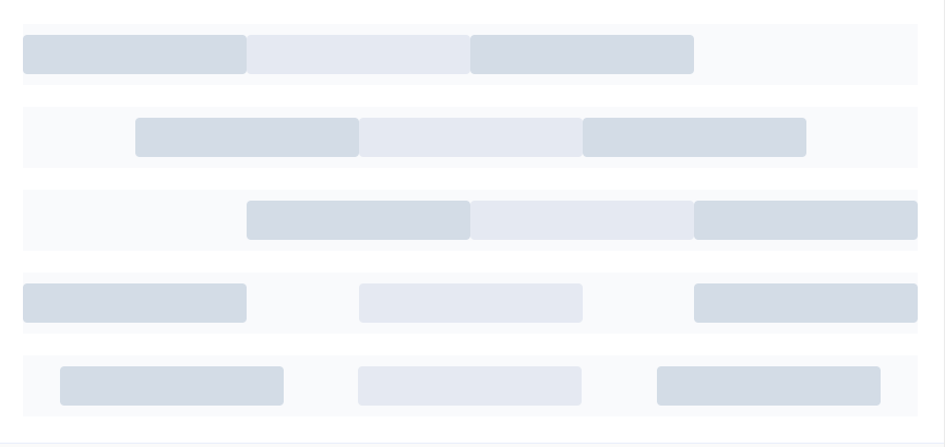
样式显示为:
响应式布局
参照 bootstrap 的响应式设计,预设了五个响应尺寸,xs、sm、md、lg、xl。当显示大小 从最小到最大时,响应依次为 xs、sm、md、lg、xl
1 <el-row :gutter="10">
2   <el-col :xs="8" :sm="6" :md="4" :lg="3" :xl="1"><div class="grid-content bg-purple"></div></el-col>
3   <el-col :xs="4" :sm="6" :md="8" :lg="9" :xl="11"><div class="grid-content bg-purple-light"></div></el-col>
4   <el-col :xs="4" :sm="6" :md="8" :lg="9" :xl="11"><div class="grid-content bg-purple"></div></el-col>
5   <el-col :xs="8" :sm="6" :md="4" :lg="3" :xl="1"><div class="grid-content bg-purple-light"></div></el-col>
6 </el-row>
响应式布局
其中用到的样式为(不包括响应式布局样式):
 1 <style>
 2   .el-row {
 3     margin-bottom: 20px;
 4     &:last-child {
 5       margin-bottom: 0;
 6     }
 7   }
 8   .el-col {
 9     border-radius: 4px;
10   }
11   .bg-purple-dark {
12     background: #99a9bf;
13   }
14   .bg-purple {
15     background: #d3dce6;
16   }
17   .bg-purple-light {
18     background: #e5e9f2;
19   }
20   .grid-content {
21     border-radius: 4px;
22     min-height: 36px;
23   }
24   .row-bg {
25     padding: 10px 0;
26     background-color: #f9fafc;
27   }
28 </style>
样式
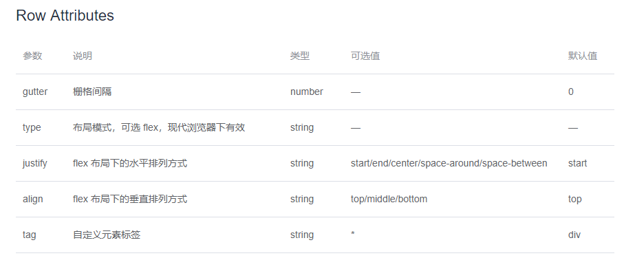
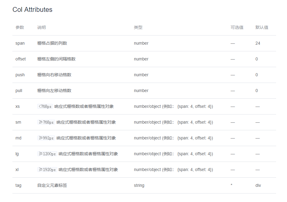
详细参数说明 :