前端工程师一般用的是Bootstrap的框架而不是样式,样式一般自己重新定义class类即可,主要样式要随具体情况而定包括位置
任何带有 class .btn 的元素都会继承圆角灰色按钮的默认外观。
但是 Bootstrap 提供了一些选项来定义按钮的样式。
<button type="button" class="btn">基本按钮</button>
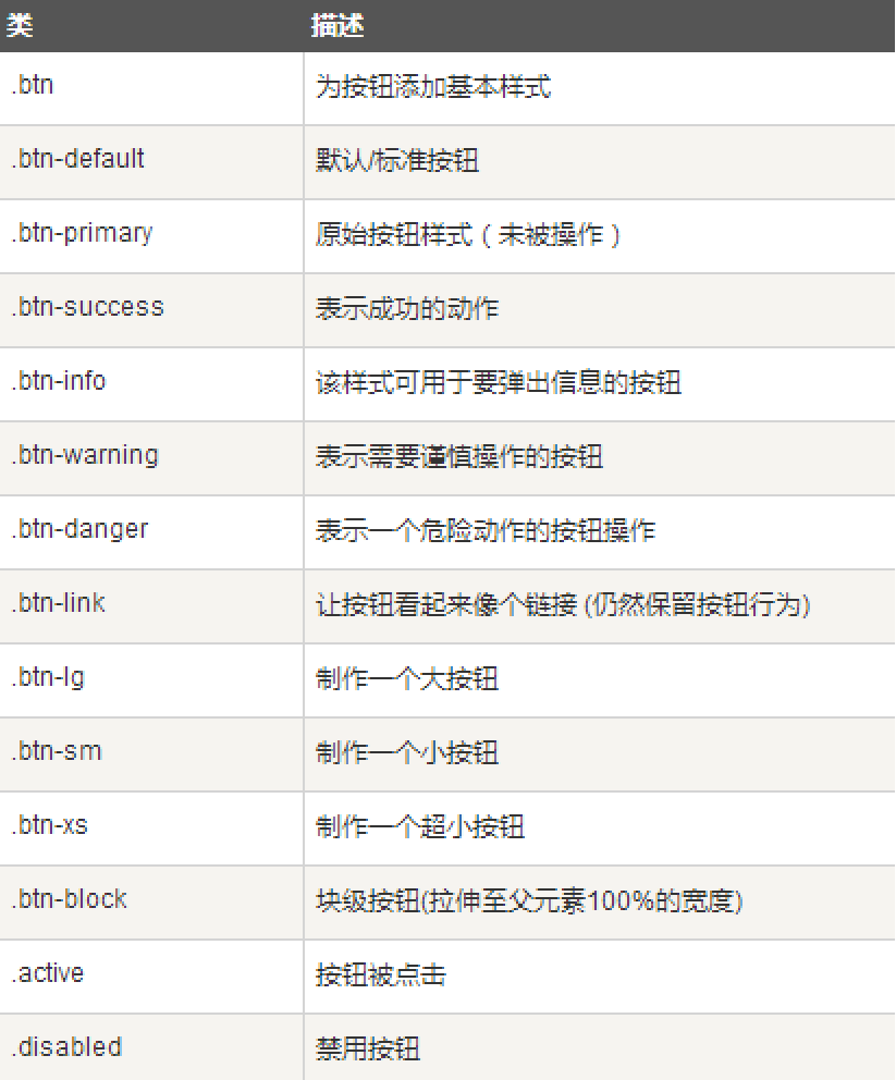
可以在 <a>、<button> 或 <input> 元素上创建并使用按钮 class。
用到按钮最好使用<button>,避免跨浏览器的不一致性问题。
- <a class="btn btn-default" href="#" role="button">链接</a>
- <button class="btn btn-default" type="submit">按钮</button>
- <input class="btn btn-default" type="button" value="输入">
- <input class="btn btn-default" type="submit" value="提交">
<!DOCTYPE html>
<html>
<head>
<Meta charset="utf-8">
<title></title>
<link href="Bootstrap/css/bootstrap.css" rel="stylesheet" />
<style type="text/css">
table{
width:100%;
font-size: 18px;
line-height: 45px;
}
td{
min-width: 500px;
}
</style>
</head>
<body>
<div style="width: 100%;height: 80px;"></div>
<div class="container">
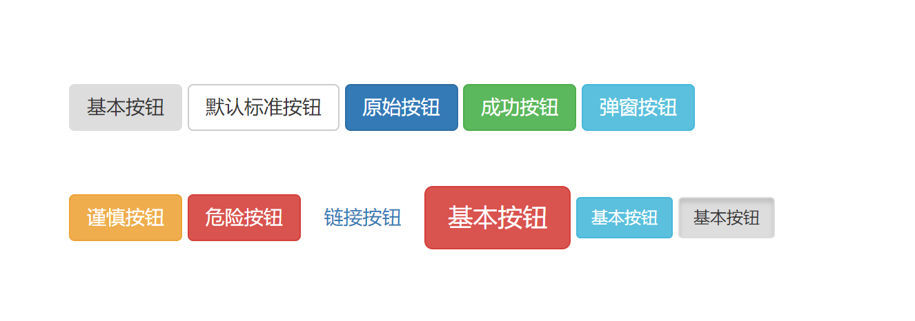
<button type="button" class="btn">基本按钮</button>
<button type="button" class="btn btn-default">默认标准按钮</button>
<button type="button" class="btn btn-primary">原始按钮</button>
<button type="button" class="btn btn-success">成功按钮</button>
<button type="button" class="btn btn-info">弹窗按钮</button> <br><br><br>
<button type="button" class="btn btn-warning">谨慎按钮</button>
<button type="button" class="btn btn-danger">危险按钮</button>
<button type="button" class="btn btn-link">链接按钮</button>
<button type="button" class="btn btn-lg btn-danger">基本按钮</button>
<button type="button" class="btn btn-sm btn-info">基本按钮</button>
<button type="button" class="btn btn-sm active">基本按钮</button>
</div>
<script src="Bootstrap/js/bootstrap.js"></script>
<script src="bootstrap/js/jquery-1.11.3.min.js"></script>
</body>
</html>