目录
重点归纳
- CSS三大特性
- CSS选择器*****
- 盒子模型
- 定位
- 浮动
- 元素的隐藏
知识点
CSS三大特性
1.层叠性
浏览器处理冲突的能力:如果一个属性通过两个相同的选择器设置到元素上,样式的层叠规则按照样式的声明顺序来层叠,就近原则
前提:选择器必须是同一种(例如都是类选择器)
样式不冲突不会层叠
<!DOCTYPE html>
<html lang="en">
<head>
    <Meta charset="UTF-8">
    <Meta http-equiv="X-UA-Compatible" content="IE=edge">
    <Meta name="viewport" content="width=device-width, initial-scale=1.0">
    <title>Document</title>
    <style>
        .fontStyle{
            color: yellow;
            font-size: 20px;
        }
        .a{
            color: red;
        }
        .backgroundStyle{
            background-color: green;
        }
    </style>
</head>
<body>
<-- 三个类选择器作用于h1 -->
<h1 class="a fontStyle backgroundStyle">我是H1标签</h1>
</body>
</html>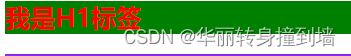
2. 继承性
比如说文本的颜色、字号
但是文本样式不会继承
3.优先级
权重:
(1)继承的权重=0:优先级最低
(2)行内样式权重=100:优先级很高
(3)权重相同时:就近原则,谁先声明谁在前。
(4)!important:定义优先级
CSS权重公式:
- 继承、* 0,0,0,0
- 标签选择器 0,0,0,1
- 类、伪类选择器 0,0,1,0
- ID选择器 0,1,0,0
- 行内样式 1.0.0.0
- !important 无穷大
- width、height 大于无穷大
- max-width、max-height 大于无穷大
- min-width、min-height 大于无穷大
!important:如果同时有max-width、max-height,!important是不管用的
例子:
选择器 div ul li {}的权重等于他们的权重相加:0,0,0,3
li{} 的权重等于:0,0,0,1
例子:
a:link{}的权重=0,0,1,1
div a {}的权重=0,0,0,2
权重不能被继承
贡献值没有进位
前提:CSS样式发生冲突
<!DOCTYPE html>
<html lang="en">
<head>
    <Meta charset="UTF-8">
    <Meta http-equiv="X-UA-Compatible" content="IE=edge">
    <Meta name="viewport" content="width=device-width, initial-scale=1.0">
    <title>Document</title>
    <style>

        h1{
            color: blue;
        }
        .div{
            height: 200px;
            width: 200px;
        }
        p{
            background-color: blueviolet !important;
        }

        /* div下的ul下的li */
        div ol li{
            color: red;
        }

        /* 这个页面上所有的li */
        li{
            color: yellow;
        }

        a:link{
            color: red;
        }

        div a {
            color: yellow;
        }
    </style>
</head>
<body>
<div class=backgroundStyle>
    <p style="background-color: red;">我是div里的p</p>
</div>

<div>
    <ol>
        <li>123456</li>
        <li>123456</li>
        <li>123456</li>
    </ol>
</div>
<div>
    <a href="#">a标签</a>
</div>
</body>
</html>
常用的单位
字体和图片的使用
<!DOCTYPE html>
<html lang="en">
<head>
    <Meta charset="UTF-8">
    <Meta http-equiv="X-UA-Compatible" content="IE=edge">
    <Meta name="viewport" content="width=device-width, initial-scale=1.0">
    <title>Document</title>
    <style>
        p {
            /* 字体大小 */
            font-size: 20px;
            /* 字体样式 */
            font-style: italic;
            /* 字体粗细 */
            font-weight: bold;
            /* 字体修饰:取消下划线、上划线、删除线 等 */
            text-decoration: none;
            /* 字体 */
            font-family: monospace;
            /* 复合属性:直接定义多个font开头的属性 */
            font: 30px italic bold;
        }
        div {
            background-color: white;
            width: 800px;
            height: 400px;
            background-image: url(./css/timg-10.jpeg);
            /* 图片默认平铺,多个图片占满区域 */
            background-size: 400px;
            /* 不平铺 */
            background-repeat: no-repeat;
            /* 图片位置,默认上左 */
            background-position: center;
            /* 有复合属性 */
            /* background:  no-repeat center; */
        }
    </style>
</head>
<body>
    <input type="color">
    <div>
        <p>我是div里的p</p>
    </div>
</body>
</html>
列表、边界样式
<!DOCTYPE html>
<html lang="en">
<head>
<Meta charset="UTF-8">
<Meta http-equiv="X-UA-Compatible" content="IE=edge">
<Meta name="viewport" content="width=device-width, initial-scale=1.0">
<title>Document</title>
<style>
div ul li{
/* 列表前的标识 */
/* 空心圆 */
list-style-type: circle;
/* 使用图片当做列表前的序号 */
list-style-image: url(./css/timg-10.jpeg);
}
.div1 {
width: 200px;
height: 200px;
background-color: yellow;
/* 圆角:像素为半径 */
border-radius: 50px;
border-bottom-left-radius: 100px;
/* 边界框样式:虚线 */
border-style: dashed;
/* 边界颜色 */
border-color: blueviolet;
}
</style>
</head>
<body>
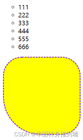
<div>
<ul>
<li>111</li>
<li>222</li>
<li>333</li>
<li>444</li>
<li>555</li>
<li>666</li>
</ul>
</div>
<div class="div1"></div>
</body>
</html>结果
练习
<!DOCTYPE html>
<html lang="en">

<head>
    <Meta charset="UTF-8">
    <Meta http-equiv="X-UA-Compatible" content="IE=edge">
    <Meta name="viewport" content="width=device-width, initial-scale=1.0">
    <title>Document</title>
    <style>
        div {
            width: 200px;
            height: 200px;
            /* display显示 */
            display: inline-block;
        }

        .div1,
        .div4 {
            border-bottom-left-radius: 50%;
            border-top-right-radius: 50%;
        }

        .div2,
        .div3 {
            border-bottom-right-radius: 50%;
            border-top-left-radius: 50%;
        }

        /* 区块属性:定义一个元素的显示方式 */
        .div1 {
            background-color: green;
        }

        .div2 {
            background-color: blue;
        }

        .div3 {
            background-color: yellow;
        }

        .div4 {
            background-color: red;
        }

        .div5 {
            background-color: orange;
            /* 隐藏元素 */
            display: none;
        }
    </style>
</head>

<body>
    <div class="div1"> </div>
    <div class="div2"> </div>
    <br>
    <div class="div3"> </div>
    <div class="div4"> </div>
    <div class="div5"></div>
</body>

</html>
结果:

盒子模型
div、a、span都是盒子
一个盒子中主要的属性有5个:width、height、padding、border、margin。
- width和height:内容的宽度、高度(不是盒子的宽度、高度)。
- padding:内边距。
- border:边框。
- margin:外边距。
<!DOCTYPE html>
<html lang="en">
<head>
    <Meta charset="UTF-8">
    <Meta http-equiv="X-UA-Compatible" content="IE=edge">
    <Meta name="viewport" content="width=device-width, initial-scale=1.0">
    <title>Document</title>
    <style>
        .div1{
            width: 300px;
            height: 300px;
            background-color: orange;
            /* 外边距 */
            margin-top: 100px;
            margin-left: 100px;
            /* 内边距 */
            padding: 20px;
            border: 10px solid red;
            /* border-Box:保证盒子的大小是300*300 ,不包括外边距*/
            /* Box-sizing: border-Box; */
            /* content-Box保证div的大小为300*300,不包括内边距和边框线 */
            Box-sizing: content-Box;
            /*
            掌握:
                会算盒子的尺寸
            */
        }
        .div2{
            width: 300px;
            height: 300px;
            background-color: orange;
            /* 可见性:隐藏盒子模型
            display: none; */
            /* 溢出策略:例如:加滑动条、溢出部分隐藏等 */
            overflow: scroll;
        }
    </style>
</head>
<body>
    <!-- 盒子模型 -->
    <div class="div1"></div>
    <div class="div2">
        <img src="../img/timg-10.jpeg" alt="">
    </div>
</body>
</html>
定位
文档流
在网页中将窗体自上而下分为多个行
并在每行从左到右的顺序排列元素,即为文档流
定位position:让一些元素脱离文档流
1.static:默认的文档流,自上而下,从左到右
2.absolute:绝对定位
相对一个父元素的绝对定位
当设置了绝对定位之后,原来的元素会脱离文档流,在页面上浮起来
3.relative:相对定位
相当于上一个元素的位置进行定位,还是在文档流中,没有浮起来
4.fixed:固定行为
固定在页面的一个位置,不是网页的一个位置
父相子绝
父元素相对定位子元素绝对定位
<!DOCTYPE html>
<html lang="en">

<head>
    <Meta charset="UTF-8">
    <Meta http-equiv="X-UA-Compatible" content="IE=edge">
    <Meta name="viewport" content="width=device-width, initial-scale=1.0">
    <title>Document</title>
    <style>
        .div1 {
            width: 300px;
            height: 300px;
            background-color: orange;
            /* 绝对定位 */
            position: absolute;
            left: 150px;
            top: 50px;
            /* 隐藏盒子模型
            display: none;
            */
        }

        .div2 {
            width: 300px;
            height: 300px;
            background-color: skyblue;
            /* 绝对定位 */
            position: absolute;
            /* 给一个类似于坐标的东西进行定位 */
            left: 150px;
            top: 400px;
            /* 隐藏div2,但不隐藏盒子模型
            visibility: hidden;
            */
        }

        .container {
            width: 800px;
            height: 800px;
            background-color: pink;
            position: relative;
            left: 200px;
            top: 100px;
        }
        .nav{
            width: 100%;
            height: 100px;
            background-color: red;
            /* 水平居中 */
            margin: auto;
            /* 固定定位 */
            position: fixed;
            /* z轴的索引 */
            z-index: 100;
        }

    </style>
</head>

<body>
      <div class="nav">我是导航栏</div>
    <div class="container">
        <div class="div1"> </div>
        <div class="div2"> </div>
    </div>
</body>

</html>
定位的left、margin-left的区别
用margin移动的位置是相对于它最开始的位置移动,margin是盒子的属性
left等是相对于父元素的位置移动的,left是定位的属性
开发中,用盒子模型就用margin,用定位就用left等
使用定位之后不要用margin,
图片隐藏及小动画
<!DOCTYPE html>
<html lang="en">

<head>
    <Meta charset="UTF-8">
    <Meta http-equiv="X-UA-Compatible" content="IE=edge">
    <Meta name="viewport" content="width=device-width, initial-scale=1.0">
    <title>Document</title>
    <style>
        div {
            width: 100px;
            height: 1000px;
            overflow: hidden;
            /* 归于一行
            float: left; */
            display: inline-block;
        }
        div:hover{
            overflow: unset;
            width: 1694px;
            height: 1000px;
        }
    </style>
</head>

<body>
    <div>
        <img src="../img/timg-10.jpeg" alt="">
    </div>
    <div>
        <img src="../img/timg-10.jpeg" alt="">
    </div>
    <div>
        <img src="../img/timg-10.jpeg" alt="">
    </div>
    <div>
        <img src="../img/timg-10.jpeg" alt="">
    </div>

</body>
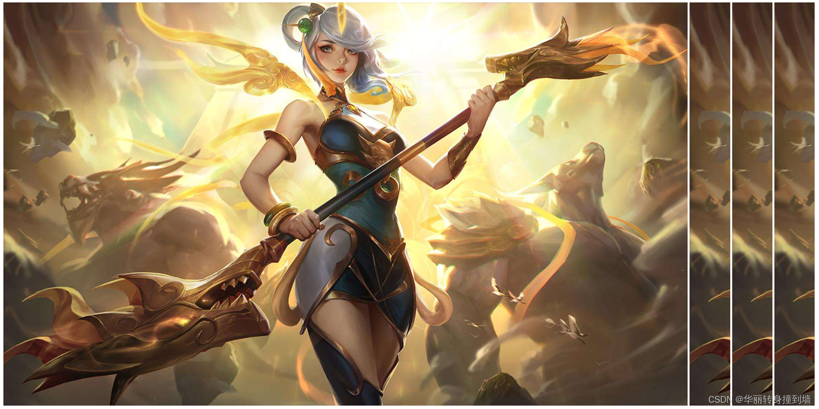
</html>鼠标放在图片上之前
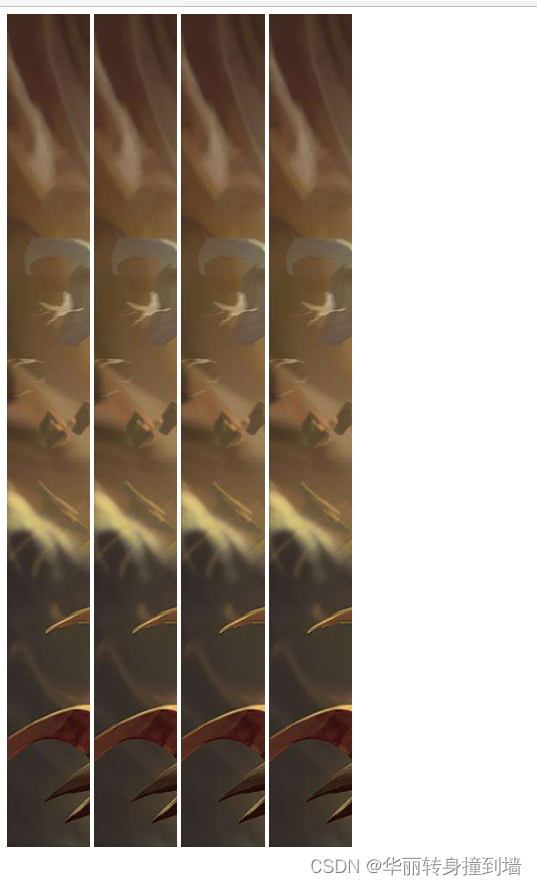
鼠标放在图片上之后
浮动
使元素脱离文档流,(浮起来),进行重新排列,如果位置相同会覆盖文档流中元素
div1、div2、div3浮动之前
<!DOCTYPE html>
<html lang="en">
<head>
    <Meta charset="UTF-8">
    <Meta http-equiv="X-UA-Compatible" content="IE=edge">
    <Meta name="viewport" content="width=device-width, initial-scale=1.0">
    <title>Document</title>
    <style>
        .div1{
            width: 300px;
            height: 300px;
            background-color: orange;
            /* float: left; */
        }
        .div2{
            width: 300px;
            height: 300px;
            background-color: skyblue;
            /* float: left; */
        }
        .div3{
            width: 300px;
            height: 300px;
            background-color: green;
            /* float: left; */
        }
    </style>
</head>
<body>
    <!--
        浮动
     -->
     <div class="div1"></div>
     <div class="div2"></div>
     <div class="div3"></div>
</body>
</html>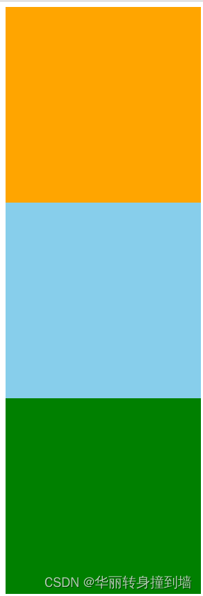
div1浮动,在左上排序,div1覆盖div2,div3在div2下
<!DOCTYPE html>
<html lang="en">
<head>
    <Meta charset="UTF-8">
    <Meta http-equiv="X-UA-Compatible" content="IE=edge">
    <Meta name="viewport" content="width=device-width, initial-scale=1.0">
    <title>Document</title>
    <style>
        .div1{
            width: 300px;
            height: 300px;
            background-color: orange;
            float: left;
        }
        .div2{
            width: 300px;
            height: 300px;
            background-color: skyblue;
            /* float: left; */
        }
        .div3{
            width: 300px;
            height: 300px;
            background-color: green;
            /* float: left; */
        }
    </style>
</head>
<body>
    <!--
        浮动
     -->
     <div class="div1"></div>
     <div class="div2"></div>
     <div class="div3"></div>
</body>
</html>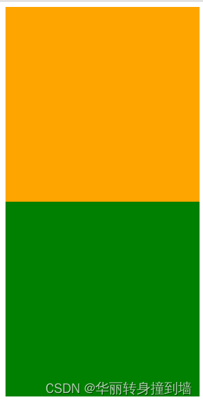
div1、div2浮动,在左上排列,div1覆盖div3
<!DOCTYPE html>
<html lang="en">
<head>
    <Meta charset="UTF-8">
    <Meta http-equiv="X-UA-Compatible" content="IE=edge">
    <Meta name="viewport" content="width=device-width, initial-scale=1.0">
    <title>Document</title>
    <style>
        .div1{
            width: 300px;
            height: 300px;
            background-color: orange;
            float: left;
        }
        .div2{
            width: 300px;
            height: 300px;
            background-color: skyblue;
            float: left;
        }
        .div3{
            width: 300px;
            height: 300px;
            background-color: green;
            /* float: left; */
        }
    </style>
</head>
<body>
    <!--
        浮动
     -->
     <div class="div1"></div>
     <div class="div2"></div>
     <div class="div3"></div>
</body>
</html>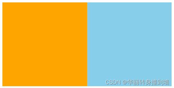
内容坍塌与清除浮
例:
<!DOCTYPE html>
<html lang="en">
<head>
    <Meta charset="UTF-8">
    <Meta http-equiv="X-UA-Compatible" content="IE=edge">
    <Meta name="viewport" content="width=device-width, initial-scale=1.0">
    <title>Document</title>
    <style>
        li{
            list-style: none;
            height: 30px;
            width: 100px;
            float: left;
            background-color: aqua;
            margin-left: 20px;
        }
        ul{
            background-color: pink;
        }
    </style>
</head>
<body>
    <!--
        一般用ul>li做导航。不做列表
     -->
    <ul class="ulstyle">
        <li>1111</li>
        <li>2222</li>
        <div style="clear:both"></div>
    </ul>
</body>
</html>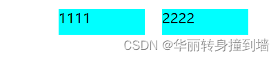
解决:清除列表ul中的浮动
方法一
<!DOCTYPE html>
<html lang="en">
<head>
    <Meta charset="UTF-8">
    <Meta http-equiv="X-UA-Compatible" content="IE=edge">
    <Meta name="viewport" content="width=device-width, initial-scale=1.0">
    <title>Document</title>
    <style>
        li{
            list-style: none;
            height: 30px;
            width: 100px;
            float: left;
            background-color: aqua;
            margin-left: 20px;
        }
        /* 如果不给ul尺寸---内容坍塌 */
        ul{
            background-color: pink;
            /* 设置ul的尺寸随li的尺寸变化自动确定 :
            在ul列表中加div块,清除浮动,解决内容坍塌
            <div style="clear:both"></div>

            */
        }

    </style>
</head>
<body>
    <!--
        一般用ul>li做导航。不做列表
     -->
    <ul class="ulstyle">
        <li>1111</li>
        <li>2222</li>
        <div style="clear:both"></div>
    </ul>
</body>
</html>
方法二
<!DOCTYPE html>
<html lang="en">
<head>
    <Meta charset="UTF-8">
    <Meta http-equiv="X-UA-Compatible" content="IE=edge">
    <Meta name="viewport" content="width=device-width, initial-scale=1.0">
    <title>Document</title>
    <style>
        li{
            list-style: none;
            height: 30px;
            width: 100px;
            float: left;
            background-color: aqua;
            margin-left: 20px;
        }
        /* 如果不给ul尺寸---内容坍塌 */
        ul{
            background-color: pink;

        }
        /*
        清除浮动方法二(推荐):
        通过CSS
        伪类:after,在元素后加入内容。
        */
        .ulstyle:after{
            content: '';
            height: 0;
            width: 0;
            display: block;
            visibility: hidden;
            clear: both;
        }
    </style>
</head>
<body>
    <!--
        一般用ul>li做导航。不做列表
     -->
    <ul class="ulstyle">
        <li>1111</li>
        <li>2222</li>
    </ul>
</body>
</html>
CSS3的动画:Transition
<!DOCTYPE html>
<html lang="en">
<head>
    <Meta charset="UTF-8">
    <Meta http-equiv="X-UA-Compatible" content="IE=edge">
    <Meta name="viewport" content="width=device-width, initial-scale=1.0">
    <title>Document</title>
    <style>
        div{
            /* Transition */
            width: 100px;
            height: 100px;
            background-color: orange;
            /* 动画变化 */
            transition: width 2s ease-in 3s,height 3s,background-color ease-out 2s;
        }
        div:hover{
            width: 500px;
            height: 500px;
            background-color: aqua;
        }
    </style>
</head>
<body>
    <!--
        CSS3有兼容器的问题
     -->
     <div></div>
</body>
</html>
CSS3的动画:anmiation
<!DOCTYPE html>
<html lang="en">

<head>
    <Meta charset="UTF-8">
    <Meta http-equiv="X-UA-Compatible" content="IE=edge">
    <Meta name="viewport" content="width=device-width, initial-scale=1.0">
    <title>Document</title>
    <style>
        .div1 {
            /* 引用自定义动画,延迟时间 */
            animation: myAnim 5s;
        }

        /* 先声明动画,再使用*/
        @keyframes myAnim {
            0% {
                width: 100px;
                height: 100px;
                background-color: orange;
            }

            25% {
                width: 200px;
                height: 200px;
                background-color: blue;
            }

            50% {
                width: 400px;
                height: 400px;
                background-color: red;
                transform: rotate(45deg);
            }

            75% {
                width: 200px;
                height: 200px;
                background-color: blue;
                transform: rotateZ(180deg);
            }

            100% {
                width: 100px;
                height: 100px;
                background-color: orange;
                transform: rotate3d(270deg);
            }
        }
    </style>
</head>

<body>
    <!-- animate -->
    <!--
        animate与transition的区别
        transition只能通过固定的属性来开始与结束值
     -->
    <div class="div1">123</div>
</body>

</html>
flex(弹性)布局:了解
<!DOCTYPE html>
<html lang="en">
<head>
    <Meta charset="UTF-8">
    <Meta http-equiv="X-UA-Compatible" content="IE=edge">
    <Meta name="viewport" content="width=device-width, initial-scale=1.0">
    <title>Document</title>
    <style>
        .container{
            display: flex;
            /* 排列方向 flex-direction:
            row:从左到右
            row-reverse:从右到左
            */
            flex-direction: row;
            /*

            如果一条轴线(一行)装不下,默认缩小排列在一行中
            也可以选择方式换行:flex-wrap:
            */
            flex-wrap: wrap;
            /* 设置主轴的排列策略(对齐方式) :例如居中*/
            justify-content: center;
            /* 交叉轴*/
            align-items: center;
            /* 父级div与父级div对齐方式 */
            align-content: center;

            align-items:flex-start;
            width: 900px;
            height: 900px;
            background-color: pink;
        }
        .flex1{
            /*
            row:从左到右
            row-reverse:从右到左
            */
            flex-direction: row;
            width: 200px;
            height: 200px;
            background-color: green;
            order: 1;
                /* 要将哪个项目放大,默认是0 */
                /* flex-grow: 2; */
                /* 要将哪个项目缩小,默认是0 */
                flex-shrink: 20;
                align-self: flex-end;
        }
        .flex2{
            flex-direction: row;
            width: 200px;
            height: 200px;
            background-color: yellow;
            order: -2;
        }
    </style>
</head>
<body>
    <!--
        flex(弹性)布局
            块级元素和行内块级元素
        父容器加上display: flex
     -->
     <div class="container">
        container
        <div class="flex1">123</div>
        <div class="flex2">456</div>
        <div class="flex1">123</div>
        <div class="flex2">456</div>
        <div class="flex1">123</div>
        <div class="flex2">456</div>
        <div class="flex1">123</div>
        <div class="flex2">456</div>
     </div>
</body>
</html>