Android 基础控件
TextView 文本框控件
    <TextView
    android:layout_width="wrap_content"
    android:layout_height="wrap_content"
    android:text="Hello World TextView This is our first meetingThis we first met!"
    android:textColor="@color/design_default_color_error"
    android:textSize="20sp"
    android:textStyle="bold"
    android:maxLines="1"
    android:maxLength="50"
    android:ellipsize="end"/>
常用属性
-
android:text 设置文本内容。可以直接写入字符串,也可以通过res/values/strings.xml中获取(推
荐:为了避免多语言(国际化)的文字翻译问题) - android:textColor 设置文字颜色。
- android:textSize 设置字体大小。 一般大小单位为sp除非不允许与系统设置字体匹配,否则慎用dp作为字体单位
-
android:textStyle 设置字体样式。
- 参数有
- bold: 粗体
- italic: 斜体
- normal: 正常
- android:maxLines 最大行数。
- android:maxLength 最大字符数。
-
android:ellipsize 设置省略号位置或走马灯效果。
- 参数有
marquee 设置跑马灯marquee这个值时并不能使文字直接滚动起来。必须要设置这两个属性:
android:singleLine=“true”
android:focusableInTouchMode=“true”
也可以设置其他属性
android:marqueeRepeatLimit=“marquee_forever” 设置为重复走动
android:singleLine=“true” 单行文字**
注意:也可以通过Java代码实现跑马灯效果,需要在代码中设置:在TextView中添加 android:singleLine=“true”
开启跑马灯
textView.setSelected(true);
关闭跑马灯
textView.setSelected(false);
TextView文本阴影
android:shadowColor 设置阴影颜⾊,需要与shadowRadius⼀起使⽤哦!
android:shadowRadius 设置阴影的模糊程度,设为0.1就变成字体颜⾊
了,建议使⽤3.0
android:shadowDx 设置阴影在⽔平⽅向的偏移,就是⽔平⽅向阴影开始的横坐标位置(默认阴影向右)
android:shadowDy 设置阴影在竖直⽅向的偏移,就是竖直⽅向阴影开始的纵坐标位置(默认阴影向下)
TextView⽂字带图⽚
主要是通过TextView的4个属性来设置不同位置的⽂字旁图⽚
android:drawabletop(上)
android:drawableButtom(下)
android:drawableLeft(左)
android:drawableRight(右)
另外,也可以使⽤drawablePadding来设置图⽚与⽂字间的间距

TextView属性识别链接类型
android:autoLink=“email”
TextView字间距和行间距
字间距:
android:textScaleX 控制字体水平方向的缩放,默认值1.0f,值是float
Java中setScaleX(2.0f);
行间距:
android:linespacingExtra 设置行间距,如"3dp" android:linespacingMultiplier:设置行间距的倍数,如"1.2"
Java代码中可以通过: setLinespacing方法来设置
带边框的TextView
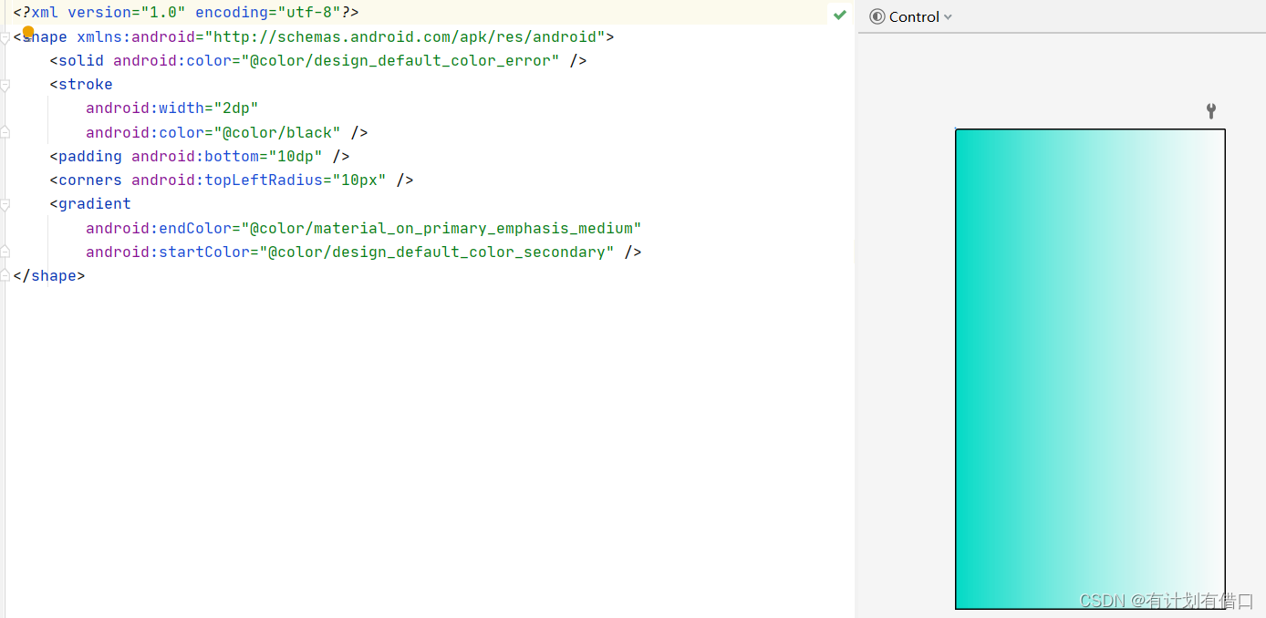
如果你想为TextView设置一个边框背景,普通矩形边框或者圆角边框!下面可能帮到你! 另外TextView是很多其他控件的父类,比如Button,也可以设置这样的边框! 实现原理很简单,自行编写一个ShapeDrawable的资源文件!然后TextView将blackgroung 设置为这个drawable资源即可!
简单说下shapeDrawable资源文件的几个节点以及属性:
<solid andro
id:color = “xxx”…> 这个是设置背景颜色的
<stroke android:width = “xdp” android:color=“xxx”…> 这个是设置边框的粗细,以及边框颜色的
<padding androidLbottom = “xdp”…> 这个是设置边距的
<corners android:topLefTradius=“10px”…> 这个是设置圆角的
<gradient …> 这个是设置渐变色的,可选属性有:
- startColor:起始颜色
- endColor:结束颜色
- centerColor:中间颜色
- angle:方向角度,等于0时,从左到右,然后逆时针方向转,当angle = 90度时从下往上
- type:设置渐变的类型
Button 按钮控件
Button 按钮 控件 Button是TextView的子类
实际开发中,无非是对按钮的几个状态做相应的操作,比如:按钮按下的时候 用一种颜色,弹起又一种颜色,或者按钮不可用的时候一种颜色
< Button
    android:layout_width="match_parent"
    android:layout_height="wrap_content"
    android:text="登录"/>
EditText 输入框控件
常用属性
- android:hint 提示文字
- android:textColorHint 设置提示文字颜色
- android:maxLines 设置最大行数
-
android:textColor 输入文字颜色
输入和显示文字一般不适用纯黑色,通常使用深灰色:#444444 #333333 #333 #444 -
android:selectAllOnFocus 光标显示时(有焦点),选中内容
- nextFocusUp 指定上键焦点控件
- nextFocusDown 指定下键焦点控件
- nextFocusLeft 指定左键焦点控件
- nextFocusRight 指定右键焦点控件
- android:textScaleX=“1.5” 设置字与字的水平间隔
- android:textScaleY=“1.5” 设置字与字的垂直间隔
-
android:inputType 设置输入内容,如仅允许输入数字,或者输入密码,文字以及密码方式显示
能使的软键盘根据设置的输入内容不同,进行动态调整,默认为none- number 仅允许输入数字
- numberDecimal 允许输入浮点数
- numberSigned 允许输入正数和负数
- numberPassword 仅允许输入数字密码(不可见)
- textPassword 输入内容为密文显示,没有密码格式限制
- textVisiblePassword可见密码
- textAutoComplete 自动补全单词
- textAutoCorrect自动纠错单词
- textCapCharacters 单词首字母大写
- textCapSentences句首字母大写
- textCapWords全部字母大写
- textEmailAddress输入为邮箱地址格式
- android:inputType=“phone” 拨号键盘
- android:inputType=“datetime”
- android:inputType=“date” 日期键盘
- android:inputType=“time” 时间键盘
android:windowSoftInputMode 设置软键盘
stateHidden 进入页面时默认隐藏软键盘,软键盘仍可以手动弹出
stateVisible 进入页面时默认显示软键盘,软键盘仍可以手动隐藏
adjustPan 软键盘弹出后,覆盖在页面之上
adjustResize 软键盘弹出后,调整页面,将输入内容始终显示出来
在AndroidManifest.xml中设置
 <activity android:name=".MainActivity"
  android:windowSoftInputMode="adjustResize" >
带表情的EditText的简单实现
btn_add = (Button) findViewById(R.id.btn_add);
        edit_one = (EditText) findViewById(R.id.edit_one);
        btn_add.setonClickListener(new OnClickListener() {
            @Override
            public void onClick(View v) {
                SpannableString spanStr = new SpannableString("imge");
                Drawable drawable = MainActivity.this.getResources().getDrawable(R.drawable.f045);
                drawable.setBounds(0,0,drawable.getIntrinsicWidth(),drawable.getIntrinsicHeight());
                ImageSpan span = new ImageSpan(drawable,ImageSpan.ALIGN_BASELINE);
                spanStr.setSpan(span,0,4,Spannable.SPAN_EXCLUSIVE_EXCLUSIVE);
                int cursor = edit_one.getSelectionStart();
                edit_one.getText().insert(cursor, spanStr);
            }
});
带删除按钮的 EditText
ImageView图像视图控件
常用属性
android:maxHeight 设置ImageView的最大高度
android:maxWidth 设置ImageView的最大宽度
adjustViewBounds 设置图像缩放时是否按原图长宽比
baselineAlignBottom和baseLine使用,实现文案和图片对齐
有两个可以设置图片的属性 src 和background
区别:
①background通常指的都是背景,而src指的是内容!!
②当使用src填入图片时,是按照图片大小直接填充,并不会进行拉伸而使用background填入图片,则是会根据ImageView给定的宽度来进行拉伸
scaleType设置缩放类型 内容裁剪
对应在Java代码中属性
imageView.setScaleType(ImageView.ScaleType.CENTER);
centerCrop 保持横纵比缩放图片,直到完全覆盖ImageView,可能会出现图片的显示不完全
fitCenter 同上,缩放后放于中间;
fitXY 对图像的横向与纵向进行独立缩放,使得该图片完全适应ImageView,但是图片的横纵比可能会发生改变(一般仅当图片尺寸与控件尺寸差别不大时)
fitStart 保持纵横比缩放图片,知道较长的边与Image的编程相等,缩放完成后将图片放在ImageView的左上角
fitEnd 同上,缩放后放于右下角;
center 保持原图的大小,显示在ImageView的中心。当原图的size大于ImageView的size,超过部分裁剪处理。
centerInside 保持横纵比缩放图片,直到ImageView能够完全地显示图片
matrix 默认值,不改变原图的大小,从ImageView的左上角开始绘制原图, 原图超过ImageView的部分作裁剪处理
Shape (自定义图片和形状)
Shape自已是可以定义当前Shape的形状的
属性有(rectangle、oval、line、ring)
shape的形状,默认为矩形,可以设置为矩形(rectangle)、椭圆形(oval)、线性形状(line)、环形(ring)
android:shape=“rectangle”
android:shape=“ring”
下面的属性只有在android:shape="ring"时可用:
- android:innerRadius 尺寸,内环的半径。
- android:innerRadiusRatio 浮点型,以环的宽度比率来表示内环的半径,
- android:thickness 尺寸,环的厚度
- android:thicknessRatio 浮点型,以环的宽度比率来表示环的厚度,例如,如果android:thicknessRatio=“2”,
- android:useLevel boolean值,如果当做是LevelListDrawable使用时值为true,否则为false. 必须写,要不然没有效果
shape里边子标签(corners、gradient、padding、size、solid、stroke)
corners标签是用来字义圆角的,其中radius与其它四个可以共同使用,但其它四个优先级更高。
      <corners android:radius="20dip"  //设置全部圆角
         android:bottomLefTradius="20dp" //设置左下圆角
         android:bottomrighTradius="30dp" //设置右下圆角
         android:topLefTradius="40dp" //设置左上圆角
         android:topRighTradius="50dp"/>//设置右上圆角
stroke 这是描边属性,可以定义描边的宽度,颜色,虚实线等
   <stroke
      android:width="dimension"   //描边的宽度
      android:color="color"   //描边的颜色
      // 以下两个属性设置虚线
      android:dashWidth="dimension"   //虚线的宽度,值为0时是实线
      android:dashGap="dimension" />      //虚线的间隔
gradient用以定义渐变色,可以定义两色渐变和三色渐变,及渐变样式,
它的优先级高于solid,同时定义时显示gradient定义的效果。它的属性有下面几个:
android:type=["linear" | "radial" | "sweep"] //共有3中渐变类型,线性渐变(默认)/放射渐变/扫描式渐变
注意:在构造放射性渐变时,要加上android:gradienTradius属性(渐变半径),即必须指定渐变半径的大小才会起作      用
android:angle="integer"     //渐变角度,必须为45的倍数,0为从左到右,90为从上到下
android:gradienTradius="float"  //渐变的半径,只有当渐变类型为radial时才能使用
android:centerX="float"     //渐变中心X的相当位置,范围为0~1 默认为0.5
android:centerY="float" //渐变中心Y的相当位置,范围为0~1 默认为0.5
android:startColor="color"  //渐变开始点的颜色
android:centerColor="color" //渐变中间点的颜色,在开始与结束点之间
android:endColor="color"    //渐变结束点的颜色
android:useLevel=["true" | "false"]   //使用LevelListDrawable时就要设置为true。设为false时才有渐变效果


<!--线性渐变(默认)-->
<gradient
    android:type="linear"
    android:startColor="#ff0000"
    android:centerColor="#00ff00"
    android:endColor="#0000ff"
    android:angle="0"
    android:centerX="0.5"
    android:centerY="0.5"
    android:useLevel="false"/>
<!--放射渐变  在构造放射性渐变时,要加上android:gradienTradius属性(渐变半径),即必须指定渐变半径的大小才会起作用-->
<gradient
    android:type="radial"
    android:startColor="#ff0000"
    android:centerColor="#00ff00"
    android:endColor="#0000ff"
    android:gradienTradius="200dp"/>
<!--扫描式渐变-->
<gradient
    android:type="sweep"
    android:startColor="#ff0000"
    android:centerColor="#00ff00"
    android:endColor="#0000ff"/>
Solid 用以指定内部填充色
<solid android:color="#ffff00"/>
padding 设置你边距
< padding
    android:bottom="10dp"
    android:left="10dp"
    android:right="10dp"
    android:top="10dp" />
size 设置图形大小
 <size
    android:width="400dp"
    android:height="400dp" />
Java代码中设置blackground和src属性:
前景(对应src属性):setimageDrawable( );
背景(对应background属性):setBackgroundDrawable( );
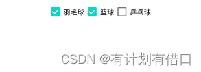
CheckBox 复选框 控件
属性
android:checked 值有true false 默认false 是否选中对应CheckBox
<CheckBox
    android:singleLine="true"
    android:layout_width="wrap_content"
    android:layout_height="wrap_content"
    android:checked="true"
    android:text="羽毛球" />
<CheckBox
    android:layout_width="wrap_content"
    android:layout_height="wrap_content"
    android:checked="true"
    android:text="篮球" />
<CheckBox
    android:layout_width="wrap_content"
    android:layout_height="wrap_content"
    android:checked="false"
    android:text="乒乓球" />
效果图
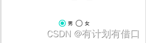
RadioButton 单选按钮控件
radioGroup 单选按钮组
<RadioButton
        android:id="@+id/nan"
        android:layout_width="wrap_content"
        android:layout_height="wrap_content"
        android:text="男"/>
按钮组
<RadioGroup
    android:layout_width="match_parent"
    android:layout_height="wrap_content"
    android:gravity="center_horizontal"
    android:orientation="horizontal">

    <RadioButton
        android:layout_width="wrap_content"
        android:layout_height="wrap_content"
        android:checked="true"
        android:text="男" />

    <RadioButton
        android:layout_width="wrap_content"
        android:layout_height="wrap_content"
        android:text="女" />
</RadioGroup>
效果图
ToggleButton 开关按钮 控件
android:textOf:按钮没有被选中时显示的文字
android:textOn按钮被选中时显示的文字
android:textStyle:文字风格,粗体,斜体写划线那些
android:typeface设置字体,默认支持这三种:sans, serif, monospace
android:background 设置按钮背景色
 <ToggleButton
      android:layout_width="wrap_content"
      android:layout_height="wrap_content"
      android:textOff="关"
      android:textOn="开"
      android:background="@drawable/rectangle"
      />
效果图

Switch 开关 控件 (androidx.appcompat.widget.SwitchCompat)
Switch是在4.0以后推出的,所以要注意开发时的minsdk设置,google在API 21后也推出support v7 包下的SwitchCompa的Material Design
开关控件,对低版本的有了更好的的支持。其实switch的应用场景和ToggleButton类似,多应用于两种状态的切换。
常用属性
android:showtext 设置on/off的时候是否显示文字,boolean
android:textOff 按钮没有被选中时显示的文字
android:textOn 按钮被选中时显示的文字
android:textStyle 文字风格,粗体,斜体写划线那些
android:typeface 设置字体,默认支持这三种:sans, serif, monospace
android:switchMinWidth 设置开关的最小宽度
android:switchPadding 设置滑块内文字的间隔
android:switchTextAppearance 设置开关的文字外观
android:track 底部的图片
android:thumb 滑块的图片
android:splitTrack 是否设置一个间隙,让滑块与底部图片分隔,boolean
android:checked=“false” 是否选中开关
<Switch
    android:id="@+id/switc"
    android:layout_width="wrap_content"
    android:layout_height="wrap_content"
    android:text="开关控件"
    android:checked="false"/>

<androidx.appcompat.widget.SwitchCompat
    android:id="@+id/switcc"
    android:layout_width="wrap_content"
    android:layout_height="wrap_content"
    android:text="开关控件"
    android:checked="false"/>