默认的自己可以定义数据的
mode=time是时间选择器
mode=date是日期选择器
跟其他的一样先来看下picker.wxml
<view class=page>
 <view class=page__hd>
 <text class=page__title>picker</text>
 <text class=page__desc>选择器</text>
 </view>
 <view class=page__bd>
 <view class=section>
  <view class=section__title>地区选择器</view>
  <picker bindchange=bindPickerChange value=pw_index range=pw_array>
  <view class=picker>
   当前选择:pw_array[index]
  </view>
  </picker>
 </view>
 <view class=section>
  <view class=section__title>时间选择器</view>
  <picker mode=time value=pw_time start=09:01 end=21:01 bindchange=bindTimeChange>
  <view class=picker>
   当前选择: pw_time
  </view>
  </picker>
 </view>


 <view class=section>
  <view class=section__title>日期选择器</view>
  <picker mode=date value=pw_date start=2015-09-01 end=2017-09-01 bindchange=bindDateChange>
  <view class=picker>
   当前选择: pw_date
  </view>
  </picker>
 </view>
 </view>
</view>
picker.wxss
page {
 background-color: #fbf9fe;
 height: 100%;
}
.page__hd{
 padding: 50rpx 50rpx 100rpx 50rpx;
 text-align: center;
}
.page__title{
 display: inline-block;
 padding: 20rpx 40rpx;
 font-size: 32rpx;
 color: #AAAAAA;
 border-bottom: 1px solid #CCCCCC;
}
.page__desc{
 display: none;
 margin-top: 20rpx;
 font-size: 26rpx;
 color: #BBBBBB;
}
.section{
 margin-bottom: 80rpx;
}
.section__title{
 margin-bottom: 16rpx;
 padding-left: 30rpx;
 padding-right: 30rpx;
}
.picker{
 padding: 26rpx;
 background-color: #FFFFFF;
}
picker.js
Page({
 data: {
 array: ['中国', '美国', '巴西', '日本'],
 index: 0,
 date: '2016-09-01',
 time: '12:01'
 },
 bindPickerChange: function(e) {
 console.log('picker发送选择改变,携带值为', e.detail.value)
 this.setData({
  index: e.detail.value
 })
 },
 bindDateChange: function(e) {
 this.setData({
  date: e.detail.value
 })
 },
 bindTimeChange: function(e) {
 this.setData({
  time: e.detail.value
 })
 }
})
demo地址 :WeAppDemo_jb51.rar
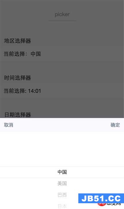
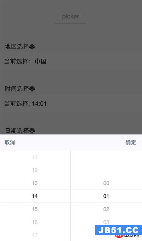
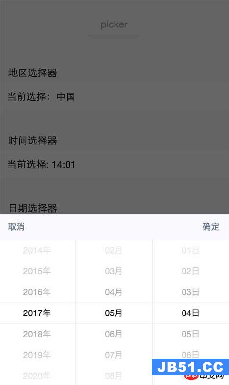
下面是页面展示
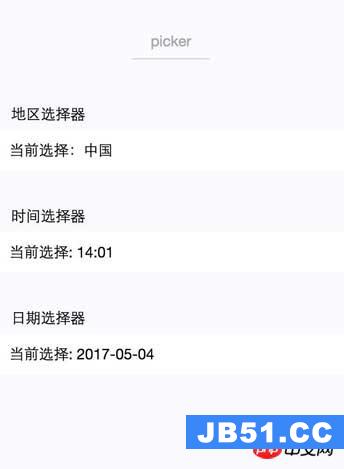
三种样式图:
1. 默认的自己可以定义数据的
2. mode=time是时间选择器
3. mode=date是日期选择器
 概述 消息能力是小程序能力中的重要组成,我们为开发者提供了...