React-Native中Modal的使用
import React,{ Component } from 'react'; import { AppRegistry,StyleSheet,Text,Modal,PixelRatio,View } 'react-native'; class ModalDemo extends Component { constructor(props) { super(props); this.state = { animationType: 'none', modalVisible: false,161);">//模态场景是否可见 transparent: true,161);">//是否透明显示 }; } render() { let modalBackgroundStyle = { backgroundColor: this.state.transparent ? 'rgba(0,0.5)' : 'red',}; let innerContainerTransparentStyle = this.state.transparent ? { backgroundColor: '#fff',padding: 20 } : null; return ( <View style={{ alignItems: 'center',flex: 1 }}> Modal animationType={this.state.animationType} transparent={this.state.transparent} visible={this.state.modalVisible} onRequestClose={() => { this._setModalVisible(false) } } onShow={this.startShow} > {[styles.container, modalBackgroundStyle]}> {[styles.innerContainer, innerContainerTransparentStyle]}> Text style={styles.date}>2016-08-11</Text> {styles.row}> View > {styles.station}>长沙站{styles.mp10}>8: 00出发View> {styles.at}>{[styles.mp10, { textAlign: 'center' }]}>G888{[styles.station, { textAlign: 'right' }]}>北京站textAlign: 'right' }]}>18: 00抵达{styles.mp10}> Text>票价:¥600.00元Text>乘车人:东方耀Text>长沙站 火车南站 网售styles.btn,{ alignItems: 'center' }]}> {styles.btn_text}>去支付Text onPress={this._setModalVisible.bind(this,false) } style={{fontSize:20,marginTop:10}}> 关闭 Modal> {{ fontSize: 30,color:'red' }} onPress=true) }>预定火车票View> ); } _setModalVisible = (visible) => { this.setState({ modalVisible: visible }); } startShow=()=>{ alert('开始显示了'); } } const styles = StyleSheet.create({ container: { flex: 1,justifyContent: 'center',152);">40,},innerContainer: { borderRadius: 10,alignItems: row: { alignItems: flex: flexDirection: 'row',marginBottom: 20,rowTitle: { flex: fontWeight: 'bold',button: { borderRadius: 5,height: 44,alignSelf: 'stretch',overflow: 'hidden',buttonText: { fontSize: 18,margin: textAlign: page: { flex: position: 'absolute',bottom: 0,left: right: top: zhifu: { height: 150,flex: { flex: at: { borderWidth: 1 / PixelRatio.get(),width: 80,marginLeft:marginRight:borderColor: '#18B7FF',marginTop: 10 },date: { textAlign: 5 },station: { fontSize: 20 },mp10: { marginTop: btn: { width: 60,152);">30,borderRadius: 3,backgroundColor: '#FFBA27',btn_text: { lineHeight: color: 'ModalDemo',() => ModalDemo);
 react 中的高阶组件主要是对于 hooks 之前的类组件来说的,如...
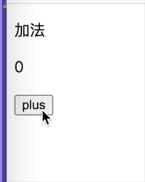 我们上一节了解了组件的更新机制,但是只是停留在表层上,例...
 我们上一节了解了 react 的虚拟 dom 的格式,如何把虚拟 dom...
 react 本身提供了克隆组件的方法,但是平时开发中可能很少使...
 mobx 是一个简单可扩展的状态管理库,中文官网链接。小编在接...
 我们在平常的开发中不可避免的会有很多列表渲染逻辑,在 pc ...