我一直在这里回答:
Pandas: how to plot yearly data on top of each other
这需要一个时间序列,并在新图上绘制每天的最后一个数据点.绘图上的每一行代表一周的数据量(例如,每周5个数据点):
我使用以下代码执行此操作:
#Chart by last price
daily = ts.groupby(lambda x: x.isocalendar()[1:]).agg(lambda s: s[-1])
daily.index = pd.MultiIndex.from_tuples(daily.index, names=['W', 'D'])
dofw = "Mon Tue Wed Thu Fri Sat Sun".split()
grid = daily.unstack('D').rename(columns=lambda x: dofw[x-1])
grid[-5:].T.plot()
我想做的是,而不是按照我想按小时汇总的一天中的最后一个数据点进行汇总(因此,将每个小时的数据平均)并绘制每周的每小时数据.因此,该图表看起来与链接图像中的图表相似,只是它每行每天有24个数据点,而不仅仅是每行每天有一个数据点
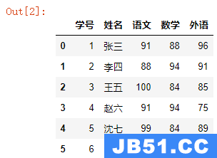
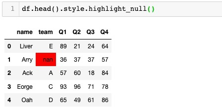
有什么方法可以将Pandas DataFrame粘贴到这篇文章中?当我单击复制粘贴时,它将粘贴为列表
编辑:
最终代码考虑到最近一周的不完整数据以作图表用途:
# First we read the DataFrame and resample it to get a mean on every hour
df = pd.read_csv(r"MYFILE.csv", header=None,
                 parse_dates=[0], index_col=0).resample('H', how='mean').dropna()
# Then we add a week field so we can filter it by the week
df['week']= df.index.map(lambda x: x.isocalendar()[1])
start_range = list(set(df['week']))[-3]
end_range = list(set(df['week']))[-1]
# Create week labels
weekdays = 'Mon Tue Wed Thu Fri Sat Sun'.split()

# Create the figure
fig, ax = plt.subplots()

# For every week we want to plot
for week in range(start_range,end_range+1):
    # Select out the week
    dfw = df[df['week'] == week].copy()
    # Here we align all the weeks to span over the same time period so they
    # can be shown on the graph one over the other, and not one next to
    # the other.
    dfw['timestamp'] = dfw.index.values - (week * np.timedelta64(1, 'W'))
    dfw = dfw.set_index(['timestamp'])
    # Then we plot our data
    ax.plot(dfw.index, dfw[1], label='week %s' % week)
    # Now to set the x labels. First we resample the timestamp to have
    # a date frequency, and set it to be the xtick values
    if week == end_range:
        resampled = resampled.index + pd.DateOffset(weeks=1)
    else:
        resampled = dfw.resample('D')
   # newresampled = resampled.index + pd.DateOffset(weeks=1)
    ax.set_xticks(resampled.index.values)
    # But change the xtick labels to be the weekdays.
    ax.set_xticklabels(weekdays)
# Plot the legend
plt.legend()
解决方法:
import numpy as np
import pandas as pd
import matplotlib.pyplot as plt

# First we read the DataFrame and resample it to get a mean on every hour
df = pd.read_csv('trayport.csv', header=None,
                 parse_dates=[0], index_col=0).resample('H', how='mean').dropna()
# Then we add a week field so we can filter it by the week
df['week']= df.index.map(lambda x: x.isocalendar()[1])

# Create week labels
weekdays = 'Mon Tue Wed Thu Fri Sat Sun'.split()

# Create the figure
fig, ax = plt.subplots()

# For every week we want to plot
for week in range(1, 4):
    # Select out the week
    dfw = df[df['week'] == week].copy()
    # Here we align all the weeks to span over the same time period so they
    # can be shown on the graph one over the other, and not one next to
    # the other.
    dfw['timestamp'] = dfw.index.values - (week * np.timedelta64(1, 'W'))
    dfw = dfw.set_index(['timestamp'])
    # Then we plot our data
    ax.plot(dfw.index, dfw[1], label='week %s' % week)
    # Now to set the x labels. First we resample the timestamp to have
    # a date frequency, and set it to be the xtick values
    resampled = dfw.resample('D')
    ax.set_xticks(resampled.index.values)
    # But change the xtick labels to be the weekdays.
    ax.set_xticklabels(weekdays)
# Plot the legend
plt.legend()
结果看起来像:


