如图实现这样的效果:
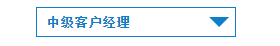
html代码如下:
<div class="select-bg">
    select ="select-green">
        option value="">高级客户经理</option>中级客户经理>
    select>
div>
css样式代码:
.select-bg{
    display:block;
    width:200px;
    margin:0 auto;
    height: 30px;
    line-height: 37px;
    font-size: 13px;
    border:1px #0f7fc7 solid ;
    box-sizing:border-box;
    cursor: pointer;
    position: relative;
}

.select-bg:after{
    content:' '; absolute;
    right:6px;
    top:50%;
    margin-top:-5px;0px;
      height:
      border-left:10px solid transparent;
      border-right:
      border-top:10px solid #0f7fc7;0px
}

.select-green {
    -webkit-appearance: none;
    -moz-appearance:
    appearance: relative;
    outline: 0 none;
    padding: 0 0 0 5px; 100%;
    color:#0f7fc7;
    font-weight: bold;
    background:
    background-color: transparent;
    z-index: 99;
    overflow: hidden;
}
 HTML5和CSS3实现3D展示商品信息的代码
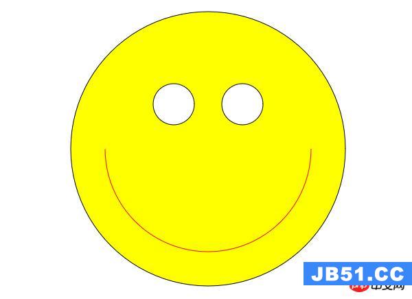 利用HTML5中的Canvas绘制笑脸的代码
 Html5移动端获奖无缝滚动动画实现