实现如图所示的东西效果(落叶下落):

html代码:
<!DOCTYPE html>
<htmlhead>
    title>HTML5树叶飘落动画</meta charset="utf-8"name="viewport" content="width=500px,initial-scale=0.64"link rel="stylesheet" href="leaves.css" type="text/css"script src="leaves.js"="text/javascript"></scriptbodydiv id="container">
        ="leafContainer"div="message">
            em>这是基于webkit的落叶动画>
>
css代码:
body
{
    background-color: #4E4226;
}

#container {
    position: relative;
    height: 700px;
    width: 500px;
    margin: 10px auto;
    overflow: hidden;
    border: 4px solid #5C090A;
    background: #4E4226 url('images/backgroundLeaves.jpg') no-repeat top left;
}

#leafContainer { absolute; 100%; 100%;
}

#message{
    top: 160px; 300px;transparent url('images/textBackground.png') repeat-x center;
    color: #5C090A;
    font-size: 220%;
    font-family: 'Georgia';
    text-align: center;
    padding: 20px 10px;
    -webkit-box-sizing: border-box;
    -webkit-background-size: 100% 100%;
    z-index: 1;
}

em {
    font-weight: bold;
    font-style: normal;
}

#leafContainer > div { 100px;
    -webkit-animation-iteration-count: infinite;
    -webkit-animation-direction: normal;
    -webkit-animation-timing-function: linear;
}

#leafContainer > div > img {
     position:
     width:
     height:
     -webkit-animation-iteration-count:
     -webkit-animation-direction: alternate;
     -webkit-animation-timing-function: ease-in-out;
     -webkit-transform-origin: 50% -100%;
}


@-webkit-keyframes fade
{
    0%   { opacity: 1; }
    95%  { opacity:
    100% { 0; }
}

@-webkit-keyframes drop
{
    0%   { -webkit-transform: translate(0px,-50px); } -webkit-transform:
}

@-webkit-keyframes clockwiseSpin
{ rotate(-50deg); } rotate(50deg); }
}


@-webkit-keyframes counterclockwiseSpinAndFlip
{ scale(-1,1) rotate(50deg); }
}
js代码:
const NUMBER_OF_LEAVES = 30;
function init(){
    var container = document.getElementById('leafContainer');
    for (var i = 0; i < NUMBER_OF_LEAVES; i++) {
        container.appendChild(createALeaf());
    }
}

 randomInteger(low,high){
    return low + Math.floor(Math.random() * (high - low));
}

 randomFloat(low,1)">return low + Math.random() * (high - low);
}

 pixelValue(value){
    return value + 'px';
}

 durationValue(value){
    return value + 's' createALeaf(){
    var leafDiv = document.createElement('div');
    leafDiv.style.top = "-100px";
    leafDiv.style.left = pixelValue(randomInteger(0,500));
    leafDiv.style.webkitAnimationName = 'fade,drop';
    var fadeAndDropDuration = durationValue(randomFloat(5,11));
    leafDiv.style.webkitAnimationDuration = fadeAndDropDuration + ',' + fadeAndDropDuration;
    var leafDelay = durationValue(randomFloat(0,5));
    leafDiv.style.webkitAnimationDelay = leafDelay + ',1)"> leafDelay;

    var image = document.createElement('img');
    image.src = 'images/realLeaf' + randomInteger(1,5) + '.png'var spinAnimationName = (Math.random() < 0.5) ? 'clockwiseSpin' : 'counterclockwiseSpinAndFlip';
    image.style.webkitAnimationName = spinAnimationName;
    var spinDuration = durationValue(randomFloat(4,8));
    image.style.webkitAnimationDuration = spinDuration;

    leafDiv.appendChild(image);
    return leafDiv;
}

window.addEventListener('load',init,false);
转载地址:http://www.html5tricks.com/css3-fall-leaves.html
 HTML5和CSS3实现3D展示商品信息的代码
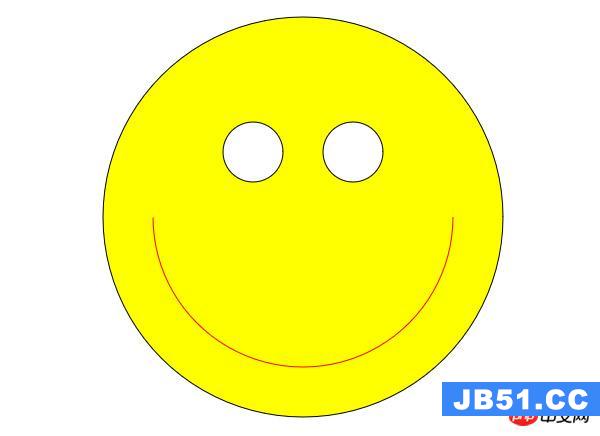 利用HTML5中的Canvas绘制笑脸的代码
 Html5移动端获奖无缝滚动动画实现