在做网页的时候,常常需要实现圆角,以前的做法就是切图,现在好了,有了css3的 border-radius 特性之后,实现边框圆角效果就非常简单了,而且其还有多个优点:一是减少网站维护工作量;二是提高了网站的性能,少了对图片的 HTTP 的请求,网页载入速度将变快;三是增加视觉美观性。

border-radius 是一种缩写方法。另外其四个值是按照top-left、top-right、bottom-right、bottom-left的顺序来设置的其主要会有下面几种情形出现:
- 1、只有一个值,那么 top-left、top-right、bottom-right、bottom-left 四个值相等。
- 2、有两个值,那么 top-left 等于 bottom-right,并且取第一个值;top-right 等于 bottom-left,并且取第二个值
- 3、有三个值,其中第一个值是设置top-left;而第二个值是 top-right 和 bottom-left 并且他们会相等,第三个值是设置 bottom-right。
- 4、有四个值,其中第一个值是设置 top-left 而第二个值是 top-right 第三个值 bottom-right 第四个值是设置 bottom-left。
其实 border-radius 和 border 属性一样,还可以把各个角单独拆分出来,也就是以下四种写法,这里我规纳一点,他们都是先Y轴在X轴,具体看下面:
border-top-left-radius: <length>  <length>   //左上角
border-top-right-radius: <length>  <length>  //右上角
border-bottom-right-radius:<length>  <length>  //右下角
border-bottom-left-radius:<length>  <length>   //左下角
border-radius 只有在以下版本的浏览器:Firefox4.0+、Safari5.0+、Google Chrome 10.0+、Opera 10.5+、IE9+ 支持 border-radius 标准语法格式,对于老版的浏览器,border-radius 需要根据不同的浏览器内核添加不同的前缀,比说 Mozilla 内核需要加上“-moz”,而 Webkit 内核需要加上“-webkit”等,那么我为了能兼容各大内核的老版浏览器,我们看看 border-radius 在不同内核浏览器下的书写格式:
1、Mozilla(Firefox,Flock等浏览器)
-moz-border-radius-topleft: //左上角
-moz-border-radius-topright: //右上角
-moz-border-radius-bottomright: //右下角
-moz-border-radius-bottomleft: //左下角
等价于:-moz-border-radius: //简写
2、WebKit (Safari,Chrome等浏览器)
-webkit-border-top-left-radius:  //左上角
-webkit-border-top-right-radius:  //右上角
-webkit-border-bottom-right-radius:  //右下角
-webkit-border-bottom-left-radius:  // 左下角
等价于:-webkit-border-radius: //简写
3、Opera浏览器
border-top-left-radius: //左上角
border-top-right-radius: //右上角
border-bottom-right-radius: //右下角
border-bottom-left-radius: //左下角
等价于:border-radius: //简写
4、Trident (IE)
IE9 以下版本不支持 border-radius,而且 IE9 没有私有格式,都是用 border-radius,其写法和 Opera 是一样的,这里就不在重复。
为了不管是新版还是老版的各种内核浏览器都能支持 border-radius 属性,那么我们在具体应用中时需要把我们的 border-radius 格式改成:
-moz-border-radius: none | <length>{1,4} [/ <length>{ ]?
-webkit-border-radius: none | <length>{ ]?
border-radius: none | <length>{ ]?
其拆分开来的格式相应需要加上 -moz 和 -webkit,上面的代码其实就等价于下面的代码:
-moz-border-radius-topleft: <length> <length> //左上角
-moz-border-radius-topright: <length> <length> //右上角
-moz-border-radius-bottomright: <length> <length> //右下角
-moz-border-radius-bottomleft: <length> <length> //左下角
-webkit-border-top-left-radius:  <length> <length> //左上角
-webkit-border-top-right-radius:  <length> <length> //右上角
-webkit-border-bottom-right-radius: <length> <length> //右下角
-webkit-border-bottom-left-radius:  <length> <length> // 左下角
border-top-left-radius: <length> <length> //左上角
border-top-right-radius: <length> <length> //右上角
border-bottom-right-radius: <length> <length> //右下角
border-bottom-left-radius: <length> <length> //左下角
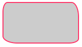
一般需求就如下:
.demo {
  width: 150px;
  height: 80px;
  border: 2px solid #f36;
  background: #ccc;
}
但是有时候也需要拆分开来,如下:
  border-top-left-radius: 10px 20px;
  border-top-right-radius: 15px 30px;
  border-bottom-right-radius: 20px 10px;
  border-bottom-left-radius: 30px 15px;
}
效果如下:
支持的浏览器

如果想查看更详细的,链接地址:http://www.cnblogs.com/lhb25/archive/2013/01/30/css3-border-radius.html
 HTML5和CSS3实现3D展示商品信息的代码
 利用HTML5中的Canvas绘制笑脸的代码
 Html5移动端获奖无缝滚动动画实现