响应式布局的原理
xsmall <576px
small >=576px
medium >=768px
large >=992px
xlarge >=1200px
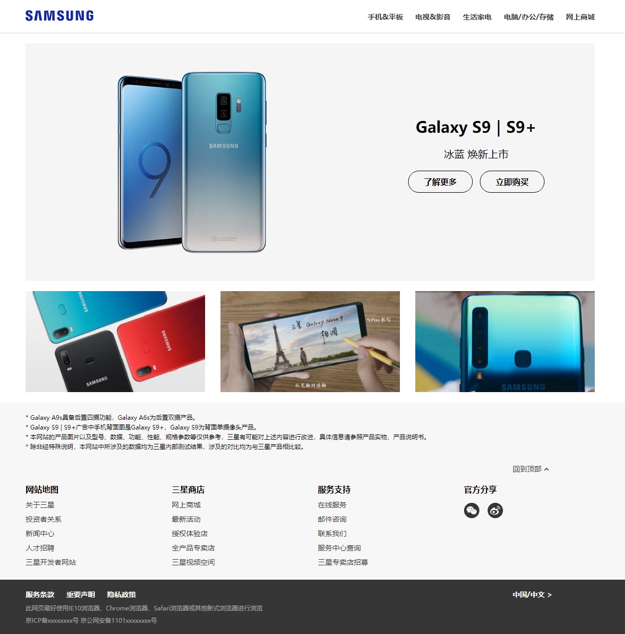
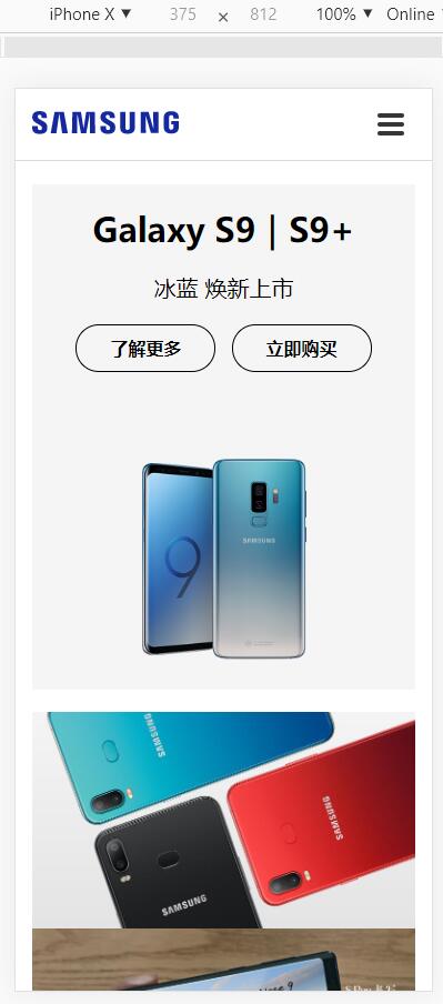
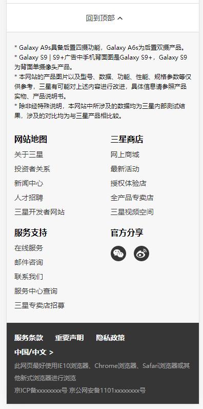
接下来是效果图
中屏及以上效果
移动端效果
方案一:使用栅格系统开发响应式页面
index.html
<!DOCTYPE html> <html lang="zh-CN"head> meta charset="UTF-8"name="viewport" content="width=device-width,initial-scale=1"title>响应式布局</link rel="stylesheet" href="css/base.css"="css/grid.css"="css/index.css"bodyheader class="header-container"> div ="container"> ="row"> ="header-logo-container col-8 col-md-3"> a href="./index.html" class="header-logo"> img src="img/logo.svg" alt="logo"adiv<!-- 下拉图标(三条杠),中屏隐藏 --> ="header-btn-container col-4 d-md-none"button type="button"="btn-toggle" id="btn-toggle"span ="btn-toggle-bar"></spanbutton 中屏导航 nav ="header-nav-container col-md-9 d-none d-md-block"ul ="header-nav"li ="header-nav-item"> ="###"="header-nav-link">手机&平板li>电视&影音>生活家电>电脑/办公/存储>网上商城ulnavheader 移动端导航 --> ="nav-container d-md-none"="nav"><="nav-link"> ="slider-container" 中屏位置往右7个网格 ="slider-text-container col-md-5 col-md-push-7"h3 ="slider-title">Galaxy S9|S9+h3h4 ="slider-subtitle">冰蓝 焕新上市h4="slider-btns"="btn-rounded">了解更多>立即购买="col-md-7 col-md-pull-5"="img/1.png"="cellphone" 中屏一行显示3张图 ="product-container"="col-md-4"="product-item"="img/2-1.jpg"="cellphone"="product-img"="img/2-2.jpg"="img/2-3.jpg" 移动端回到顶部 ="backtop-container d-md-none"="#"="btn-backtop">回到顶部="helper-container"="helper-info-container"p>* Galaxy A9s具备后置四摄功能,Galaxy A6s为后置双摄产品。>* Galaxy S9 | S9+广告中手机背面图是Galaxy S9+,Galaxy S9为背面单摄像头产品。>* 本网站的产品图片以及型号、数据、功能、性能、规格参数等仅供参考,三星有可能对上述内容进行改进,具体信息请参照产品实物、产品说明书。>* 除非经特殊说明,本网站中所涉及的数据均为三星内部测试结果,涉及的对比均为与三星产品相比较。 中屏回到顶部 --> ="helper-backtop-container col-md-2 col-md-offset-10 d-none d-md-block" 底部导航,中屏一行4个,小屏一行2个 ="col-6 col-md-3"="helper-list-title">网站地图="helper-list"="###">关于三星>投资者关系>新闻中心>人才招聘>三星开发者网站>三星商店>最新活动>授权体验店>全产品专卖店>三星视频空间>服务支持>在线服务>邮件咨询>联系我们>服务中心查询>三星专卖店招募>官方分享="btn-share btn-share-weixin"="btn-share btn-share-weibo"="footer-container"="col-md-10"="footer-item"="footer-link">服务条款>重要声明>隐私政策="col-md-2">中国/中文 >>此网页最好使用IE10浏览器、Chrome浏览器、Safari浏览器或其他新式浏览器进行浏览>京ICP备xxxxxxxx号 京公网安备1101xxxxxxxx号script> var nav = document.getElementById('nav); navExtendedClassName = nav-container-extended; // 移动端点击下拉按钮,展开顶部导航 document.getElementById(btn-toggle).onclick function() { nav.className += ' ' + navExtendedClassName; if (nav.classList.contains(navExtendedClassName)) { 收起 nav.classList.remove(navExtendedClassName); } else { 展开 nav.classList.add(navExtendedClassName); } }; html>
base.css
* {
    box-sizing: border-box;
    padding: 0;
    margin: 0;
}

body {
    font-size: 14px;
}

li {
    list-style: none;
}

a { 14px;
    color: #363636;
    text-decoration:
a:hover { #1428a0;
}

img {
    vertical-align: top;
    width: 100%;
    border: none;
}
grid.css
.container {
    padding-left: 15px;
    padding-right:
    margin-left: auto;
    margin-right: auto;
}

/*sm*/
@media (min-width: 576px) {
    .container {
        width: 540px;
    }
}
md
@media (min-width: 768px) { 720px;
    }lg
@media (min-width: 992px) { 960px;
    }xl
@media (min-width: 1200px) { 1140px;
    }
}

.row { -15px; -15px;
}

.col-1,.col-2,.col-3,.col-4,.col-5,.col-6,.col-7,.col-8,.col-9,.col-10,.col-11,.col-12,.col-sm-1,.col-sm-2,.col-sm-3,.col-sm-4,.col-sm-5,.col-sm-6,.col-sm-7,.col-sm-8,.col-sm-9,.col-sm-10,.col-sm-11,.col-sm-12,.col-md-1,.col-md-2,.col-md-3,.col-md-4,.col-md-5,.col-md-6,.col-md-7,.col-md-8,.col-md-9,.col-md-10,.col-md-11,.col-md-12,.col-lg-1,.col-lg-2,.col-lg-3,.col-lg-4,.col-lg-5,.col-lg-6,.col-lg-7,.col-lg-8,.col-lg-9,.col-lg-10,.col-lg-11,.col-lg-12,.col-xl-1,.col-xl-2,.col-xl-3,.col-xl-4,.col-xl-5,.col-xl-6,.col-xl-7,.col-xl-8,.col-xl-9,.col-xl-10,.col-xl-11,.col-xl-12 {
    position: relative; 15px;
}
    float: left;
}
.col-1 { 8.33333333%;
}
.col-2 { 16.66666667%;
}
.col-3 { 25%;
}
.col-4 { 33.33333333%;
}
.col-5 { 41.66666667%;
}
.col-6 { 50%;
}
.col-7 { 58.33333333%;
}
.col-8 { 66.66666667%;
}
.col-9 { 75%;
}
.col-10 { 83.33333333%;
}
.col-11 { 91.66666667%;
}
.col-12 { 100%;
}

.col-offset-12 {
.col-offset-11 {
.col-offset-10 {
.col-offset-9 {
.col-offset-8 {
.col-offset-7 {
.col-offset-6 {
.col-offset-5 {
.col-offset-4 {
.col-offset-3 {
.col-offset-2 {
.col-offset-1 {
.col-offset-0 {

.col-pull-12 {
    right:
.col-pull-11 {
.col-pull-10 {
.col-pull-9 {
.col-pull-8 {
.col-pull-7 {
.col-pull-6 {
.col-pull-5 {
.col-pull-4 {
.col-pull-3 {
.col-pull-2 {
.col-pull-1 {
.col-pull-0 { auto;
}
.col-push-12 {
    left:
.col-push-11 {
.col-push-10 {
.col-push-9 {
.col-push-8 {
.col-push-7 {
.col-push-6 {
.col-push-5 {
.col-push-4 {
.col-push-3 {
.col-push-2 {
.col-push-1 {
.col-push-0 {
    .col-sm-1,.col-sm-12 {
        float: left;
    }
    .col-sm-1 {
        width: 8.33333333%;
    }
    .col-sm-2 { 16.66666667%;
    }
    .col-sm-3 { 25%;
    }
    .col-sm-4 { 33.33333333%;
    }
    .col-sm-5 { 41.66666667%;
    }
    .col-sm-6 { 50%;
    }
    .col-sm-7 { 58.33333333%;
    }
    .col-sm-8 { 66.66666667%;
    }
    .col-sm-9 { 75%;
    }
    .col-sm-10 { 83.33333333%;
    }
    .col-sm-11 { 91.66666667%;
    }
    .col-sm-12 { 100%;
    }

    .col-sm-offset-12 {
        margin-left:
    .col-sm-offset-11 {
    .col-sm-offset-10 {
    .col-sm-offset-9 {
    .col-sm-offset-8 {
    .col-sm-offset-7 {
    .col-sm-offset-6 {
    .col-sm-offset-5 {
    .col-sm-offset-4 {
    .col-sm-offset-3 {
    .col-sm-offset-2 {
    .col-sm-offset-1 {
    .col-sm-offset-0 { 0;
    }

    .col-sm-pull-12 {
        right:
    .col-sm-pull-11 {
    .col-sm-pull-10 {
    .col-sm-pull-9 {
    .col-sm-pull-8 {
    .col-sm-pull-7 {
    .col-sm-pull-6 {
    .col-sm-pull-5 {
    .col-sm-pull-4 {
    .col-sm-pull-3 {
    .col-sm-pull-2 {
    .col-sm-pull-1 {
    .col-sm-pull-0 { auto;
    }
    .col-sm-push-12 {
        left:
    .col-sm-push-11 {
    .col-sm-push-10 {
    .col-sm-push-9 {
    .col-sm-push-8 {
    .col-sm-push-7 {
    .col-sm-push-6 {
    .col-sm-push-5 {
    .col-sm-push-4 {
    .col-sm-push-3 {
    .col-sm-push-2 {
    .col-sm-push-1 {
    .col-sm-push-0 {
    .col-md-1,.col-md-12 {
        float:
    .col-md-1 {
    .col-md-2 {
    .col-md-3 {
    .col-md-4 {
    .col-md-5 {
    .col-md-6 {
    .col-md-7 {
    .col-md-8 {
    .col-md-9 {
    .col-md-10 {
    .col-md-11 {
    .col-md-12 {

    .col-md-offset-12 {
    .col-md-offset-11 {
    .col-md-offset-10 {
    .col-md-offset-9 {
    .col-md-offset-8 {
    .col-md-offset-7 {
    .col-md-offset-6 {
    .col-md-offset-5 {
    .col-md-offset-4 {
    .col-md-offset-3 {
    .col-md-offset-2 {
    .col-md-offset-1 {
    .col-md-offset-0 {

    .col-md-pull-12 {
    .col-md-pull-11 {
    .col-md-pull-10 {
    .col-md-pull-9 {
    .col-md-pull-8 {
    .col-md-pull-7 {
    .col-md-pull-6 {
    .col-md-pull-5 {
    .col-md-pull-4 {
    .col-md-pull-3 {
    .col-md-pull-2 {
    .col-md-pull-1 {
    .col-md-pull-0 {
    .col-md-push-12 {
    .col-md-push-11 {
    .col-md-push-10 {
    .col-md-push-9 {
    .col-md-push-8 {
    .col-md-push-7 {
    .col-md-push-6 {
    .col-md-push-5 {
    .col-md-push-4 {
    .col-md-push-3 {
    .col-md-push-2 {
    .col-md-push-1 {
    .col-md-push-0 {
    .col-lg-1,.col-lg-12 {
        float:
    .col-lg-1 {
    .col-lg-2 {
    .col-lg-3 {
    .col-lg-4 {
    .col-lg-5 {
    .col-lg-6 {
    .col-lg-7 {
    .col-lg-8 {
    .col-lg-9 {
    .col-lg-10 {
    .col-lg-11 {
    .col-lg-12 {

    .col-lg-offset-12 {
    .col-lg-offset-11 {
    .col-lg-offset-10 {
    .col-lg-offset-9 {
    .col-lg-offset-8 {
    .col-lg-offset-7 {
    .col-lg-offset-6 {
    .col-lg-offset-5 {
    .col-lg-offset-4 {
    .col-lg-offset-3 {
    .col-lg-offset-2 {
    .col-lg-offset-1 {
    .col-lg-offset-0 {

    .col-lg-pull-12 {
    .col-lg-pull-11 {
    .col-lg-pull-10 {
    .col-lg-pull-9 {
    .col-lg-pull-8 {
    .col-lg-pull-7 {
    .col-lg-pull-6 {
    .col-lg-pull-5 {
    .col-lg-pull-4 {
    .col-lg-pull-3 {
    .col-lg-pull-2 {
    .col-lg-pull-1 {
    .col-lg-pull-0 {
    .col-lg-push-12 {
    .col-lg-push-11 {
    .col-lg-push-10 {
    .col-lg-push-9 {
    .col-lg-push-8 {
    .col-lg-push-7 {
    .col-lg-push-6 {
    .col-lg-push-5 {
    .col-lg-push-4 {
    .col-lg-push-3 {
    .col-lg-push-2 {
    .col-lg-push-1 {
    .col-lg-push-0 {
    .col-xl-1,.col-xl-12 {
        float:
    .col-xl-1 {
    .col-xl-2 {
    .col-xl-3 {
    .col-xl-4 {
    .col-xl-5 {
    .col-xl-6 {
    .col-xl-7 {
    .col-xl-8 {
    .col-xl-9 {
    .col-xl-10 {
    .col-xl-11 {
    .col-xl-12 {

    .col-xl-offset-12 {
    .col-xl-offset-11 {
    .col-xl-offset-10 {
    .col-xl-offset-9 {
    .col-xl-offset-8 {
    .col-xl-offset-7 {
    .col-xl-offset-6 {
    .col-xl-offset-5 {
    .col-xl-offset-4 {
    .col-xl-offset-3 {
    .col-xl-offset-2 {
    .col-xl-offset-1 {
    .col-xl-offset-0 {

    .col-xl-pull-12 {
    .col-xl-pull-11 {
    .col-xl-pull-10 {
    .col-xl-pull-9 {
    .col-xl-pull-8 {
    .col-xl-pull-7 {
    .col-xl-pull-6 {
    .col-xl-pull-5 {
    .col-xl-pull-4 {
    .col-xl-pull-3 {
    .col-xl-pull-2 {
    .col-xl-pull-1 {
    .col-xl-pull-0 {
    .col-xl-push-12 {
    .col-xl-push-11 {
    .col-xl-push-10 {
    .col-xl-push-9 {
    .col-xl-push-8 {
    .col-xl-push-7 {
    .col-xl-push-6 {
    .col-xl-push-5 {
    .col-xl-push-4 {
    .col-xl-push-3 {
    .col-xl-push-2 {
    .col-xl-push-1 {
    .col-xl-push-0 {
}

.d-none {
    display: none !important;
}
.d-block { block !important;
}


    .d-sm-none {
        display: none !important;
    }
    .d-sm-block {
        display: block !important;
    }
    .d-md-none {
        display:
    .d-md-block {
    .d-lg-none {
        display:
    .d-lg-block {
    .d-xl-none {
        display:
    .d-xl-block {
}

.clearfix:after,.clearfix:before,.container:after,.container:before,.row:after,.row:before { table;
    content: ' ';
}
.clearfix:after,.row:after {
    clear: both;
}
index.css
-- 布局 start --*/


.header-container {
    background-color: #fff;
    border-bottom: 1px solid #dadada;
}
.header-logo-container,.header-btn-container,.header-nav-container {
    height: 64px;
}
.header-btn-container { flex;
    justify-content: flex-end;
    align-items: center;
}


.nav-container {
    overflow: hidden;
    top: -1px; 1px solid #dadada;
    transition: height 0.5s;
}
.nav-container-extended { 201px;
}

slider
.slider-container {
    margin-top: 20px;
    margin-bottom: 20px;
}
.slider-container .row { #f5f5f5;
    .slider-container .row {
        display:
        align-items: center;
    }
}
.slider-text-container { 20px 0;
}

product
.product-container { 20px;
}

backtop
.backtop-container {
    border-top: 1px solid #dadada;
}

helper
.helper-container {
    padding-top:
    padding-bottom: 10px; #f7f7f7; 12px;
    line-height: 2;
}
.helper-info-container { 1.6;
}
.helper-backtop-container { 10px;
}

footer
.footer-container { 15px 0; #a6a6a6; 2;
}

-- 布局 end --*/


-- 组件 start --btn-toggle
.btn-toggle { transparent; none;
    border-radius: 4px;
    cursor: pointer;
}
.btn-toggle:hover { #f9f9f9;
}
.btn-toggle:hover .btn-toggle-bar {
.btn-toggle-bar { block; 24px; 2px;
}
.btn-toggle-bar + .btn-toggle-bar { 4px;
}

btn-rounded
.btn-rounded { inline-block; 10px 30px; 1px solid #000; 30px; #000; 16px;
    font-weight: bold; all 0.3s;
}
.btn-rounded:hover { #fff;
}

btn-backtop
.btn-backtop:after { ''; -2px; 5px; 6px;
    background-image: url(../img/up.svg);
}
.btn-backtop:hover:after { url(../img/up-hover.svg);
}

btn-share
.btn-share {
    background-size: 100% 100%;
}
.btn-share-weixin { url(../img/weixin.svg);
}
.btn-share-weixin:hover { url(../img/weixin-hover.svg);
}
.btn-share-weibo { url(../img/weibo.svg);
}
.btn-share-weibo:hover { url(../img/weibo-hover.svg);
}

-- 组件 end ---- 内容 start --
.header-logo { center; 136px;
.header-nav,.header-nav-item,.header-nav-link {
.header-nav {
.header-nav-item { 24px;
}
.header-nav-item:first-child {
.header-nav-link { bold;
}


.nav-link { 40px;
.slider-title,.slider-subtitle,.slider-btns {
    text-align: center;
}
.slider-title { 30px;
}
.slider-subtitle { normal;
}
.slider-btns .btn-rounded { 10px;
}
.slider-btns .btn-rounded:last-child { 0;
}


.product-item { block;
}
.product-img { transform 1s;
}
.product-img:hover {
    transform: scale(1.2);
}


.backtop-container .btn-backtop { 18px 0;
.helper-list-title { 16px;
}
.helper-list {
.helper-list .btn-share { 12px;
}
.helper-list .btn-share:last-child {
.footer-item {
.footer-item:last-child {
.footer-link { bold;
}
.footer-link:hover { underline;
}

-- 内容 end --*/
方案2:用flex布局实现栅格系统
index-flex.html
>响应式布局--flex="css/grid-flex.css"="slider-text-container col-md-5 col-md-order-last"="col-md-7 col-md-order-first"="col-md"="col-6 col-md">京ICP备05068163号 京公网安备110105011756号;

        document.getElementById(>
grid-flex.css
    flex-wrap: wrap;

.col,.col-sm,.col-md,.col-lg,.clo-xl,.col-1,1)">

.col {
    flex-basis:
    flex-grow: 1;
}
    flex: 0 0 8.33333333%;
} 0 0 16.66666667%;
} 0 0 25%;
} 0 0 33.33333333%;
} 0 0 41.66666667%;
} 0 0 50%;
} 0 0 58.33333333%;
} 0 0 66.66666667%;
} 0 0 75%;
} 0 0 83.33333333%;
} 0 0 91.66666667%;
} 0 0 100%;
}

.col-order-first {
    order: -1;
}
.col-order-last { 13;
}
.col-order-0 {
.col-order-1 {
.col-order-2 {
.col-order-3 { 3;
}
.col-order-4 { 4;
}
.col-order-5 { 5;
}
.col-order-6 { 6;
}
.col-order-7 { 7;
}
.col-order-8 { 8;
}
.col-order-9 { 9;
}
.col-order-10 { 10;
}
.col-order-11 { 11;
}
.col-order-12 { 12;
}


    .col-sm {
        flex-basis:
        flex-grow: 1;
    }

    .col-sm-1 {
        flex: 0 0 8.33333333%;
    } 0 0 16.66666667%;
    } 0 0 25%;
    } 0 0 33.33333333%;
    } 0 0 41.66666667%;
    } 0 0 50%;
    } 0 0 58.33333333%;
    } 0 0 66.66666667%;
    } 0 0 75%;
    } 0 0 83.33333333%;
    } 0 0 91.66666667%;
    } 0 0 100%;
    }

    .col-sm-order-first {
        order: -1;
    }
    .col-sm-order-last { 13;
    }
    .col-sm-order-0 {
    .col-sm-order-1 {
    .col-sm-order-2 { 2;
    }
    .col-sm-order-3 { 3;
    }
    .col-sm-order-4 { 4;
    }
    .col-sm-order-5 { 5;
    }
    .col-sm-order-6 { 6;
    }
    .col-sm-order-7 { 7;
    }
    .col-sm-order-8 { 8;
    }
    .col-sm-order-9 { 9;
    }
    .col-sm-order-10 { 10;
    }
    .col-sm-order-11 { 11;
    }
    .col-sm-order-12 { 12;
    }
    .col-md {
        flex-basis:

    .col-md-1 {

    .col-md-order-first {
    .col-md-order-last {
    .col-md-order-0 {
    .col-md-order-1 {
    .col-md-order-2 {
    .col-md-order-3 {
    .col-md-order-4 {
    .col-md-order-5 {
    .col-md-order-6 {
    .col-md-order-7 {
    .col-md-order-8 {
    .col-md-order-9 {
    .col-md-order-10 {
    .col-md-order-11 {
    .col-md-order-12 {
    .col-lg {
        flex-basis:

    .col-lg-1 {

    .col-lg-order-first {
    .col-lg-order-last {
    .col-lg-order-0 {
    .col-lg-order-1 {
    .col-lg-order-2 {
    .col-lg-order-3 {
    .col-lg-order-4 {
    .col-lg-order-5 {
    .col-lg-order-6 {
    .col-lg-order-7 {
    .col-lg-order-8 {
    .col-lg-order-9 {
    .col-lg-order-10 {
    .col-lg-order-11 {
    .col-lg-order-12 {
    .col-xl {
        flex-basis:

    .col-xl-1 {

    .col-xl-order-first {
    .col-xl-order-last {
    .col-xl-order-0 {
    .col-xl-order-1 {
    .col-xl-order-2 {
    .col-xl-order-3 {
    .col-xl-order-4 {
    .col-xl-order-5 {
    .col-xl-order-6 {
    .col-xl-order-7 {
    .col-xl-order-8 {
    .col-xl-order-9 {
    .col-xl-order-10 {
    .col-xl-order-11 {
    .col-xl-order-12 {
}
base.css和index.css方案1里的一样一样的
 HTML5和CSS3实现3D展示商品信息的代码
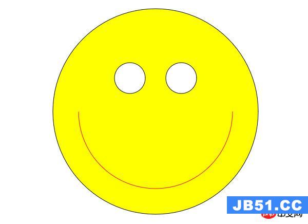 利用HTML5中的Canvas绘制笑脸的代码
 Html5移动端获奖无缝滚动动画实现