先准备个测试模板
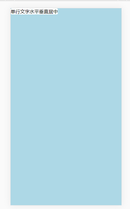
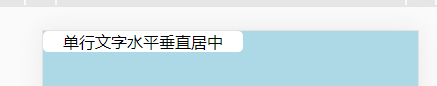
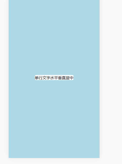
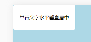
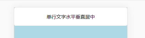
<!DOCTYPE html>
<html lang="en"head>
    meta charset="UTF-8"name="viewport" content="width=device-width,initial-scale=1.0"title>Document</style>
        .bg{
            width:100%;
            height
            position fixed
            top0
            right
            bottom
            left
            background-color lightblue;
        }
        .text
            background#fff
            border-radius 5px}
    bodydiv class="bg">
        span ="text">单行文字水平垂直居中spandivhtml>
内联元素,没有设置宽高
1、自身水平垂直居中
设置padding (左右方向有效,上下方向无效)
2、在容器内水平垂直居中
方法一:
            position: absolute;
            top:50%;
            left:50%;
            transform:translate(-50%,-50%);
方法二:flex布局(适合移动端)
            display: flex;
            justify-content: center;
            align-items: center;
内联块元素,没有设置宽高
1、自身水平垂直居中
设置padding
            display:inline-block;
            padding:30px 20px;
2、在容器内水平垂直居中
            display:block;
            padding:20px 0;
            text-align: center;
2、在容器内水平垂直居中

设置position为absolute,相当于把元素变为了inline-block,因此宽度没有占据整行
如果需要的话,可以手动添加width
display:inline-block;
width:200px;
height:100px;
1、自身水平垂直居中
单行文字可以使用line-height
text-align:center;
line-height:100px;
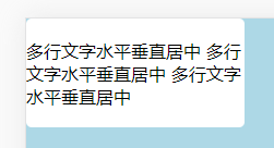
多行文字
display: flex;
justify-content: center;
align-items: center;
这种是将多行文字看做一个整体水平垂直居中,因此不是每一行文字都是水平居中效果
2、在容器内水平垂直居中
position: absolute;
top:50%;
left:50%;
margin-left:-100px;
margin-top:-50px;
指定容器宽高,块元素
1、自身水平垂直居中
单行文字
display:block;
width:200px;
height:100px;
text-align:center;
line-height:100px;
多行文字
display: flex;
justify-content: center;
align-items: center;
2、在容器内水平垂直居中
position: absolute;
top:50%;
left:50%;
margin-left:-100px;
margin-top:-50px;
或者
margin:0 auto;
 HTML5和CSS3实现3D展示商品信息的代码
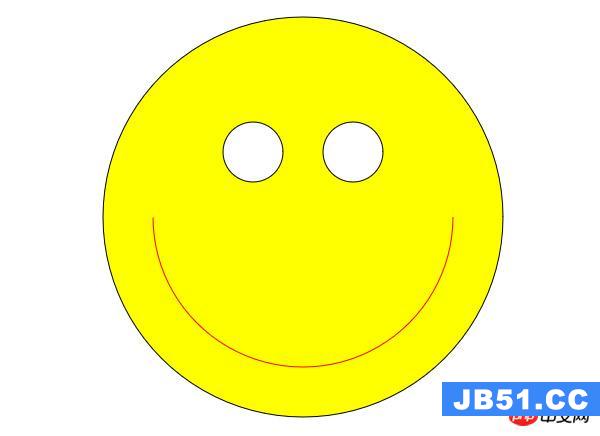 利用HTML5中的Canvas绘制笑脸的代码
 Html5移动端获奖无缝滚动动画实现