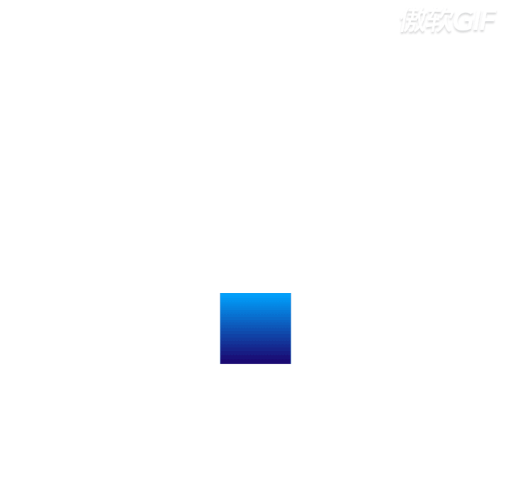
<!DOCTYPE html>
<html lang="en">

<head>
    <meta charset="UTF-8">
    <title>Title</title>
    <style>
        * {
            padding: 0;
            margin: 0;
        }

        div {
            width: 100px;
            height: 100px;
            background: linear-gradient(to bottom,#00a4ff,#1c036c);
            animation: yidong linear 2s infinite;
        }
        @keyframes yidong {
            0% {
                transform: translate(0px,0px);
            }

            25% {
                transform: translate(440px,0px);
            }

            50% {
                transform: translate(440px,440px);
            }

            75% {
                transform: translate(0px,440px);
            }

            100% {
                transform: translate(0px,0px);
            }
        }
    </style>
</head>

<body>
    <div>
    </div>
</body>
</html>
 HTML5和CSS3实现3D展示商品信息的代码
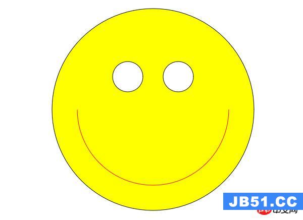 利用HTML5中的Canvas绘制笑脸的代码
 Html5移动端获奖无缝滚动动画实现