<h1 id="页面布局">1、页面布局
<h3 id="题目假设高度已知请写出三栏布局其中左栏右栏宽度为300px中间自适应">题目:假设高度已知,请写出三栏布局,其中左栏右栏宽度为300px,中间自适应?
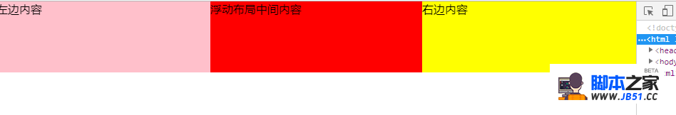
<h3 id="浮动">1、浮动
- 浮动布局
- 优点:兼容性比较好
- 缺点:浮动后,元素是脱离文档流的,需要处理清除浮动clear:both;处理好与周边元素关系
div是left-right-center
效果图
css
* {
margin: 0;
padding: 0;
}
.layout .content div{
min-height: 100px;
}
.layout .content .left{
float: left;
width: 300px;
background: pink;
}
.layout .content .right{
float: right;
width: 300px;
background: yellow;
}
.layout .content .center {
background: red;
}</code></pre>
html
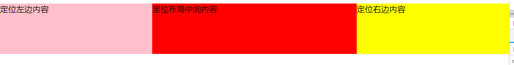
- 绝对定位布局
- 优点:布局相对迅速
缺点: 定位的元素脱离了文档流,意味着子元素也要脱离文档流,所以这种方式的可使用性比较差
效果图
css
.layout-absolute .absolute-content {
position: relative;
}
.layout-absolute .absolute-content div {
min-height: 100px;
}
.layout-absolute .absolute-content .left {
position: absolute;
left: 0;
width: 300px;
background: pink;
}
.layout-absolute .absolute-content .right {
position: absolute;
right: 0;
width: 300px;
background: yellow;
}
.layout-absolute .absolute-content .center {
position:absolute;
left: 300px;
right: 300px;
background: red;
}
html
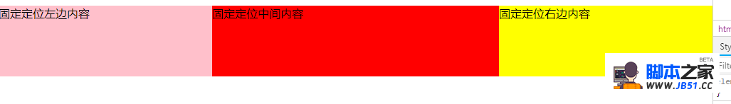
- flex
- 优点: 非常有效的解决了浮动和绝对定位的问题
缺点:兼容性比较差(css3的属性),不兼容IE8及以下
效果图
css
.flexbox-content {
display: flex;
width: 100%;
}
.flexbox-content div {
min-height: 100px;
}
.flexbox-content .left {
width: 300px;
background: pink;
}
.flexbox-content .right {
width: 300px;
background: yellow;
}
.flexbox-content .center {
flex: 1;
background: red;
}
html
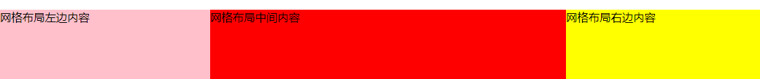
- 表格布局
- 优点:兼容性非常好,弥补了flex布局兼容的问题
缺点:操作繁琐,当三栏中其中某一栏高度超出时,其他两栏的高度也会自动跟着调整(不符合某些场景)
效果图

css
.table-content {
display: table;
width: 100%;
}
.table-content div{
display: table-cell;
height: 100px;
}
.table-content .left {
width: 300px;
background: pink;
}
.table-content .center {
background: red;
}
.table-content .right {
width: 300px;
background: yellow;
}
html
- 效果图
css
.grid-content {
display: grid;
width: 100%;
grid-template-rows: 100px;
grid-template-columns: 300px auto 300px;
}
.grid-content .left {
background: pink;
}
.grid-content .center {
background: red;
}
.grid-content .right {
background: yellow;
}
html
- 假如把高度已知去掉或者高度超出
- 1.flex布局高度可以自适应
- 2.表格布局高度可以自适应
- 3.浮动,绝对定位,网格布局不能自适应高度
相关文章
1==>简述一下src与href的区别 src用于替换当前元素;...
什么是window对象?什么是document对象? window对象代表浏览...
1 》vue-router有哪几种导航钩子? 第一种:是全局导航钩子:...
1=>为什么data是一个函数 【理解】 组件的data写成一...
01 vue3的新特征 1.组合式API. setUp作为组合函数的入口函数...
// var arr=[1,2,23,23,4,5,5]; // var n...