主APP main.mxml:
<?xml version="1.0" encoding="utf-8"?>
<s:Application name="Spark_DropDownList_PopUp_placement_test"
        xmlns:fx="http://ns.adobe.com/mxml/2009"
        xmlns:s="library://ns.adobe.com/flex/spark"
        xmlns:mx="library://ns.adobe.com/flex/halo"
		minHeight="300"
		skinClass="skins.ApplicationSkin">
	<fx:Script>
		<![CDATA[
		]]>
	</fx:Script>

	<!--<s:Scroller height="200">-->
		<s:VGroup height="600">

			<s:DropDownList id="dropDownList"
							labelField="label"
							requireSelection="true"
							skinClass="skins.CustomDropDownListSkin"
							horizontalCenter="0"
							top="20">
				<s:dataProvider>
					<s:ArrayList>
						<fx:Object label="The" />
						<fx:Object label="Quick" />
						<fx:Object label="brown" />
						<fx:Object label="Fox" />
						<fx:Object label="Jumps" />
						<fx:Object label="Over" />
						<fx:Object label="The" />
						<fx:Object label="Lazy" />
						<fx:Object label="Dog" />
					</s:ArrayList>
				</s:dataProvider>
			</s:DropDownList>

		</s:VGroup>

	<!--</s:Scroller>-->


</s:Application>
CustomDropDownListSkin.mxml的代码:
<?xml version="1.0" encoding="utf-8"?>
<s:Skin name="CustomDropDownListSkin"
        xmlns:fx="http://ns.adobe.com/mxml/2009"
        xmlns:s="library://ns.adobe.com/flex/spark"
        alpha.disabled="0.5">
    <!-- states -->
    <s:states>
        <s:State name="normal" />
        <s:State name="open" />
        <s:State name="disabled" />
    </s:states>

    <!-- host component -->
    <fx:Metadata>
    <![CDATA[
        [HostComponent("spark.components.DropDownList")]
    ]]>
    </fx:Metadata>

    <!--- The PopUpAnchor control that opens the drop-down list. -->
    <s:PopUpAnchor id="popUp"  displayPopUp.normal="false" displayPopUp.open="true" includeIn="open"
            left="0" right="0" top="0" bottom="0" itemDestructionPolicy="auto"
            popUpPosition="left" popUpWidthMatchesAnchorWidth="true">
        <!--- The drop down area of the skin. This includes borders,background colors,scrollers,and filters. -->
        <s:Group id="dropDown" maxHeight="134" minHeight="22" >
            <!-- drop shadow -->
            <s:RectangularDropShadow blurX="20" blurY="20" alpha="1.0" distance="5"
                    angle="90" color="#000000" left="0" top="0" right="0" bottom="0"/>
            <!-- border -->
            <s:Rect left="0" right="0" top="0" bottom="0">
                <s:stroke>
                    <s:SolidColorstroke color="0x686868" weight="1"/>
                </s:stroke>
            </s:Rect>

            <!-- fill -->
            <!---  Defines the appearance of drop-down list's background fill. -->
            <s:Rect id="background" left="1" right="1" top="1" bottom="1" >
                <s:fill>
                    <!--- The color of the drop down's background fill. The default color is 0xFFFFFF. -->
                    <s:SolidColor id="bgFill" color="0xFFFFFF" />
                </s:fill>
            </s:Rect>

            <s:Scroller left="0" top="0" right="0" bottom="0" focusEnabled="false" minViewportInset="1">
                <!--- The container for the data items in the drop-down list. -->
                <s:DataGroup id="dataGroup" itemRenderer="spark.skins.spark.DefaultItemRenderer">
                    <s:layout>
                        <s:VerticalLayout gap="0" horizontalAlign="contentJustify"/>
                    </s:layout>
                </s:DataGroup>
            </s:Scroller>
        </s:Group>
    </s:PopUpAnchor>

    <!--- The anchor button used by the DropDownList. The default skin is DropDownListButtonSkin. -->
    <s:Button id="openButton" left="0" right="0" top="0" bottom="0" focusEnabled="false"
            skinClass="spark.skins.spark.DropDownListButtonSkin" />
    <!--- The prompt area of the DropDownList. -->
   <!-- <s:SimpleText id="labeldisplay" verticalAlign="middle" maxdisplayedLines="1"
            left="7" right="30" top="2" bottom="2" verticalCenter="1" /> -->
	<!--- @copy spark.components.DropDownList#labeldisplay -->
	<s:Label id="labeldisplay" verticalAlign="middle" maxdisplayedLines="1"
			 mouseEnabled="false" mouseChildren="false"
			 left="7" right="30" top="2" bottom="2" width="75" verticalCenter="1" />

</s:Skin>
ApplicationSkin.mxml:
<?xml version="1.0" encoding="utf-8"?>
<s:Skin xmlns:fx="http://ns.adobe.com/mxml/2009"
		xmlns:mx="library://ns.adobe.com/flex/mx"
		xmlns:s="library://ns.adobe.com/flex/spark"
		xmlns:c="com.sununion.web.seller.component.*">

	<fx:Metadata>
		[HostComponent("spark.components.Application")]
	</fx:Metadata>

	<s:states>
		<s:State name="normal" />
		<s:State name="disabled" />
	</s:states>

	<!--背景-->
	<!--<c:BackgroundComponent id="backgroundRect" left="0" right="0" top="0" bottom="0" />-->

	<!--滚动条-->
	<s:Scroller height="100%" width="100%" horizontalScrollPolicy="auto" verticalScrollPolicy="auto">
		<s:Group id="contentGroup" left="0" right="0" top="0" bottom="0" />
	</s:Scroller>
</s:Skin>
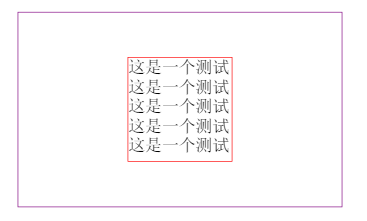
效果图如下: