注意:
1. 这个案例,是我写vue项目修改的,所以思路同样适用于vue框架项目。
2. 建议先把代码直接复制过去,先看一下效果。
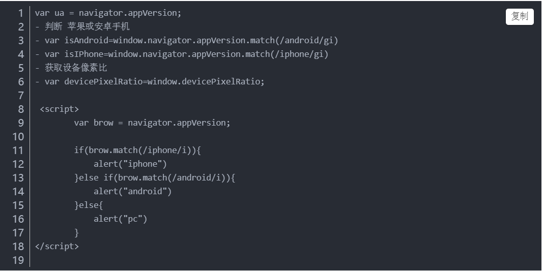
3. 涉及到知识点,flex布局的属性配合使用 , @media媒体查询的语法
4. 给ul设置 flex-wrap: wrap , 一定要允许li可以换行,我在这个坑里,躺了好几分钟。
5. 我写的时候,也花了不少时间,学的人应该更耐心些。
<!DOCTYPE html>
<html lang="en">
<head>
    <Meta charset="UTF-8">
    <title>实现响应式:flex布局 + 媒体查询</title>
    <style type="text/css">
        .site_introduce{
          width: 1200px;
          margin: 0 auto;
          margin-top: 70px;
          height: 250px;
          border: 1px solid #00ff00;
        }
        li{
          list-style: none;
        }
        .product_introduction{
          width: 1200px;
          margin: 0 auto;
        }
        .product_introduction ul{
          display: flex;
          flex-direction: row;
          justify-content:space-between;
          align-items: center;
           flex-wrap:wrap;
        }
        .product_introduction ul li{
          width: 272px;
          height: 250px;
          padding: 20px 0;
          border: 1px solid #00ff00;

          display: flex;
          align-items: center;
          justify-content: center;
        }
        .product_introduction ul li:hover{
          background-color: #F2F2F2;
        }
        .product_introduction ul li>div>p{
          text-align: center;
        }
        /* 设置图片样式 */
        .introduce_pic{
          width: 100px;
          height: 100px;
          margin: 0 auto;
          border-radius: 50%;
          background-color: #F1F3F4;
          text-align: center;
        }
        .introduce_pic img{
          width: 70px;
          padding-top: 18px;
          background-repeat: no-repeat;
        }
        @media screen and (max-width:1200px) {
          .product_introduction{
            width: 928px;
            margin: 100px auto;
          }
        }
        @media screen and (max-width:928px) {
          .product_introduction{
            width: 646px;
            margin: 100px auto;
          }
        }
        @media screen and (max-width:646px) {
          .product_introduction{
              width: 364px;
              margin: 100px auto;
          }
    </style>
</head>
<body>
     <div class="product_introduction">
      <ul>
        <li>
          <div>
            <div class="introduce_pic">
              <img  src="dog.jpg" alt="hero" />
            </div>
            <p>随便的文本1</p>
          </div>
        </li>
        <li>
          <div>
            <div class="introduce_pic">
              <img  src="dog.jpg" alt="hero" />
            </div>
            <p>随便的文本2</p>
          </div>
        </li>
        <li>
          <div>
            <div class="introduce_pic">
              <img  src="dog.jpg" alt="hero" />
            </div>
            <p>随便的文本3</p>
          </div>
        </li>
        <li>
          <div>
            <div class="introduce_pic">
              <img  src="dog.jpg" alt="hero" />
            </div>
            <p>随便的文本4</p>
          </div>
        </li>
      </ul>
    </div>
</body>
</html>