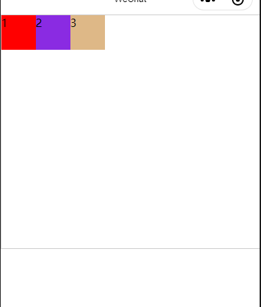
1.1 flex-direction(主轴方向)
flex-direction:row; (布局为一行,从start开始排)
flex-direction:row-reverse; (布局为一行,从end开始排)

flex-direction:column; (布局为一列,从start开始排)

flex-direction:column-reverse; (布局为一列,从end开始排)

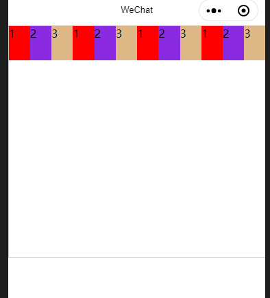
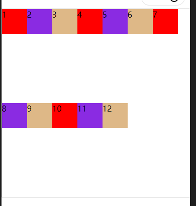
1.2 flex-wrap(一条轴线排不下如何换行)
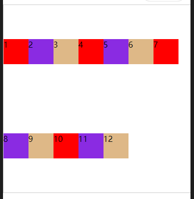
flex-wrap:nowrap; (不换行,在一行显示,即使子元素的宽度或者高度大于父元素的宽度或者高度,也在一行显示)
flex-wrap:wrap; (内容超过后换行)

flex-wrap:wrap-reverse; (换行后有两条轴线,reverse就是把轴线排列的顺序倒置过来)

1.3 justify-content (主轴对齐方式)
justify-content:flex-start; (start侧对齐,左对齐)
justify-content:flex-end; (end侧对齐,右对齐)

justify-content:center (中心对齐)
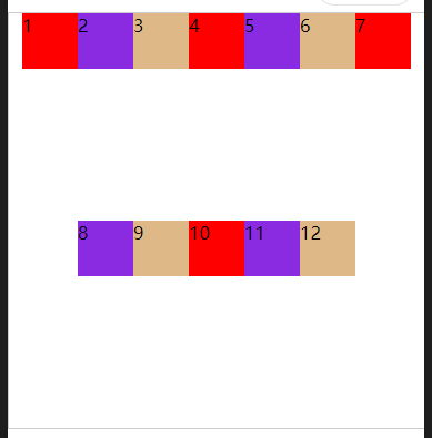
justify-content:space-between;(左右两侧没有间距,中间间距相同)

justify-content:space-around; (左右两侧的间距为中间间距的一半)

1.4 align-items(交叉轴对齐方式)
align-items:stretch; (拉伸)

align-items:flex-start; (start侧开始,上对齐)

align-items:flex-end; (end侧开始,下对齐)

align-items:center; (中心对齐)

align-items:baseline; (基线对齐) 在子元素加font-size:属性

1.5 align-content (多根轴线对齐方式)
align-content :stretch; (拉伸)

align-content :flex-start; (start侧开始,上对齐)

align-content :flex-end; (end侧开始,下对齐)

align-content :center; (中心对齐)

align-content:space-between; (上下没有间距,中间各子元素间距相同)

align-content:space-around; (上下间距之和等于中间各个间距)
2.flex-item相关属性
flex-item中的5个属性分别是order, flex-grow, flex-shrink, flex-basis, flex-self (分别对应下面的0,0,1,auto,auto初始顺序是123)

2.1 order(排列顺序)
2.2 flex-grow(放大比例,剩余空间怎么分配,如下图所示,剩余空间的分配比例是1:2:1)

2.3 flex-shrink (缩小比例,超出空间怎么压缩)
2.4 flex-basis (item所占主轴空间,优先级高于width)
2.5 align-self (对齐方式,取值和align相同,覆盖align-items)
3.属性总结
flex-container的属性有flex-direction, flex-wrap, justify-content, align-items, align-content
flex-direction(主轴方向): 1) row(布局为一行,从start开始排)
2) row-reverse(布局为一行,从end开始排)
3) column(布局为一列,从start开始排)
4) column-reverse(布局为一列,从end开始排)
flex-wrap(一条轴线排不下如何换行):1) nowarp (不换行,在一行显示)
2) wrap(内容超过后换行)
3) warp-reverse(换行后有两条轴线,reverse就是把轴线排列的顺序倒置过来)
justify-content(主轴对齐方式):1) flex-start (start侧对齐,左对齐)
2) flex-end(end侧对齐,右对齐)
3) center(中心对齐)
4) space-between(左右两侧没有间距,中间间距相同)
5) justify-content:space-around(左右两侧的间距为中间间距的一半)
align-items(交叉轴对齐方式): 1)align-items:stretch; (拉伸)
2)align-items:flex-start(start侧开始,上对齐)
3)align-items:flex-end(end侧开始,下对齐)
4)align-content :center (中心对齐)
5)align-items:baseline(基线对齐)
align-content(多根轴线对齐方式): 1)align-content :stretch (拉伸)
2)align-content :flex-start (start侧开始,上对齐)
3)align-content :flex-end(end侧开始,下对齐)
4)align-content :center (中心对齐)
5)align-content:space-between(上下没有间距,中间各子元素间距相同)
6)align-content:space-around (上下间距之和等于中间各个间距)
flex-item相关属性有order,flex-grow,flex-shrink,lex-basis,align-self
order(排列顺序)
flex-grow(放大比例,剩余空间怎么分配,如下图所示,剩余空间的分配比例是1:2:1)
flex-shrink (缩小比例,超出空间怎么压缩)
flex-basis (item所占主轴空间,优先级高于width)
align-self (对齐方式,覆盖align-items)
2.6 justify-content 对齐方式
justify-content:flex-start; (上,左对齐)

justify-content:flex-end;(下,右对齐)

justify-content:center;(居中)

justify-content:space-between;(两个块之间平均分布)

justify-content:space-around;(块与块之间均分布)
