问题描述
得益于出色的flexbox规范,这在CSS中是可行的。使用order和flex-flow属性,我们可以实现您想要的。无前缀的IE11和所有常绿浏览器将支持此功能。IE10前缀-ms-order,不支持flex-flow。
该解决方案考虑了您列出的所有约束:
- 将指定顺序的元素列表显示为一行。
- 如果窗口太小,请更改它们以显示在列中。
- 当元素在列中显示时,更改它们的顺序。
由于堆栈代码段的限制,您需要以整页模式查看演示,并调整浏览器的大小以查看效果。
.container div {

    width: 100px;

    height: 50px;

    display: inline-block;

}


.one { background: red; }

.two { background: orange; }

.three { background: yellow; }

.four { background: green; }

.five { background: blue; }


@media screen and (max-width: 531px) {

    .container { display: flex; flex-flow: column; }

    .five { order: 1; }

    .four { order: 2;  }

    .three { order: 3; }

    .two { order: 4; }

    .one { order: 5 }

}


<div class="container">

    <div class="one">I'm first</div>

    <div class="two">I'm second</div>

    <div class="three">I'm third</div>

    <div class="four">I'm fourth</div>

    <div class="five">I'm fifth</div>

</div>
另外,这是一个JSFiddle演示。
如果您倾向于冗长的CSS,也可以在flex-flow: column-
reverse不将order属性分配给每个div的情况下直接使用。相同的演示限制适用;全屏查看此演示并相应地调整浏览器窗口的大小。
.container div {

    width: 100px;

    height: 50px;

    display: inline-block;

}


.one { background: red; }

.two { background: orange; }

.three { background: yellow; }

.four { background: green; }

.five { background: blue; }


@media screen and (max-width: 531px) {

    .container { display: flex; flex-flow: column-reverse; }

}


<div class="container">

    <div class="one">I'm first</div>

    <div class="two">I'm second</div>

    <div class="three">I'm third</div>

    <div class="four">I'm fourth</div>

    <div class="five">I'm fifth</div>

</div>
值得指出的是,这flex-flow是同时包含flex-direction和flex-wrap属性的简写属性。
解决方法
我在一个响应式网站上工作,遇到一个有趣的问题。我有一些并排的div。可能有2到6个左右的任何地方。当屏幕的宽度不足以正确显示所有内容时,div将垂直堆叠。使用CSS足够简单。
问题是,我需要根据布局以不同的顺序排列它们。使用2或3个div([根据width更改div的顺序])很容易做到这一点,但是当您添加第四个[div时,难度就更大。
我可以使用position: absolute;并手动设置位置,但是这会使父级缩小并且不能正确包含它们。
更复杂的是,我不能使用JavaScript。
使用两列:
(未试)
HTML:
<div id="container">
    <div class="column-half column-half-2">
        First div on mobile,right div on desktop
    </div>
    <div class="column-half column-half-1">
        Second div on mobile,left div on desktop
    </div>
</div>
CSS:
.container {
    width: 80%;
    max-width: 1200px;
    margin: 0 auto;
    padding-bottom: 20px;
    position: relative;
}
.column-half {
    display: table-cell;
    padding: 25px;
    vertical-align: top;
    width: 40%;
}
.column-half-1 {
    float: left;
}
.column-half-2 {
    float: right;
}
HTML,有4列:
<div id="container">
    <div class="column-quarter column-quarter-3">
        First div on mobile,third div on desktop
    </div>
    <div class="column-quarter column-quarter-2">
        Second div on mobile,second div on desktop
    </div>
    <div class="column-quarter column-quarter-1">
        Third div on mobile,first div on desktop
    </div>
    <div class="column-quarter column-quarter-4">
        Fourth div on mobile,fourth div on desktop
    </div>
</div>
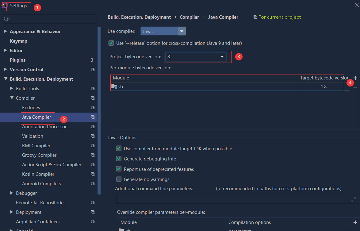 依赖报错 idea导入项目后依赖报错,解决方案:https://blog....
 错误1:gradle项目控制台输出为乱码 # 解决方案:https://bl...