问题描述
我有以下用于图片库的HTML:
.post-gallery{
  display:flex;
  width: 600px;
  height: 500px;
}

.post-gallery img{
   max-width: 100%;
   display: inline-block;
   border: 1px solid black;
}
<div class="post-gallery">
<img src="" width="300" height="500">
<img src="" width="300" height="250">
<img src="" width="300" height="250">
</div>我已经为演示目的放置了图像的宽度和高度,但是我需要显示的图像的宽度和高度来指定画廊中每个图像的位置。
所以我想要的是这样的(在我的情况下,大图像的尺寸为300x500,较小的图像为300x250,图库容器为600x500):

如果第一张图片的尺寸为600x250,较小的图片的尺寸为300x250,则如下所示:

解决方法
<div style="column-count: 2;column-gap: 10px;width: 600px;">
<img src="" width="300" height="500">
<img src="" width="300" height="250">
<img src="" width="300" height="250">
</div>
这里column-gap: 10px;是您的网格空间
您可以使用flex-flow: column wrap
* {
box-sizing: border-box;
}
.post-gallery {
display: flex;
width: 600px;
height: 500px;
flex-flow: column wrap;
}
.post-gallery img {
max-width: 100%;
display: inline-block;
border: 1px solid white;
}<div class="post-gallery">
<img src="" width="300" height="500">
<img src="" width="300" height="250">
<img src="" width="300" height="250">
</div>,
我使用 float 属性以一种简单的方式解决了该问题,如下所示:
.post-gallery {
height: 500px;
width: 600px;
}
.post-gallery img{
float: left;
}<h1>First </h1>
<div class="post-gallery">
  <img src="" width="300" height="500">
  <img src="" width="300" height="250">
  <img src="" width="300" height="250">
</div>
<h1>Second </h1>
<div class="post-gallery">
<img src="" width="600" height="250">
<img src="" width="300" height="250">
<img src="" width="300" height="250">
</div>
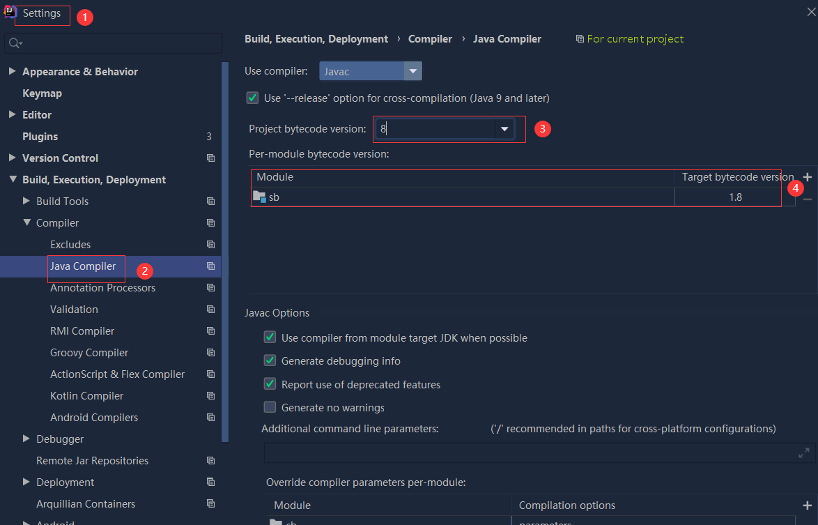 依赖报错 idea导入项目后依赖报错,解决方案:https://blog....
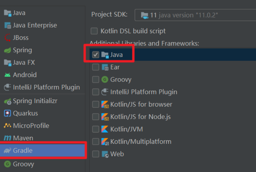 错误1:gradle项目控制台输出为乱码 # 解决方案:https://bl...