问题描述
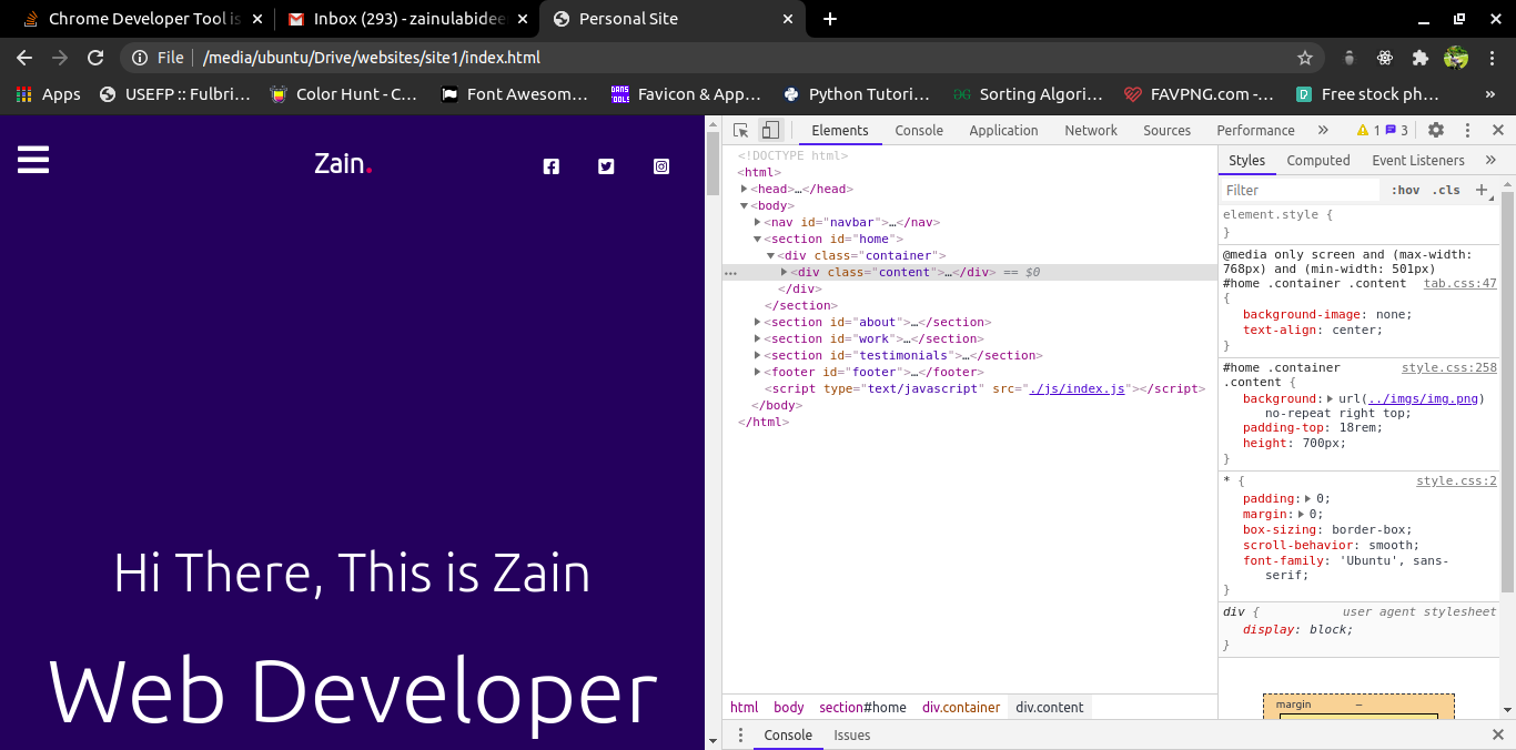
在Chrome开发者工具上检查我的网站的响应能力时出现问题。当我调整Chrome窗口的大小时,它显示了响应度
在下面的图片中,chrome窗口的宽度为768px
但是当我在Chrome中使用Toggle Device Toolbar时,它不会显示响应,如下图所示。宽度为768像素。

我的 index.html 文件如下
<!DOCTYPE html>
<html>
<head>
    <title>Personal Site</title>
    <link rel="stylesheet" type="text/css" href="./styles/style.css">
    <link rel="stylesheet" type="text/css" href="./styles/tab.css">
    <link rel="stylesheet" type="text/css" href="./styles/mobile.css">
</head>
<body>
All the Code lies here
</body>
</html>
我的CSS文件如下
style.css
All the styles are here no media queries
tab.css
@media only screen and (max-width: 768px) and (min-width: 501px)
{
All the styles are here
}
mobile.css
@media only screen and (max-width: 500px)
{
All the styles are here
}
解决方法
您的头部缺少视口标签,
将此添加到您的head标签
<meta name="viewport" content="width=device-width,initial-scale=1.0">
请访问此Document以获取更多信息