问题描述
我使用Drawer在右侧制作一个<Drawer/>,我希望1 <div>粘在<Drawer /> 的底部,同时宽度<div>中的{}与<Drawer /> 中相同。
所需结果:
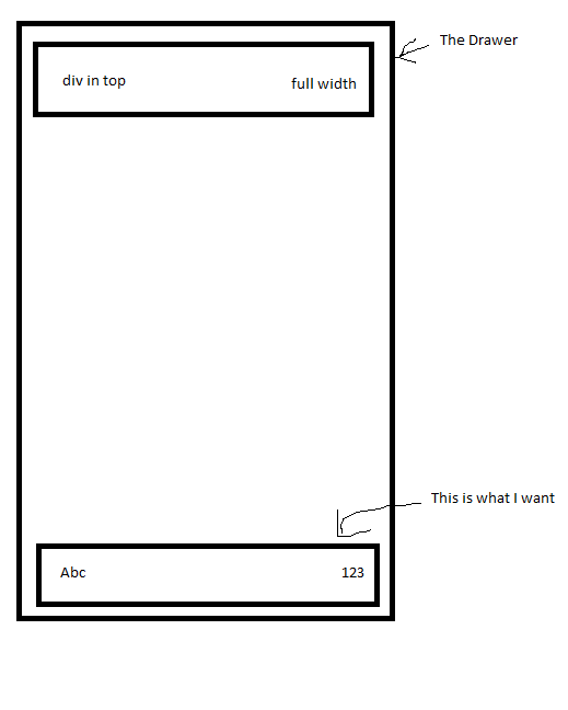
这就是我试图实现上述结果的原因:
 const useStyles = makeStyles({
  list: { // <-- this set the width of Drawer
    width: 500,},bottomContainer: {
    position: "fixed",bottom: 0,display: 'flex',flex: 1,flexDirection: 'row',justifyContent: 'space-between',margin: '30px'
 },});
但是当我设置position:fixed时,底部的div变成这样:

如您所见,整个div凝胶在一起,与抽屉的宽度不匹配。但是,如果设置了position: relative,则bottomContainer会显示相同的宽度div in top并显示在其下方,而不显示在<Drawer /> 的底部。
如果我将width: '100%'设置为bottomContainer,则Abc会出现在<Drawer /> 之外
因此,我的问题是:
如何制作与<div> 相同宽度的<Drawer/> 并出现在<Drawer /> 的底部?
解决方法
在这种情况下,请使用 flexbox 。
您应该设置一个包含高度和两个子元素的容器。通过添加display: flex,flex-direction: column和justify-content: space-between。
在包含两个段落元素的第二个div中,添加另一个display: flex和justify-content: space-between。您无需在此处添加flex-direction,因为默认值为flex-direction: row。您还可以在此处添加align-items: center以使内容垂直居中对齐。
* {
  margin: 0;
  padding: 0;
}

.flex {
  width: 100%;
  height: 500px;
  background-color: grey;
  display: flex;
  flex-direction: column;
  justify-content: space-between;
}

.div1,.div2 {
  width: 100%;
  height: 100px;
  background-color: red;
}

.div2 {
  display: flex;
  justify-content: space-between;
  align-items: center;
}
<div class="flex">
<div class="div1"></div>
<div class="div2">
<p>abc</p>
<p>123</p>
</div>
</div>