问题描述
我知道关于此问题还有更多问题,但是我发现的所有解决方案都不符合预期的行为,而且我不知道我的一位父母是否有问题。 我有三个“ div”,其中包含必须在自己的行中显示的三个不同的信息,并且父级必须对其应用边框,以使所有内容在垂直和水平方向上都居中,从而创建一个包含不同文本的框。 通过将inline-block或clear:both和float:这样的解决方案应用到每个文本块,可将宽度调整为适合内容,而不调整为父元素。 尝试对父级执行相同操作不适用。
这是我的html
<div class="service-options">
    <div class="from-group">
        <h1 class="animal-title">testing inline-block</h1>
        <div class="list-services">
            <div class='column-service'>
                <div class="service-name">
                    online
                </div>
                <div class="service-description">
                    Lorem ipsum dolor sit amet,consectetuer adipiscing elit.
                </div>
                <div class="service-price">
                    100<span class="pricecurrency">€</span>
                </div>
            </div>
            <div class='column-service'>
                <div class="service-name">
                    store
                </div>
                <div class="service-description">
                    Lorem ipsum dolor sit amet,consectetuer adipiscing elit.
                </div>
                <div class="service-price">
                    200<span class="pricecurrency">€</span>
                </div>
            </div>
            <div class='column-service'>
                <div class="service-name">
                    postal service
                </div>
                <div class="service-description">
                    Lorem ipsum dolor sit amet,consectetuer adipiscing elit.
                </div>
                <div class="service-price">
                    150<span class="pricecurrency">€</span>
                </div>
            </div>
        </div>
    </div>
</div>
这是我的CSS。
.animal-title {
  padding: 45px 0 45px 60px;
  color: #666B74;
  font-family: 'RalewayRegular';
  font-weight: bold;
  font-size: 36px;
}
.column-service {
  border: 3px solid #D53865;
 }

.list-services {
  display: flex;
  justify-content: space-around;
  padding: 45px 0 0 60px;
}

.service-name {
  clear: both;
  float: left;

  font-size: 20px;
  color: #D53865;
  font-weight: bold;
  font-family: 'RalewayRegular';
}

.service-description {
  clear: both;
  float: left;

  font-size: 16px;
  color: #666b74;
  font-family: 'RalewayRegular';
  width: 50%;
}

.service-price {
  clear: both;
  float: left;
  font-size: 22px;
  color: #D53865;
  font-weight: bold;
}

.price-currency {
  font-weight: normal;
}
我留下一个codepen链接供您查看当前行为
https://codepen.io/CharlieJS/pen/GRZqbGB
希望您可以帮助我摆脱错误。我先感谢您的时间和帮助
解决方法
您已将.service-description的宽度设置为width: 50%。 50%表示宽度的一半,因此不允许容器相应地收缩。
如果要调整段落的宽度,则应在容器上设置宽度,以便自动调整内容的大小或为列服务增加边距。
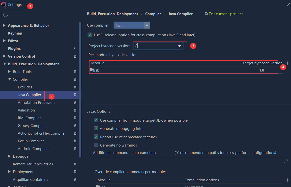 依赖报错 idea导入项目后依赖报错,解决方案:https://blog....
 错误1:gradle项目控制台输出为乱码 # 解决方案:https://bl...