问题描述
我一直在网站上工作,因为我试图在div中使用clip-path属性来创建箭头形状(我打算将其变成直角三角形),因此现在的结果:
.aboutus {
    width: 100%;
    height: 50vh;
    position: relative;
    background: #589AB8;
    clip-path: polygon(0% 100%,40% 100%,50% 50%,60% 100%,100% 100%,100% 0%,0% 0%);
}
<div id="aboutus" class="aboutus">
</div>我想知道是否有一种方法可以获取vh和vw之间的比例(vh / vw),以保持任何视口的三角形边的比例,而不会在我改变视口时变形大小。
或者如果您对保持形状有任何建议,我会欢迎您。
谢谢
解决方法
calc()函数具有帮助
通过
calc()CSS函数,您可以在指定CSS属性值时执行计算。它可以在允许<length>,<frequency>,<angle>,<time>,<percentage>,<number>或<integer>的任何地方使用
- 始终为20px / 30px的三角形
.aboutus {
    width: 100%;
    height: 50vh;
    position: relative;
    background: #589AB8;
    clip-path: polygon(0% 100%,calc(50% - 20px) 100%,50% calc(100% - 20px ),calc(50% + 20px)  100%,100% 100%,100% 0%,0% 0%);
}
<div id="aboutus" class="aboutus">
</div>
- 从vmin设置的三角形
.aboutus {
    width: 100%;
    height: 50vh;
    position: relative;
    background: #589AB8;
    clip-path: polygon(0% 100%,calc(50% - 10vmin) 100%,50% calc(100% - 10vmin ),calc(50% + 10vmin)  100%,0% 0%);
}
<div id="aboutus" class="aboutus">
</div>
- 从vmax设置的三角形
.aboutus {
    width: 100%;
    height: 50vh;
    position: relative;
    background: #589AB8;
    clip-path: polygon(0% 100%,calc(50% - 5vmax) 100%,50% calc(100% - 5vmax),calc(50% + 5vmax)  100%,0% 0%);
}
<div id="aboutus" class="aboutus">
</div>
- vh / vw的混合形式?,也许是您想做什么?
.aboutus {
    width: 100%;
    height: 50vh;
    position: relative;
    background: #589AB8;
    clip-path: polygon(0% 100%,calc(50% - (5vh + 2.5vw)) 100%,50% calc(100% - (5vh + 2.5vw)),calc(50% + (5vh + 2.5vw))  100%,0% 0%);
}
<div id="aboutus" class="aboutus">
</div>,
除了建议the answer of @G-Cyrillus之外,您还可以考虑使用遮罩和一些CSS变量来轻松控制形状并保持比例。
.aboutus {
    --angle:45deg;
    --d:10vh;

    height: 50vh;
    background: #589AB8;
    margin:5px;
    --g:transparent var(--d),#fff calc(var(--d) + 1px);
    -webkit-mask:
      linear-gradient(        var(--angle),var(--g)) right,linear-gradient(calc(-1*var(--angle)),var(--g)) left ;
    -webkit-mask-size:50% 100%;
    -webkit-mask-repeat:no-repeat;
    mask:
      linear-gradient(        var(--angle),var(--g)) left ;
    mask-size:50% 100%;
    mask-repeat:no-repeat;
}
<div class="aboutus"></div>
<div class="aboutus" style="--angle:60deg;"></div>
<div class="aboutus" style="--angle:30deg;--d:30px;"></div>
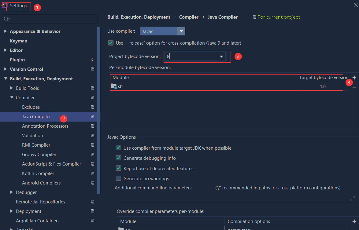 依赖报错 idea导入项目后依赖报错,解决方案:https://blog....
 错误1:gradle项目控制台输出为乱码 # 解决方案:https://bl...