问题描述
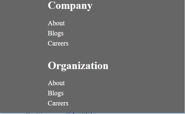
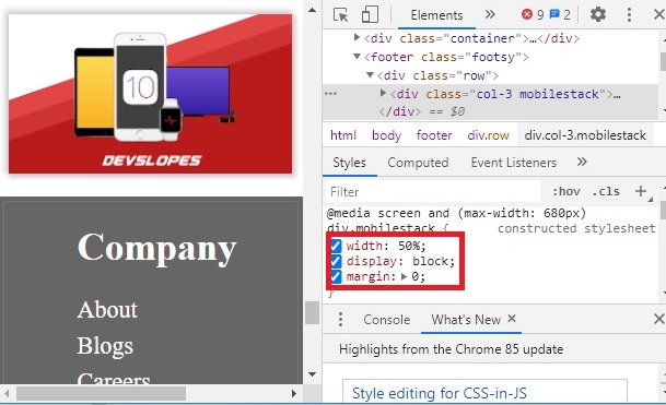
我有一个专为手机和网络设计的网页。我在该页面中有一个页脚,该页脚由4列组成(每列的宽度为25%)。当触发移动模式时,我已将每一列的宽度设置为50%,以使页脚分成两行(每行有两列)。为此,我给列指定了两个类的名称。在CSS媒体下的一个类中,我指定了它在移动视图中的宽度仅为50%。但是,即使CSS在移动视图的每个列中都得到了反映,它仍然占据了宽度的100%,并产生4行,每行具有其中一列。我已经将屏幕截图和代码一起附加了。谁能指出我哪里错了?
/********DEFAULTS*******/
nav,header,footer
{
    display:block;
}

body
{
    line-height: 1;
    margin :0;
}

label
{
    font-size: 35px;
    font-weight: 600
}

p
{
    font-size:28px;
    line-height: 1.2;
}

article p
{
    font-size:35px;
    padding:20px;
}

/********NAV BAR*******/
nav
{
    width:100%;
    margin:0;
}

nav ul
{
    background-color: #eee;
    overflow: hidden;
    margin:0;
    padding:0;
}

ul.topnav li
{
    list-style: none;
    float : left;
    margin:0;
    padding:0;
}

ul.topnav li.topnav-right
{
    float : right;
}

ul.topnav li a
{
    display : block;
    text-decoration : none;
    min-height:16px;
    text-align:centre;
    padding:14px;
    text-transform: uppercase;
    color:#665;
}

ul.topnav li a:hover
{
    background-color: #0000ff;
    color:#fff;
}

ul.topnav li.dropdownicon
{
    display: none;
}
button
{
    font-size:32px;
    font-weight: 700;
    color:#fff;
    background-color:#0069ff;
    padding: 15px 60px;
    display:block;
    text-align: center;
    margin:5px;
    border-radius: 7px;
}

button.learnMore
{
    display:block;
    margin:auto;
}
.container
{
    width : 100%;
    margin: auto;
    padding-top: 4%;
    padding-bottom: 4%;
    background:
}
/********custom style*******/
#section-1-gradient
{
    background:#076DFF;
    background-image: -webkit-linear-gradient(#076DFF,#65A5FF);
    background-image: -o-linear-gradient(#076DFF,#65A5FF);
    background-image: -moz-linear-gradient(#076DFF,#65A5FF);
    background-image: linear-gradient(#076DFF,#65A5FF);
}

div.box
{
    margin:24px;
    text-align:center;
    background-color: #fff;
    padding: 36px 24px 36px 24px;
    border-radius: 7px;
    box-shadow: 0 0 0 1px rgba(0,.15),0 2px 3px 0 rgba(0,.1);
}

div.slopeIcon img
{
    display:block;
    margin:auto;
    box-shadow: -2px -2px 5px 2px rgba(0,2px 2px 4px 2px rgba(0,.15);
}
h1.large
{
    color:#fff;
    font-size: 56px;
    margin:0;
    line-height: 70px;
}

h1.section2header
{
    font-size:65px;
    text-align:center;
}

div.leftside-col
{
    margin-left:30%;

}

div.rightside-col
{
    margin-left:15%;
}
input[type="password"],/* added by shamil*/
input[type="text"]
{
    font-size: 20px;
    width:400px;
    min-width: 100px;
    padding:5px;
    border-radius: 7px
}


form h2
{
    color:white;
}
.row
{
    width:100%;
    display:flex;
    flex:wrap;
    align-items:center;
}

.row::after
{
    display:table;
    clear: both;
    content:"";
}

.col-1{width:8.33%;}
.col-2{width:16.66%;}
.col-3{width:25%;}
.col-4{width:33.33%;}
.col-5{width:41.66%;}
.col-6{width:50%;}
.col-7{width:58.33%;}
.col-8{width:66.66%;}
.col-9{width:75%;}
.col-10{width:83.33%;}
.col-11{width:91.66%;}
.col-12{width:100%;}


*{
    box-sizing: border-box
}

footer.footsy
{
    background-color: #666;
    padding:2%
}

footer.footsy h1
{
    color:#fff;
    font-size: 35px;
}

footer.footsy ul
{
    list-style: none;
    text-align:left;
    padding-left: 0;
}

footer.footsy ul li
{
    color:#fff;
    font-size:22px;
    line-height: 1.5;
}
/********MOBILE*******/
@media screen and (max-width : 680px)
{
    ul.topnav li:not(:nth-child(1))
    {
        display: none;
    }
    ul.topnav li.dropdownicon
    {
        display:block;
        float: right;
    }
    ul.topnav.responsive li.dropdownicon{
        position: absolute;
        top:0;
        right:0;
    }
    ul.topnav.responsive{
        position: relative;
    }
    ul.topnav.responsive li{
        display:inline;
        float : none;
    }
    ul.topnav.responsive li a
    {
        display: block;
        text-align: left;
        text-transform: uppercase;
    }

    h1.section2header
    {
        font-size:55px;
    }

    .row {
    flex-direction: column;

    }

    article p
    {
        font-size: 25px;
    }

    .col-4,.col-5,.col-6,.col-7
    {
        width:100%;
        margin:0;
    }

    div.mobilestack
    {
        width:50%;
        display:block;
        margin:0;
    }

    div.box
    {
        padding:5px;
        display:block;
    }
    div.slopeIcon
    {
        margin:10px;
    }
    div.slopeIcon img
    {
        width:100%;
    }

    div.rightside-col,div.leftside-col
    {
        width:15%;
    }
   input[type="password"],input[type="text"]
    {
        width:200px;
        float:left;
        padding:5px;
    }
   .videoContainer iframe
    {
       width:400px;
        float:left;
        padding:5px; ;
    }
}
<! DOCTYPE html>
<html>
<head>
<title>
Anime Shop
</title>
<link rel="stylesheet" href="style.css">
</head>
<body>
<nav>
<ul class="topnav" id="dropdownClick">
<li><a href="#Home">Home</a></li>
<li><a href="#News">News</a></li>
<li><a href="#Contact">Contact</a></li>
<li><a href="#About">About</a></li>
<li class="topnav-right"><a href="#Signup">Sign up</a></li>
<li class="topnav-right"><a href="#Signin">Sign in</a></li>
<li class="dropdownicon"><a href="javascript:void(0);" onclick = "dropdownMenu()">☰</a></li>
</ul>
</nav>
<div class="container" id="section-1-gradient">
<div class="row">
<div class= "col-6">
<div class= "leftside-col">
<h1 class="large">
Crazy radness
</h1>
<h1 class="large">
Made for Otaku
</h1>
<form>
<div class= "leftside-col">
<h2>Username</h2>
<input class="inputbox" type="text" name="Username "placeholder="Username">
<h2>Password</h2>
<input class="inputbox" type="password" name="Password "placeholder="Password">
</div>
</form>
</div>
</div>
<div class= "col-6">
<div class= "rightside-col">
<div class="videoContainer">
<iframe width="560" height="315" src="https://www.youtube.com/embed/uC_SgMzlr6U" frameborder="0" allow="accelerometer; autoplay; encrypted-media; gyroscope; picture-in-picture" allowfullscreen></iframe>
</div>
</div>
</div>
</div>
</div>
<header>
<h1 class = "section2header"> Top Anime Counties </h1>
</header>
<div class="container">
<div class="row">
<div class="col-4">
<div class="box">
<div class="icon">
<img src="devIcon.png">
</div>
<label>Anime</label>
<p>Lorem Ipsum is simply dummy text of the printing and typesetting industry. Lorem Ipsum has been the industry's standard dummy text ever since the 1500s,when an unknown printer took a galley of type and scrambled it to make a type specimen book. </p>
</div>
</div>
<div class="col-4">
<div class="box">
<div class="icon">
<img src="devIcon.png">
</div>
<label>Manga</label>
<p>Lorem Ipsum is simply dummy text of the printing and typesetting industry. Lorem Ipsum has been the industry's standard dummy text ever since the 1500s,when an unknown printer took a galley of type and scrambled it to make a type specimen book. </p>
</div>
</div>
<div class="col-4">
<div class="box">
<div class="icon">
<img src="devIcon.png">
</div>
<label>Anime and Manga</label>
<p>Lorem Ipsum is simply dummy text of the printing and typesetting industry. Lorem Ipsum has been the industry's standard dummy text ever since the 1500s,when an unknown printer took a galley of type and scrambled it to make a type specimen book. </p>
</div>
</div>
</div>
<div class ="row">
<div class ="col-12">
<button class="learnMore">Learn More</button>
</div>
</div>
</div>
<hr>
<div class="container">
<div class="row">
<div class="col-7">
<article>
<p>
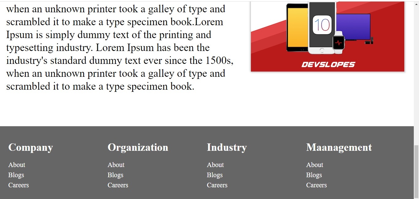
Lorem Ipsum is simply dummy text of the printing and typesetting industry. Lorem Ipsum has been the industry's standard dummy text ever since the 1500s,when an unknown printer took a galley of type and scrambled it to make a type specimen book.Lorem Ipsum is simply dummy text of the printing and typesetting industry. Lorem Ipsum has been the industry's standard dummy text ever since the 1500s,when an unknown printer took a galley of type and scrambled it to make a type specimen book.
</p>
</article>
</div>
<div class= "col-5">
<div class="slopeIcon">
<img src="iOS_Slope.png">
</div>
</div>
</div>
</div>
<footer class="footsy">
<div class="row">
<div class="col-3 mobilestack">
<h1>Company</h1>
<ul>
<li>About</li>
<li>Blogs</li>
<li>Careers</li>
</ul>
</div>
<div class="col-3 mobilestack">
<h1>Organization</h1>
<ul>
<li>About</li>
<li>Blogs</li>
<li>Careers</li>
</ul>
</div>
<div class="col-3 mobilestack">
<h1>Industry</h1>
<ul>
<li>About</li>
<li>Blogs</li>
<li>Careers</li>
</ul>
</div>
<div class="col-3 mobilestack">
<h1>Maanagement</h1>
<ul>
<li>About</li>
<li>Blogs</li>
<li>Careers</li>
</ul>
</div>
</div>
</footer>
<script>
function dropdownMenu()
{
var x= document.getElementById("dropdownClick");
if(x.className === "topnav")
{
x.className = "topnav responsive";
/*change topnav to topnav.responsive*/
}
else
{
x.className = "topnav";
}
}
</script>
</body>
</html>解决方法
暂无找到可以解决该程序问题的有效方法,小编努力寻找整理中!
如果你已经找到好的解决方法,欢迎将解决方案带上本链接一起发送给小编。
小编邮箱:dio#foxmail.com (将#修改为@)