问题描述
我正在构建仅包含HTML和CSS的待办事项列表,我只希望通过侧滚动来移动网站主要部分的内容。
该页面分为3个部分(包含在flexBox容器中)和标题。在图像中,您可以看到代表该想法的模型。
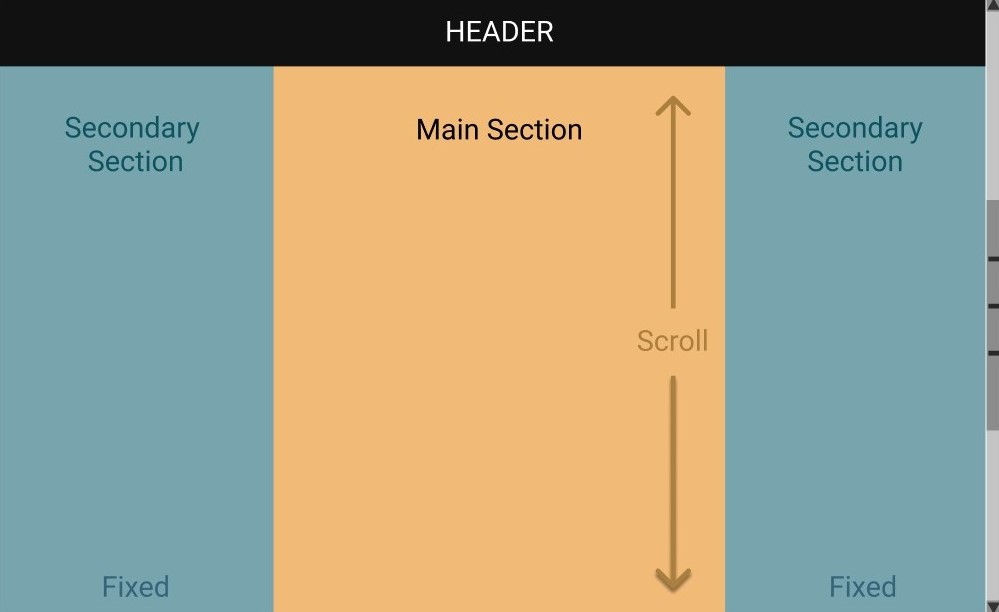
主要部分是中间的部分,必须只允许垂直滚动,所有其他元素(例如标题和次要部分)必须在屏幕上保持固定。
我简化了代码,以简化我的情况并使其更易于理解:
 <!DOCTYPE html>
    <html lang="en">
      <head>
        <Meta charset="UTF-8" />
        <Meta name="viewport" content="width=device-width,initial-scale=1.0" />
        <link rel="stylesheet" href="style.css" />
        <title>To-do list</title>
      </head>
      <body>
        <header>
          <h1>To-Do List</h1>
        </header>
        <div class="flex-container">
          <section class="secondary-section">
            <h2>Secondary Section</h2>
          </section>
          <section class="main-section">
            <h2>Main Section</h2>
          </section>
          <section class="secondary-section">
            <h2>Secondary Section</h2>
          </section>
        </div>
      </body>
    </html>
CSS代码
 * {
      margin: 0;
      padding: 0;
      Box-sizing: border-Box;
    }

    header {
      background-color: black;
      width: 100%;
      padding: 20px;
      text-align: center;
      color: white;
    }

    .flex-container {
      display: flex;
      flex: 1 1 0;
      text-align: center;
      height: 1000px;
    }

    .flex-container h2 {
      margin-top: 30px;
      font-size: 2rem;
    }

    .main-section {
      background-color: rgb(255,222,144);
      width: 100%;
    }

    .secondary-section {
      background-color: rgb(114,181,245);
      width: 100%;
    }
我一直在尝试使用“位置:固定”并配置各节溢出,但是我没有成功,什么是将这些flex元素固定在屏幕上而不滚动滚动的正确方法? >
解决方法
在此示例中,您可以使用position: sticky。我已经将两个第二部分设置为全屏高度(height: 100vh),并在其中添加了position属性。
像这样-
 * {
      margin: 0;
      padding: 0;
      box-sizing: border-box;
    }

    header {
      background-color: black;
      width: 100%;
      padding: 20px;
      text-align: center;
      color: white;
    }

    .flex-container {
      display: flex;
      flex: 1 1 0;
      text-align: center;
      height: 1000px;
    }

    .flex-container h2 {
      margin-top: 30px;
      font-size: 2rem;
    }

    .main-section {
      background-color: rgb(255,222,144);
      width: 100%;
    }

    .secondary-section {
      background-color: rgb(114,181,245);
      width: 100%;
      /* added */
      height: 100vh;
      position: sticky;
      top: 0;
    }
<!DOCTYPE html>
<html lang="en">
<head>
<meta charset="UTF-8" />
<meta name="viewport" content="width=device-width,initial-scale=1.0" />
<link rel="stylesheet" href="style.css" />
<title>To-do list</title>
</head>
<body>
<header>
<h1>To-Do List</h1>
</header>
<div class="flex-container">
<section class="secondary-section">
<h2>Secondary Section</h2>
</section>
<section class="main-section">
<h2>Main Section</h2>
</section>
<section class="secondary-section">
<h2>Secondary Section</h2>
</section>
</div>
</body>
</html>,
   body{
        overflow: hidden;
      }
      * {
      margin: 0;
      padding: 0;
      box-sizing: border-box;
    }

    header {
      background-color: black;
      width: 100%;
      padding: 20px;
      text-align: center;
      color: white;
    }

    .flex-container {
      display: flex;
      flex: 1 1 0;
      text-align: center;
      height: 1000px;
    }

    .flex-container h2 {
      margin-top: 30px;
      font-size: 2rem;
    }

    .main-section {
      background-color: rgb(255,144);
      width: 100%;
      height: 700px;
      max-height: 900px;
      overflow: auto;
    }

    .secondary-section {
      background-color: rgb(114,245);
      width: 100%;
    }
<!DOCTYPE html>
<html lang="en">
<head>
<meta charset="UTF-8" />
<meta name="viewport" content="width=device-width,initial-scale=1.0" />
<link rel="stylesheet" href="style.css" />
<title>To-do list</title>
</head>
<body>
<header>
<h1>To-Do List</h1>
</header>
<div class="flex-container">
<section class="secondary-section">
<h2>Secondary Section</h2>
</section>
<section class="main-section">
<div>
<h2>Main Section</h2>
Hi there Need to add content to this to get the scroll
Hi there Need to add content to this to get the scroll
Hi there Need to add content to this to get the scroll
Hi there Need to add content to this to get the scroll
Hi there Need to add content to this to get the scroll
Hi there Need to add content to this to get the scroll
Hi there Need to add content to this to get the scroll
Hi there Need to add content to this to get the scroll
Hi there Need to add content to this to get the scroll
Hi there Need to add content to this to get the scroll
Hi there Need to add content to this to get the scroll
Hi there Need to add content to this to get the scroll
Hi there Need to add content to this to get the scrollHi there Need to add content to this to get the scrollHi there Need to add content to this to get the scrollHi there Need to add content to this to get the scrollHi there Need to add content to this to get the scrollHi there Need to add content to this to get the scrollHi there Need to add content to this to get the scrollHi there Need to add content to this to get the scrollHi there Need to add content to this to get the scrollHi there Need to add content to this to get the scrollHi there Need to add content to this to get the scrollHi there Need to add content to this to get the scrollHi there Need to add content to this to get the scrollHi there Need to add content to this to get the scrollHi there Need to add content to this to get the scrollHi there Need to add content to this to get the scrollHi there Need to add content to this to get the scrollHi there Need to add content to this to get the scrollHi there Need to add content to this to get the scrollHi there Need to add content to this to get the scrollHi there Need to add content to this to get the scrollHi there Need to add content to this to get the scrollHi there Need to add content to this to get the scrollHi there Need to add content to this to get the scrollHi there Need to add content to this to get the scrollHi there Need to add content to this to get the scrollHi there Need to add content to this to get the scrollHi there Need to add content to this to get the scroll
</div>
</section>
<section class="secondary-section">
<h2>Secondary Section</h2>
</section>
</div>
</body>
</html>,
试试看,
通过添加
获取固定的标题header {
position: fixed;
height:80px;
top: 0;
}
修复了次要部分
.secondary-section {
  width: calc(100% / 3);
  height: 100vh;
  position: fixed;
  top: 80px; // height of header
}
可滚动的主要部分
.main-section {
  width: calc(100% / 3);
  position:absolute;
  bottom:0;
  right:calc(100% / 3);
  left:calc(100% / 3);
  top: 80px; // height of header
  height: inherit;
  z-index: -1;
}
* {
  margin: 0;
  padding: 0;
  box-sizing: border-box;
}
header {
  background-color: black;
  width: 100%;
  padding: 20px;
  text-align: center;
  color: white;
  position: fixed;
  top: 0;
  height:80px;
}

.flex-container {
  display: flex;
  flex: 1 1 0;
  text-align: center;
  height: 1000px;
  top:80px;
}

.flex-container h2 {
  margin-top: 30px;
  font-size: 2rem;
}

.main-section {
  background-color: rgb(255,144);
  width: calc(100% / 3);
  position:absolute;
  bottom:0;
  right:calc(100% / 3);
  left:calc(100% / 3);
  top: 0px;
  height: inherit;
  z-index: -1;
  top:80px;
}

.secondary-section {
  background-color: rgb(114,245);
  width: calc(100% / 3);
  height: 100vh;
  position: fixed;
  top:80px;
}
.secondary-section.right{
  right:0;
}
<!DOCTYPE html>
<html lang="en">
<head>
<meta charset="UTF-8" />
<meta name="viewport" content="width=device-width,initial-scale=1.0" />
<link rel="stylesheet" href="style.css" />
<title>To-do list</title>
</head>
<body>
<header>
<h1>To-Do List</h1>
</header>
<div class="flex-container">
<section class="secondary-section">
<h2>Secondary Section</h2>
</section>
<section class="main-section">
<h2>Main Section</h2>
<p>Lorem ipsum dolor sit amet,consectetur adipisicing elit,sed do eiusmod
tempor incididunt ut labore et dolore magna aliqua. Ut enim ad minim veniam,quis nostrud exercitation ullamco laboris nisi ut aliquip ex ea commodo
consequat. Duis aute irure dolor in reprehenderit in voluptate velit esse
cillum dolore eu fugiat nulla pariatur. Excepteur sint occaecat cupidatat non
proident,sunt in culpa qui officia deserunt mollit anim id est laborum.</p>
<p>Lorem ipsum dolor sit amet,sunt in culpa qui officia deserunt mollit anim id est laborum.</p>
</section>
<section class="secondary-section right">
<h2>Secondary Section</h2>
</section>
</div>
</body>
</html>,
* {
  margin: 0;
  padding: 0;
  box-sizing: border-box;
}

body {
  text-align: center;
}

h1 {
  font-size: 20px;
}

h2 {
  font-size: 16px;
}

header {
  color: white;
  width: 100%;
  height: 50px;
  padding: 10px;
  background: black;
  position: fixed;
  left: 0;
  top: 0;
  z-index: 1;
}

.flex-container {
  display: flex;
  justify-content: center;
  min-height: 100vh;
}

.flex-container [class$="-section"] {
  width: 33.33%;
  height: 100%;
  padding: 60px 10px 10px;
}
.secondary-section {
  background: #78a4ad;
  height: 100%;
  position: fixed;
  top: 0;
  left: 0;
}

.secondary-section ~ .secondary-section {
  left: auto;
  right: 0;
}

.main-section {
  background: #f1ba77;
}
<header>
<h1>HEADER</h1>
</header>
<div class="flex-container">
<section class="secondary-section">
<h2>Secondary Section</h2>
</section>
<section class="main-section">
<h2>Main Section</h2>
<p>Contrary to popular belief,Lorem Ipsum is not simply random text. It has roots in a piece of classical Latin literature from 45 BC,making it over 2000 years old. Richard McClintock,a Latin professor at Hampden-Sydney College in Virginia,looked up one of the more obscure Latin words,consectetur,from a Lorem Ipsum passage,and going through the cites of the word in classical literature,discovered the undoubtable source. Lorem Ipsum comes from sections 1.10.32 and 1.10.33 of "de Finibus Bonorum et Malorum" (The Extremes of Good and Evil) by Cicero,written in 45 BC. This book is a treatise on the theory of ethics,very popular during the Renaissance. The first line of Lorem Ipsum,"Lorem ipsum dolor sit amet..",comes from a line in section 1.10.32.
The standard chunk of Lorem Ipsum used since the 1500s is reproduced below for those interested. Sections 1.10.32 and 1.10.33 from "de Finibus Bonorum et Malorum" by Cicero are also reproduced in their exact original form,accompanied by English versions from the 1914 translation by H. Rackham.</p>
</section>
<section class="secondary-section">
<h2>Secondary Section</h2>
</section>
</div>