问题描述
我正在尝试为我的Android应用程序创建自定义按钮。这些按钮仅用于在屏幕上添加/编辑/删除数据。但是,我想对按钮做一些漂亮的样式设置,但是我在android编程的工作方式上遇到了一些困难。
该想法是使边界具有给定厚度(例如2dp),其颜色为渐变色。但是,这意味着中心是透明的,我认为这是主要困难之一。与此同时,我希望按钮的内部有一个代表其功能的图标。
目前,我有这样的渐变及其圆形边缘:
<?xml version="1.0" encoding="utf-8"?>
<layer-list xmlns:android="http://schemas.android.com/apk/res/android">
    <item android:gravity="top">
        <shape android:shape="rectangle">
            <gradient
                android:startColor="@color/colorPrimaryDark"
                android:centerColor="@color/colorAccent"
                android:endColor="@android:color/white"
                android:angle="270" />
            <corners android:radius="20dp"/>
        </shape>
    </item>
</layer-list>
这对应于我想要的颜色。但是,在可绘制资源文件中似乎没有透明的中心。
与此问题有关,在我的代码中,我在ListView上方有一个LinearLayout,其中包含应最终应用此样式的三个按钮。但是,我什至无法更改按钮的背景颜色。
以下是代表活动的代码:
<?xml version="1.0" encoding="utf-8"?>
<RelativeLayout xmlns:android="http://schemas.android.com/apk/res/android"
    xmlns:app="http://schemas.android.com/apk/res-auto"
    xmlns:tools="http://schemas.android.com/tools"
    android:layout_width="match_parent"
    android:layout_height="match_parent"
    tools:context=".AddplayersActivity"
    android:orientation="vertical"
    android:paddingRight="10dp"
    android:paddingLeft="10dp"
    android:background="@drawable/background_gradient">

    <TextView
        android:id="@+id/add_players_activity_title"
        android:layout_width="match_parent"
        android:layout_height="wrap_content"
        android:layout_marginBottom="20dp"
        android:fontFamily="@font/lato_bold"
        android:text="@string/app_name"
        android:textAlignment="center"
        android:textColor="@android:color/white"
        android:textSize="36sp" />

    <TextView
        android:layout_below="@+id/add_players_activity_title"
        android:id="@+id/add_players_activity_current_players"
        android:layout_width="match_parent"
        android:layout_height="wrap_content"
        android:fontFamily="@font/lato"
        android:text="@string/current_players"
        android:textColor="@android:color/white"
        android:textSize="20sp" />

    <ListView
        android:id="@+id/add_players_activity_player_list"
        android:layout_width="match_parent"
        android:layout_height="wrap_content"
        android:layout_below="@id/add_players_activity_current_players"
        android:layout_above="@id/add_players_activity_button_layout" />

    <LinearLayout
        android:id="@+id/add_players_activity_button_layout"
        android:layout_alignParentBottom="true"
        android:layout_width="match_parent"
        android:layout_height="wrap_content"
        android:gravity="center">

        <Button
            android:layout_width="wrap_content"
            android:layout_height="match_parent"
            android:layout_marginHorizontal="10dp"
            android:text="Add"/>

        <Button
            android:layout_width="wrap_content"
            android:layout_height="match_parent"
            android:layout_marginHorizontal="10dp"
            android:text="Edit"/>

        <Button
            android:layout_width="wrap_content"
            android:layout_height="match_parent"
            android:layout_marginHorizontal="10dp"
            android:text="Delete" />
    </LinearLayout>
</RelativeLayout>
其他StackOverflow问题都没有解决我的任何一个问题。甚至是最常见的“设置按钮的style属性”。
我对可能需要外部工具或其他东西的解决方案持开放态度,因此不会局限于内部功能。不过,我确实认为Android Studio中必须有解决此问题的方法。
在此先感谢所有需要时间调查的人!
这里是一个要求的示例(唯一的区别是我将使用可绘制/图像而不是文本)
解决方法
我不知道这是否是最佳解决方案,但是您可以通过以下方式轻松实现:
- 创建
gradient_back.xml:
<shape xmlns:android="http://schemas.android.com/apk/res/android">
    <corners android:radius="10dp" />
    <gradient
        android:endColor="@color/colorPrimary"
        android:startColor="@color/colorAccent" />
</shape>
- 创建
shape_front.xml:
<shape xmlns:android="http://schemas.android.com/apk/res/android">
    <corners android:radius="9dp" />
    <solid android:color="@android:color/white" />
</shape>
- 现在在您的布局中创建一个如下所示的按钮:
<FrameLayout
    android:layout_width="wrap_content"
    android:layout_height="wrap_content"
    android:background="@drawable/gradient_back">

    <Button
        android:layout_width="wrap_content"
        android:layout_height="wrap_content"
        android:layout_margin="3dp"
        android:background="@drawable/shape_front"
        android:text="WOW" />

</FrameLayout>
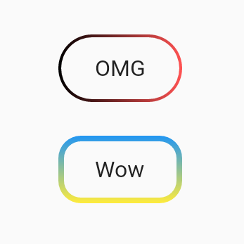
结果:

具有透明主体但不具有渐变的版本:
- 向您的
build.gradle(模块:应用)添加:
implementation "com.google.android.material:material:1.2.1"
- 在
res/values/styles中将父样式更改为:
parent="Theme.MaterialComponents.Light.DarkActionBar"
- 现在在布局中您可以添加一个按钮:
<com.google.android.material.button.MaterialButton
    style="@style/Widget.MaterialComponents.Button.OutlinedButton"
    android:layout_width="wrap_content"
    android:layout_height="wrap_content"
    android:text="WOW"
    android:textColor="@color/textColor"
    app:cornerRadius="10dp"
    app:strokeWidth="2dp"
    app:strokeColor="@color/colorAccent" />
结果:

我建议为此创建一个自定义视图。创建自定义视图对您非常有益,因为您已经提到了许多按钮。通过自定义视图,您可以重复使用具有不同高度,宽度,边框宽度,颜色和拐角半径的按钮。
阅读更多自定义视图here。您还可以通过一系列this one开始的代码实验室。
attrs.xml (值/attrs.xml):
<?xml version="1.0" encoding="utf-8"?>
<resources>
    <!-- Custom attributes for the button -->
    <declare-styleable name="StyledButton">
        <attr name="cornerRadius" format="dimension" />
        <attr name="borderWidth" format="dimension" />
        <attr name="startColor" format="color" />
        <attr name="centerColor" format="color" />
        <attr name="endColor" format="color" />
    </declare-styleable>
</resources>
StyledButton.kt :
import android.content.Context
import android.graphics.Canvas
import android.graphics.Color
import android.graphics.LinearGradient
import android.graphics.Paint
import android.graphics.Path
import android.graphics.Shader
import android.util.AttributeSet
import androidx.appcompat.widget.AppCompatImageButton
import androidx.core.content.withStyledAttributes

class StyledButton @JvmOverloads constructor(
    context: Context,attrs: AttributeSet? = null,defStyleAttr: Int = 0
) : AppCompatImageButton(context,attrs,defStyleAttr) {

    private var cornerRadius = 0f
    private var borderWidth = 0f
    private var startColor = 0
    private var centerColor = 0
    private var endColor = 0

    private val path = Path()
    private val borderPaint = Paint().apply {
        style = Paint.Style.FILL
    }

    init {
        //Get the values you set in xml
        context.withStyledAttributes(attrs,R.styleable.StyledButton) {
            borderWidth = getDimension(R.styleable.StyledButton_borderWidth,10f)
            cornerRadius = getDimension(R.styleable.StyledButton_cornerRadius,10f)
            startColor = getColor(R.styleable.StyledButton_startColor,Color.WHITE)
            centerColor = getColor(R.styleable.StyledButton_centerColor,Color.RED)
            endColor = getColor(R.styleable.StyledButton_endColor,Color.BLACK)
        }
    }

    override fun onSizeChanged(w: Int,h: Int,oldw: Int,oldh: Int) {
        super.onSizeChanged(w,h,oldw,oldh)

        // Create and set your gradient here so that the gradient size is always correct
        borderPaint.shader = LinearGradient(
            0f,0f,width.toFloat(),height.toFloat(),intArrayOf(startColor,centerColor,endColor),null,Shader.TileMode.CLAMP
        )
    }

    override fun onDraw(canvas: Canvas) {
        super.onDraw(canvas)

        //Remove inner section (that you require to be transparent) from canvas
        path.rewind()
        path.addRoundRect(
            borderWidth,borderWidth,width.toFloat() - borderWidth,height.toFloat() - borderWidth,cornerRadius - borderWidth / 2,Path.Direction.CCW
        )
        canvas.clipOutPath(path)

        //Draw gradient on the outer section
        path.rewind()
        path.addRoundRect(
            0f,cornerRadius,Path.Direction.CCW
        )
        canvas.drawPath(path,borderPaint)
    }
}
用法:
<com.example.andriod.myapplication.StyledButton
    android:layout_width="100dp"
    android:layout_height="40dp"
    android:src="@drawable/ic_android"
    android:scaleType="center"
    android:layout_gravity="center"
    app:borderWidth="2dp"
    app:cornerRadius="20dp"
    app:startColor="@color/colorPrimaryDark"
    app:centerColor="@android:color/holo_red_dark"
    app:endColor="@color/colorPrimary"/>
结果
