问题描述
我正试图让我的网格每行仅放置3个按钮,以便当我添加第4个按钮时,它应该自动放置在下一行。
这是我的代码:
.div {
  display: grid;
  grid-template-columns: auto auto auto;
  background: #3c763d;
}

.button {
  background: #27ae60;
  float: left;
  margin: 6px 6px 6px 6px;
  height: 2rem;
  width: 8.33%;
  box-shadow: 0 1px 3px rgba(0,0.32),0 1px 2px rgba(0,0.34);
  color: #f9f9f9;
  text-align: center;
  justify-content: center;
  padding-top: 12px;
}

.button:hover {
  box-shadow: 0 1px 1px rgba(0,0.12),0 1px 1px rgba(0,0.24);
  cursor: pointer;
}
<!DOCTYPE html>
<html>
<head>
<title>Rock,Paper,Scissors!</title>
<meta charset="utf-8">
<meta http-equiv="X-UA-Compatible" content="IE=edge,chrome=1">
<link rel="stylesheet" type="text/css" href="index.css">
</head>
<h1>Rock Paper Scissors</h1>
<h3>Make your selection!</h3>
<div>
<div class="button">Rock</div>
<div class="button">Paper</div>
<div class="button">Scissors</div>
<div class="button">Clear</div>
</div>
</html>相反,我一直只剩下一行4个按钮,而不是一行3个,后面是新的一行1个。
解决方法
您已经很亲密,但是需要进行一些修改才能使其正常工作。
1。您的网格CSS规则位于您不使用的类div中:
您的网格CSS规则位于.div {...}中,或者您要成为一个<div>元素(FYI不起作用-它将使每个 div成为网格容器! ),或者忘记将div类添加到HTML的grid元素中。
相反,将一个类添加到您的外部div中,例如<div class="mygrid">并将网格CSS规则添加到该类,例如
.mygrid {
    display: grid;
    grid-template-columns: auto auto auto;
    background: #3c763d;
    /* Extra info! You can use this for even grid gaps */
    grid-gap: 6px;
    padding: 6px;
}
2。您正在给按钮width 8.33% -这将使按钮占网格列的8.55%,我认为您不想要:)。
3。您还可以从按钮中删除display:float ,因为这将由网格自动管理
4。您可以使用grid-gap在网格元素之间创建均匀的间距,而不是在网格元素上设置边距-这将使行和列之间的间距相同,因为没有边距收缩。
(您可以在容器上使用相同尺寸的填充物来均匀填充空间。)
工作示例:
.mygrid {
    display: grid;
    grid-template-columns: auto auto auto;
    background: #3c763d;
    grid-gap: 6px;
    padding: 6px;
}

.button {
    background: #27ae60;
    height: 2rem;
    box-shadow: 0 1px 3px rgba(0,0.32),0 1px 2px rgba(0,0.34);
    color: #f9f9f9;
    text-align: center;
    justify-content: center;
    padding-top: 12px;
}

.button:hover {
    box-shadow: 0 1px 1px rgba(0,0.12),0 1px 1px rgba(0,0.24);
    cursor: pointer;
}
<h1>Rock Paper Scissors</h1>
<h3>Make your selection!</h3>
<div class="mygrid">
<div class="button">Rock</div>
<div class="button">Paper</div>
<div class="button">Scissors</div>
<div class="button">Clear</div>
</div>,
#1使用网格方法
width:8.33%;float:left不需要按钮,也可以向网格中的主div添加一个类,我将其添加为 maindiv 并为其设置样式,而样式直接div会影响所有
.maindiv {
  display: grid;
  grid-template-columns: auto auto auto;
  background: #3c763d;
}
.maindiv {
  display: grid;
  grid-template-columns: auto auto auto;
  background: #3c763d;
}

.button {
  background: #27ae60;
  margin: 6px 6px 6px 6px;
  height: 2rem;
  box-shadow: 0 1px 3px rgba(0,0.34);
  color: #f9f9f9;
  text-align: center;
  justify-content: center;
  padding-top: 12px;
}

.button:hover {
  box-shadow: 0 1px 1px rgba(0,0.24);
  cursor: pointer;
}
<!DOCTYPE html>
<html>
<head>
<title>Rock,Paper,Scissors!</title>
<meta charset="utf-8">
<meta http-equiv="X-UA-Compatible" content="IE=edge,chrome=1">
<link rel="stylesheet" type="text/css" href="index.css">
</head>
<h1>Rock Paper Scissors</h1>
<h3>Make your selection!</h3>
<div class="maindiv">
<div class="button">Rock</div>
<div class="button">Paper</div>
<div class="button">Scissors</div>
<div class="button">Clear</div>
</div>
</html>
#2使用flex方法
.maindiv {
    display: flex;
    flex-wrap:wrap;
    background: #3c763d;
}

.button {
    background: #27ae60;
    margin: 6px 6px 6px 6px;
    height: 2rem;
    box-shadow: 0 1px 3px rgba(0,0.34);
    color: #f9f9f9;
    text-align: center;
    justify-content: center;
    padding-top: 12px;
    max-width: calc(33.33% - 12px );
    flex-basis: calc(33.33% - 12px );
}
.button:hover {
    box-shadow: 0 1px 1px rgba(0,0.24);
    cursor: pointer;
}
<!DOCTYPE html>
<html>
<head>
<title>Rock,Scissors!</title>
<meta charset="utf-8">
<meta http-equiv="X-UA-Compatible" content="IE=edge,chrome=1">
<link rel="stylesheet" type="text/css" href="index.css">
</head>
<h1>Rock Paper Scissors</h1>
<h3>Make your selection!</h3>
<div class="maindiv">
<div class="button">Rock</div>
<div class="button">Paper</div>
<div class="button">Scissors</div>
<div class="button">Clear</div>
</div>
</html>,
为此,请确保给包装div一个类。
所以您的HTML将会是
<div class="button-wrapper">
    <div class="button">Rock</div>
    <div class="button">Paper</div>
    <div class="button">Scissors</div>
    <div class="button">Clear</div>
</div>
然后,您的网格将只有3个项目。
您可能希望通过移除fixed width 来固定每个项目的宽度,以便按钮可以填满网格中的空间。
从类.button中删除它,您应该会很好。
.button{
      width: 8.33%;
}
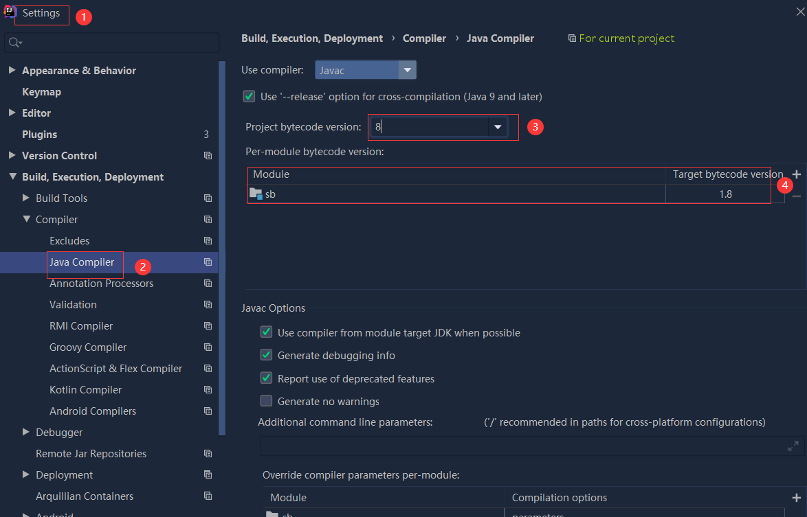 依赖报错 idea导入项目后依赖报错,解决方案:https://blog....
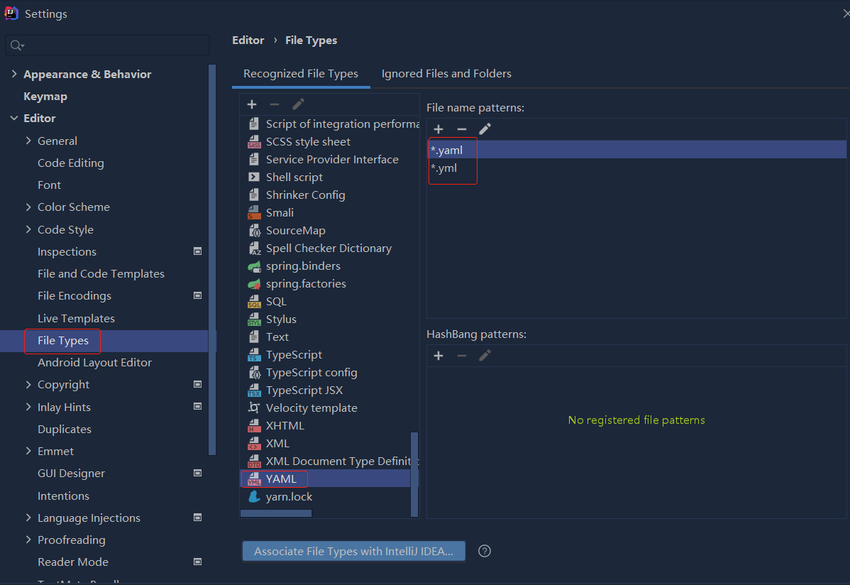
 错误1:gradle项目控制台输出为乱码 # 解决方案:https://bl...