问题描述
在我的网站上,我有一个很长的案例研究页面,其中包含10个部分,因此我想创建一个水平菜单,其中包含指向页面上每个部分的链接。用户将可以在小屏幕设备上水平滑动此按钮,以便用户可以访问通常不在视口画布上的链接。
我了解如何实现所有这些,但是我需要的是这;当用户向下滚动并到达第五部分时,其菜单链接稍微偏离了右侧,菜单将向左滑动足够多,以便链接图标出现在视口中,并在最左侧停止。反过来,这也将随后的其他链接也带到画布上。
但是问题是,如果我在滚动菜单容器中添加一个类来分配一个转换:translate(X)值,并因此在用户到达特定部分时将其动画化到左侧,则整个菜单会固定在该位置,然后用户无法手动前后滑动菜单来访问他们从那时起所需的任何菜单链接。
我也希望反向进行同样的操作,以便在触发以上操作并将菜单移至左侧后,当用户决定向后滚动页面并越过触发初始菜单幻灯片的部分时操作,它将向右滑动回到其原始位置。
每次用户在任一方向(向上或向下)滚动经过该特定点时,都应发生这种触发菜单幻灯片的行为,但是用户仍应能够手动将菜单滑动到任一方向的任何一点
我知道所有这些都必须使用Javascript才能实现,但是我尝试了很多不同的想法,包括element.scrollintoView,由于将其分配给菜单中的一个ID不会使整个菜单滑落,因此无法正常工作。我还尝试过通过添加动画类来移动菜单,但这也不起作用。
更新:
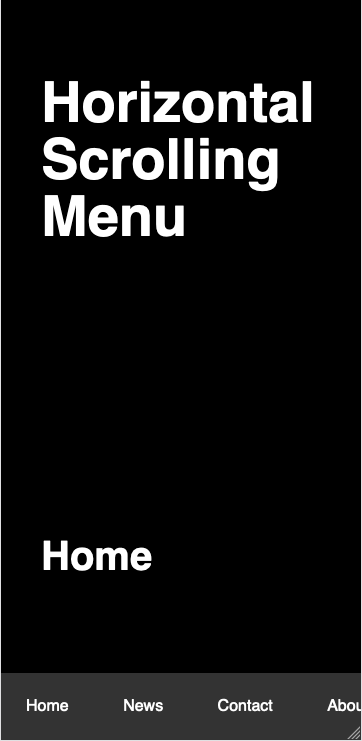
https://codepen.io/creativezest/pen/MWyqPYL
<!DOCTYPE html>
<html>

    <head>
        <Meta charset="utf-8">
        <Meta http-equiv="X-UA-Compatible" content="IE=edge">
        <title>Horizontal Scrolling Menu</title>
        <Meta name="description" content="An interactive getting started guide for Brackets.">
        <Meta name="viewport" content="width=device-width,initial-scale=1.0" />
        <link rel="stylesheet" href="style.css">
    </head>
    <body>
    <wrapper>
    <div class="container heading">
        <h1>Horizontal Scrolling Menu</h1>
    </div>

    <section id="home" class="page-section">
        <div class="container">
            <h2>Home</h2>
        </div>
    </section>

    <section id="news" class="page-section">
        <div class="container">
            <h2>News</h2>
        </div>
    </section>

    <section id="contact" class="page-section">
        <div class="container">
            <h2>Contact</h2>
        </div>
    </section>

    <section id="about" class="page-section">
        <div class="container">
            <h2>About</h2>
        </div>
    </section>

    <section id="support" class="page-section">
        <div class="container">
            <h2>Support</h2>
        </div>
    </section>

    <section id="blog" class="page-section">
        <div class="container">
            <h2>Blog</h2>
        </div>
    </section>

    <section id="tools" class="page-section">
        <div class="container">
            <h2>Tools</h2>
        </div>
    </section>

    <section id="base" class="page-section">
        <div class="container">
            <h2>Base</h2>
        </div>
    </section>

    <section id="custom" class="page-section">
        <div class="container">
            <h2>Custom</h2>
        </div>
    </section>

    <section id="testimonials" class="page-section">
        <div class="container">
            <h2>Testimonials</h2>
        </div>
    </section>

    <section id="more" class="page-section">
        <div class="container">
            <h2>More</h2>
        </div>
    </section>


    <div id="scrollmenu">
      <div class="scroll-links-container">
          <a href="#home" class="link">Home</a>
          <a href="#news" class="link">News</a>
          <a href="#contact" class="link">Contact</a>
          <a href="#about" class="link">About</a>
          <a href="#support" class="link">Support</a>
          <a href="#blog" class="link">Blog</a>
          <a href="#tools" class="link">Tools</a>
          <a href="#base" class="link">Base</a>
          <a href="#custom" class="link">Custom</a>
          <a href="#testimonials" class="link">Testimonials</a>
          <a href="#more" class="link">More</a>
      </div>
    </div>

    </wrapper>


body,html {
    margin: 0;
    padding: 0;
    font-family: sans-serif;
    font-size: 16px;
    background-color: white;
}

html {
    scroll-behavior: smooth;
}

wrapper {
    display: block;
    width: 360px;
    margin: 0 auto;
    background-color: black;
    padding-top: 20px;
}

h1 {
    font-family: sans-serif;
    font-size: 3.5rem;
    color: white;
    padding: 0px 20px;
}

h2 {
    font-family: sans-serif;
    font-size: 2.5rem;
    color: white;
}


section {
    width: 360px;
    background-color: transparent;
}

.container.heading {
    padding: 20px 20px 20px 20px;
}

.container {
    padding: 200px 40px 200px 40px;
}


div#scrollmenu {
    position: fixed;
    bottom: 0;
    background-color: #333;
    overflow: auto;
    white-space: Nowrap;
    width: 360px;
    margin: 0 auto;
    text-align: center;
    padding: 0;
    margin: 0;
}

div#scrollmenu a {
    display: inline-block;
    color: white;
    text-align: center;
    padding: 25px 25px;
    text-decoration: none;
}

div#scrollmenu a:hover {
    background-color: #777;
}

.active {
    background-color: #777;
}

.slide-about-left {
    transform: translateX(-300px);
    transition: transform 0.5s;
}


        $(window).scroll(function() {
   var hT = $('#about').offset().top,hH = $('#about').outerHeight(),wH = $(window).height(),wS = $(this).scrollTop();
   if (wS > (hT+hH-wH)){
       $(".scroll-links-container").addClass("slide-about-left");
   }
});


</body>
</html>
您会看到我添加了一些JavaScript,试图在页面向下滚动到#about部分时使菜单向左滚动,从而使底部菜单中的“ about”链接滑动到菜单的最左侧视口。但这似乎不起作用。
正如我在上一篇文章中解释的那样,这是我要实现的目标,并且使菜单向后滚动,以便当用户滚动时,“ home”链接位于视口最左侧的原始位置。通过#about部分进行备份。

在发生上述行为之后,我还需要用户仍然能够手动向左和向右滑动菜单。
我真的很感谢任何人都可以提供的帮助。
非常感谢。
马克
解决方法
暂无找到可以解决该程序问题的有效方法,小编努力寻找整理中!
如果你已经找到好的解决方法,欢迎将解决方案带上本链接一起发送给小编。
小编邮箱:dio#foxmail.com (将#修改为@)