问题描述
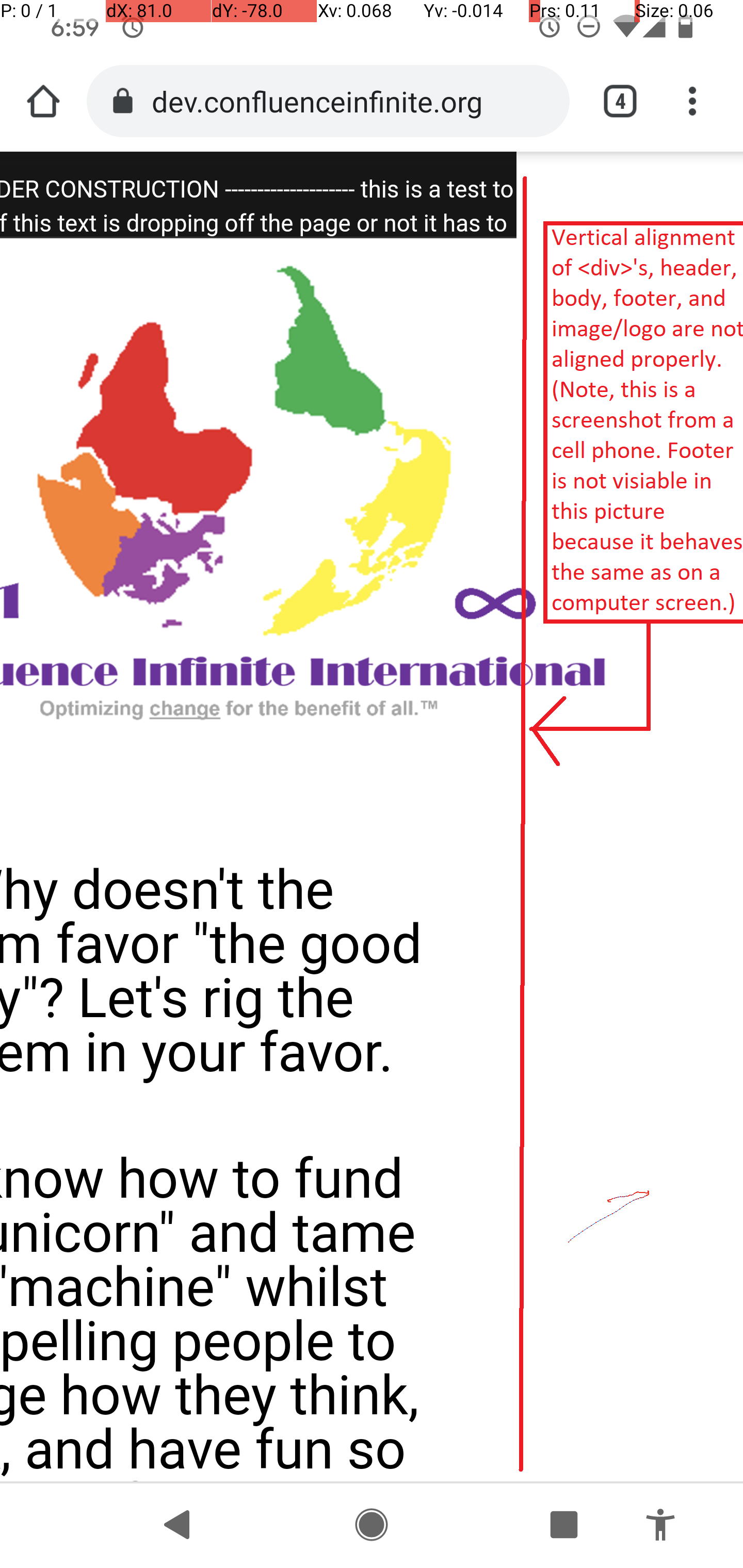
我试图将页眉,正文,页脚和div垂直对齐在一列中,以使Web设计具有响应性(在不同的屏幕尺寸上看起来都不错):ConfluenceInfinite.org或参见下面的dev子域。
对于html和css的新手(像我一样),这是纯css / html的实现/标记,包括菜单。
您可以直接前往我的开发子域查看此问题: my development subdomain: dev.confluenceinfinite.org
我已经对此进行了大量研究。这是一些研究:
我不认为此问题/答案适用于我的问题,因为我的问题是垂直对齐(如果我错了,请纠正我)。它使用固定的px值,该值不适用于手机,并且我尝试了display: inline-block,但没有用。这是SO问题的链接:
click here
这个问题/答案(通过搜索OS标签的垂直对齐方式获得)也具有固定宽度,我不想这样做,因为我希望<div>在所有屏幕尺寸下都是完全动态的:{ {3}}
我也不认为这有帮助,因为它使容器内的元素对齐,但是我希望容器/ div对齐。我错过了什么吗?: click here
此解决方案具有正确的标题/标题,但垂直对齐了“右侧”的内容,这似乎不适用于我的问题: click here
我曾经使用允许开发人员在多种屏幕尺寸上测试/可视化网站设计的网站或程序。我找不到该网站。如果您知道该站点的位置,请发表评论或将其放入答案中。谢谢!
这是我的索引/主页html标记:
<!DOCTYPE html>
<html lang="en">
<head>
<Meta name="generator"
content="HTML Tidy for HTML5 (experimental) for Windows https://github.com/w3c/tidy-html5/tree/c63cc39" />
<link rel="icon" type="/images/png" href="/images/CII - favicon for website - 2020-09-17 0435.png" />
<Meta charset="UTF-8" />
<Meta name="viewport" content="width=device-width,initial-scale=1.0" />
<Meta http-equiv="X-UA-Compatible" content="ie=edge" />
<link rel="stylesheet" href="/StylePage.css" />
<link rel="stylesheet" href="/StyleMenu.css" />
<title>CII - Optimizing change for the benefit of all.</title>
</head>
<body>
<header>
<!-- start ============================================================================ menu (goes in header) ============================== start -->
<div class="menu-wrap">
<input type="checkBox" class="toggler" />
<div class="hamburger">
<div class="ClassForTidy"></div>
</div>
<div class="menu">
<div>
<div>
<ul>
<li>
<a href="Index.html">Home</a>
</li>
<li>
<a href="Team.html">Team</a>
</li>
<li>
<a href="AboutUs.html">About Us</a>
</li>
<li>
<a href="DeFinitions.html">DeFinitions</a>
</li>
<li>
<a href="HaveDoubts.html">Have Doubts?</a>
</li>
<li>
<a href="ContactUs.html">Contact Us</a>
</li>
<li>
<a href="Donatetoday.html">Donate Today</a>
</li>
<li>
<a href="GetInvolved.html">Get Involved</a>
</li>
<li>
<a href="TheMovement.html">The Movement</a>
</li>
<li>
<a href="c11.html">c11</a>
</li>
<li>
<a href="TheCeosstory.html">The CEO's Story</a>
</li>
<li>
<a href="News.html">News</a>
</li>
</ul>
</div>
</div>
</div>
</div>
<!-- end ============================================================================ menu (goes in header) ============================== end -->
<!-- start ============================================================================ header text ============================== start -->
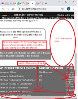
<p id="HeaderText">-------------------- SITE UNDER CONSTRUCTION -------------------- this is a test to see if the right side of this text is dropping off the page or not it has to be very long to test the issue</p>
<!-- end ============================================================================ header text ============================== end -->
</header>
<div class="site-wrap">
<!-- start ============================================================================ logo region ============================== start -->
<figure class="fig_logo_reg">
<img src="/images/CII_logo.PNG" class="img_logo_reg" />
</figure>
<!-- end ============================================================================ logo region ============================== end -->
<!-- start ============================================================================ start page content ============================== start -->
<!-- start ============================================================================ paste content below ============================== start -->
<div class="container showcase-inner">
<br />
<br />
<h1 style="font-size:30px; color: black; padding: 10px 0 0 0; margin: 30px 0; line-height: 30px;">Why doesn't the system favor "the good guy"? Let's rig the system in your
favor.</h1>
<h1 style="font-size:30px; color: black; padding: 10px 0 0 0; margin: 30px 0; line-height: 30px;">We kNow how to fund the "unicorn" and tame the "machine" whilst compelling
people to change how they think,work,and have fun so it benefits good people,without breaking any laws. Truly.</h1>
<br />
<p>The world is focused on money,getting people’s attention,and offering goods and service at an equilibrium price
where both the lowest financial cost and highest financial gain are at. CII is focused on destroying this “machine”
and system of values in a legal,ethical,and morally sound way. CII has created technology that will facilitate,perpetuate,and maintain the new system by optimizing change for the benefit of all that will connect good people,produce optimal “humanitarian value” output,and simultaneously destroy the old system over time. CII will facilitate
this with the help of good people in a way that will protect individuals and their livelihood achieving a better system
for society.</p>
<a href="AboutUs.html" class="btn">Read More this is a test to see if the right side of this text is dropping off the page or not it has to be very long to test the issue</a>
</div>
<!-- end ============================================================================ paste content above ============================== end -->
</div>
<!-- start =============================================================== footer ============================================= end -->
<footer>
<div class="navLeftFooter nav-globe" id="navFooter">
<a href="#top" id="navBackToTop">
<div class="navFooterBackToTop">
<span class="navFooterBackToTopText">Go Back to Top of Page - this is a test to see if the right side of this text is dropping off the page or not it has to be very long to test the issue</span>
</div>
</a>
<div class="navFooterVerticalColumn navAccessibility" role="presentation">
<div class="navFooterVerticalRow navAccessibility" style="display: table-row;">
<div class="navFooterLinkCol navAccessibility">
<div class="navFooterColHead">Get to KNow Us</div>
<ul>
<li class="nav_first">
<a href="GetInvolved.html" class="nav_a">Careers & Volunteer</a>
</li>
<li>
<a href="TheCeosstory.html" class="nav_a">Blog</a>
</li>
<li>
<a href="AboutUs.html" class="nav_a">About CII</a>
</li>
<li>
<a href="AboutUs.html#TargetSusCsr" class="nav_a">Sustainability</a>
</li>
<li>
<a href="News.html" class="nav_a">News & Press Center</a>
</li>
<li>
<a href="ContactUs.html" class="nav_a">Donor Relations</a>
</li>
</ul>
</div>
<div class="navFooterColSpacerInner navAccessibility"></div>
<div class="navFooterLinkCol navAccessibility">
<div class="navFooterColHead">Get Involved with CII's Platform</div>
<ul>
<li class="nav_first">
<a href="ContactUs.html" class="nav_a">Become an Affiliate</a>
</li>
<li>
<a href="ContactUs.html" class="nav_a">Become a Strategic Partner</a>
</li>
<li>
<a href="ContactUs.html" class="nav_a">Offer Your Product or Service/"Advertise"</a>
</li>
<li>
<a href="ContactUs.html" class="nav_a">Submit an Ideology for Consideration</a>
</li>
<li>
<a href="ContactUs.html" class="nav_a">Submit an Idea for Consideration</a>
</li>
<li>
<a href="ContactUs.html" class="nav_a">Submit a Core Value for Consideration</a>
</li>
<li>
<a href="ContactUs.html" class="nav_a">Submit a Concept for Consideration</a>
</li>
<li>
<a href="ContactUs.html" class="nav_a">Submit a Core Change for Consideration</a>
</li>
<li>
<a href="ContactUs.html" class="nav_a">Submit Anything Else</a>
</li>
</ul>
</div>
<div class="navFooterColSpacerInner navAccessibility"></div>
<div class="navFooterLinkCol navAccessibility">
<div class="navFooterColHead">Connect with People</div>
<ul>
<li class="nav_first">
<a href="TheMovement.html" class="nav_a">The Movement</a>
</li>
<li>
<a href="c11.html" class="nav_a">c11</a>
</li>
<li>
<a href="ContactUs.html" class="nav_a">CII</a>
</li>
</ul>
</div>
<div class="navFooterColSpacerInner navAccessibility"></div>
<div class="navFooterLinkCol navAccessibility">
<div class="navFooterColHead">Help People</div>
<ul>
<li class="nav_first">
<a href="c11.html" class="nav_a">c11 - this is a test to see if the right side of this text is dropping off the page or not it has to be very long to test the issue</a>
</li>
<li>
<a href="ContactUs.html" class="nav_a">Report Something</a>
</li>
<li>
<a href="ContactUs.html" class="nav_a">Pay Something Forward</a>
</li>
<li>
<a href="ContactUs.html" class="nav_a">Report a "Do-gooder"</a>
</li>
<li>
<a href="ContactUs.html" class="nav_a">Report a High Humanitarian Value Output Organization</a>
</li>
<li>
<a href="ContactUs.html" class="nav_a">Report a High Humanitarian Value Output Business</a>
</li>
<li>
<a href="ContactUs.html" class="nav_a">Report a High Humanitarian Value Output nonprofit</a>
</li>
<li>
<a href="ContactUs.html" class="nav_a">Report a High Humanitarian Value Output Government/Country</a>
</li>
<li class="nav_last">
<a href="ContactUs.html" class="nav_a">Help</a>
</li>
</ul>
</div>
</div>
</div>
<div class="nav-footer-line"></div>
<div class="navFooterLine navFooterLinkLine navFooterPadItemLine">
<div class="navFooterLine navFooterlogoLine">
<figure id="figlogoTiny">
<img src="/images/CII%20-%20favicon%20for%20website%20-%202020-09-17%200435.png" />
</figure>
</div>
<div class="navFooterLine"></div>
</div>
</div>
</footer>
<!-- end ============================================================================ footer ============================== end -->
</body>
</html>
这里是style.css:
/* imports see https://medium.com/@elad/normalize-css-or-css-reset-9d75175c5d1e#_=_    */
@import "resets/normalize.css";
@import "resets/reset.local.css";
@import "resets/typography.css";

/* CORE STYLES */
:root {
  --primary-color: rgba(255,255,0.75);
  --overlay-color: rgba(24,39,51,0.85);
  --menu-speed: 0.75s;
}

* {
  margin: 0;
  padding: 0;
  Box-sizing: border-Box;
    -moz-Box-sizing: border-Box;
    -webkit-Box-sizing: border-Box;
    Box-sizing: border-Box;
}

body {
  font-family: 'Roboto',sans-serif;
  line-height: 1.4;
}

header {

    transition-timing-function: cubic-bezier(0.2,0.38,0.9);
    background: var(--cds-ui-background,#fff);
    border: none;
    max-width: 100vw; /*99rem;*/
    margin-left: 0;
    margin-right: 0;
    margin-bottom: 1px;
    position: relative;
    z-index: 5999;
    position: fixed;
    top: 0;
    right: 0;
    left: 0;
    display: flex;
    align-items: center;
    height: 3rem;
    background-color: #161616;
    border-bottom: 1px solid #393939;
    color: white;
    text-align: center;
    display: block;
}

#HeaderText {
        margin-bottom: auto;
        margin-top: auto;
        margin-left: 0;
        margin-right: 0;
        color: white;
        padding-top: 12px;
}

#SharePopup {
  position: absolute;
  top: 0;
  right: 0;
  z-index: 1;
  width: 60px;
  /* height: 60px; */
  padding: 1rem;
  /* background: var(--primary-color); */
  display: flex;
  align-items: center;
  justify-content: center;
  Box-sizing: inherit;
  height: 3rem;
  color: white;
  text-align: right;
  cursor: pointer;
  background: #06D85F;
  -moz-border-radius: 50px;
    -webkit-border-radius: 50px;
    border-radius: 50px;

}
#SharePopup:hover {
  background: white;
  color: black;
}

h1 {
        line-height: 35px;
        font-size: 23px;
        padding-bottom: 0;
        padding-top: 15px;
        text-align: center;
}
h2 {
    line-height: 35px;
    font-size: 23px;
    padding-bottom: 0;
    padding-top: 0px;
    text-align: left;
}
.container {
  max-width: 100vw;
  margin: auto;
  overflow: hidden;

  /*removed on 2020-09-28 to get text to spread accross screen more and not be so scrunched/narrow in the div/tall etc*/
  /* padding: 0 3rem; */
}

.showcase {
  background: var(--primary-color);
  color: #fff;
  height: 100vh;
  position: relative;
}

.showcase:before {
  content: '';
  /* background: url('https://images.pexels.com/photos/533923/pexels-photo-533923.jpeg?auto=compress&cs=tinysrgb&dpr=2&h=750&w=1260') no-repeat center center/cover;*/
  position: absolute;
  top: 0;
  left: 0;
  width: 100vw;
  height: 100vh;
  z-index: -1;
}

.showcase .showcase-inner {
  display: flex;
  flex-direction: column;
  align-items: center;
  justify-content: center;
  text-align: center;
  height: 80%;
}

.showcase h1 {
  font-size: 4rem;
  padding: 15px;
}

.showcase p {
  font-size: 1.3rem;
  color: black;
}

.site-wrap {
  min-width: 100vw;
  min-height: 100vh;
  /* background-color: #ffffff; /* white */
  /* position: relative; */
  top: 0;
  bottom: 100%;
  left: 0;
  z-index: 1;
  padding: 4em; /*spaces out content from hamburger*/
}

.site-wrap img {
    max-width: 100vw; /*60% */
    max-height: 45vh; /*60% */
    display: block;
  margin-left: auto;
  margin-right: auto;
}
.site-wrap p {
        padding: 5px;
}
.site-wrap figure {
    align-items: center;
}
.site-wrap ul,li {
    padding: 5px;
    margin-left: 5px;
    padding-left: 15px;
}


.container.showcase-inner .btn {
  display: inline-block;
  border: none;
  background: white; /*var(--secondary-color);*/
  color: black;
  padding: 0.75rem 1.5rem;
  margin-top: 1rem;
  transition: opacity 1s ease-in-out;
  text-decoration: none;
   border:1px solid black;
   border-radius: 25px;

   /*fixmeben*/
    text-align: center;
   display: block;

}

.btn:hover {
  opacity: 0.7;
  background: gray;
}

/* footer stuff */

#navFooter.navLeftFooter .navFooterBackToTop .navFooterBackToTopText {
    color: white;
}
#navFooter .navFooterBackToTop span {
    display: block;
    text-align: center;
    color: #111;
    padding: 15px 0;
    line-height: 19px;
    font-size: 13px;
}
#navFooter a,#navFooter span {
    font-family: inherit;
    white-space: normal;
}

#navFooter a:link,#navFooter a:visited {
    font-family: inherit;
    color: #004B91;
    text-decoration: none;
}
a,a:active,a:link,a:visited {
    text-decoration: none;
    color: #0066c0;
}
user agent stylesheet
a:-webkit-any-link {
    color: -webkit-link;
    cursor: pointer;
}
.a-ember body {
    font-family: Arial,sans-serif;
}
body {
    color: #0F1111;
}
body {
    font-size: 13px;
    line-height: 19px;
    font-family: Arial,sans-serif;
}
html {
    font-size: 100%;
    -webkit-text-size-adjust: 100%;
}
#navFooter.navLeftFooter .navFooterBackToTop {
    margin-bottom: 40px;
    background-color: gray;
}
#navFooter .navFooterBackToTop {
    background-color: #f3f3f3;
    margin-bottom: 25px;
}
/* * { */
    /* -moz-Box-sizing: border-Box; */
    /* -webkit-Box-sizing: border-Box; */
    /* Box-sizing: border-Box; */
/* } */
user agent stylesheet
div {
    display: block;
}
#navFooter a:link,#navFooter a:visited {
    font-family: inherit;
    color: #004B91;
    text-decoration: none;
}
#navFooter a,#navFooter span {
    font-family: inherit;
    white-space: normal;
}
a,a:visited {
    text-decoration: none;
    color: #0066c0;
}
user agent stylesheet
a:-webkit-any-link {
    color: -webkit-link;
    cursor: pointer;
}

/* body { */
    /* color: #0F1111; */
/* } */
/* body { */
    /* font-size: 13px; */
    /* line-height: 19px; */
    /* font-family: Arial,sans-serif; */
/* } */
/* html { */
    /* font-size: 100%; */
    /* -webkit-text-size-adjust: 100%; */
/* } */
 /* start footer table 1 starting with Get to kNow us */

#navFooter .navAccessibility.navFooterVerticalColumn {
    display: table;
    margin: 0 auto;
}

#navFooter.navLeftFooter .navFooterVerticalColumn {
    /* changed 2020-09-28 18:10 */
    max-width: 100vw;
    background: rgb(105,105,105);
}
#navFooter .navAccessibility.navFooterVerticalRow {
    display: table-row;
}
#navFooter .navAccessibility.navFooterLinkCol {
    display: table-cell;
    padding: 0 10px;
}
#navFooter .navAccessibility.navFooterLinkCol {
    line-height: 120%;
}

.navFooterLinkCol {
    color: #333;
    vertical-align: top;
}

#navFooter.navLeftFooter .navFooterColHead {
    font-weight: 700;
}
.navFooterColHead {
    font-family: inherit;
    color: white;
    font-size: 16px;
    margin: 6px 0 14px 0;
    white-space: Nowrap;
}
.navFooterLinkCol ul {
    padding: 0;
    margin: 0;
}
.a-ordered-list,.a-unordered-list,ol,ul {
    padding: 0;
}
.a-unordered-list,ul {
    margin: 0 0 0 18px;
    color: #111;
}
#navFooter.navLeftFooter .navFooterLinkCol ul li {
    margin: 0 0 10px;
}
.navFooterLinkCol ul li {
    list-style-type: none;
    white-space: Nowrap;
    margin: 0 0 8px 0;
}

.a-ordered-list li,.a-unordered-list li,ol li,ul li {
    word-wrap: break-word;
    margin-top: 0px;
    margin-right: 0px;
    margin-bottom: 0px;
    margin-left: 25px;
    padding: 0px;
}
.a-unordered-list li,ul li {
    list-style: disc;
}
li {
    display: list-item;
    text-align: -webkit-match-parent;
}

.a-unordered-list,ul {
    margin: 0 0 0 18px;
    color: #111;
}

#navFooter .navAccessibility.navFooterLinkCol {
    line-height: 120%;
}
.navFooterLinkCol {
    color: #333;
    vertical-align: top;
}
#navFooter.navLeftFooter a.nav_a:link,#navFooter.navLeftFooter a.nav_a:visited,#navFooter.navLeftFooter li.nav_a_carat span.nav_a_carat {
    color: #DDD;
}
#navFooter a:link,a:visited {
    text-decoration: none;
    color: #0066c0;
}

/* working on navFooterColSpacerInner */
#navFooter .navAccessibility.navFooterColSpacerInner,#navFooter .navAccessibility.navFooterLinkCol {
    display: table-cell;
    padding: 0 5px;
}
.navFooterVerticalColumn .navFooterColSpacerInner {
    width: 5%;
    padding: 0 15px;
}
#navFooter.navLeftFooter .nav-footer-line {
    border-top: 1px solid #3a4553;
    margin-top: 40px;
}
#navFooter.navLeftFooter div.navFooterLine {
/* working */
    max-width: 25%;
}
#navFooter.navLeftFooter .navFooterLinkLine {
    margin: 10px auto;
}
#navFooter.navLeftFooter .navFooterlogoLine,#navFooter.navLeftFooter .navFooterPadItemLine {
    text-align: center;
    max-width: 100vw;
    margin: 30px auto 15px;
}
div.navFooterLine {
    font-family: inherit;
    color: #767676;
    font-size: 11px;
    text-align: center;
    line-height: 18px;
    white-space: Nowrap;
}
.navFooterLinkLine {
    margin: 0 8px 0 8px;
}
#navFooter a,#navFooter span {
    font-family: inherit;
    white-space: normal;
}
.navFooterPadItemLine a,.navFooterPadItemLine span {
    padding: 0 .6em;
}
.navFooterLinkLine span,.navFooterLinkLine ul {
    list-style-type: none;
    display: inline-block;
    padding: 0;
    margin: 0;
}
#navFooter.navLeftFooter div.navFooterLine {
    font-size: 12px;
}
#navFooter.navLeftFooter .navFooterlogoLine,#navFooter.navLeftFooter .navFooterPadItemLine {
    text-align: center;
    max-width: 100vw;
    margin: 30px auto 15px;
}
div.navFooterlogoLine {
    margin: 30px 8px 4px 8px;
    font-size: 1px;
    line-height: 0;
}
div.navFooterLine {
    font-family: inherit;
    color: #767676;
    font-size: 11px;
    text-align: center;
    line-height: 18px;
    white-space: Nowrap;
}
a,a:visited {
    text-decoration: none;
    color: #0066c0;
}
#navFooter .nav-logo-base {
    background-position: -10px -90px;
    width: 76px;
    height: 23px;
    margin: 0 auto;
    background: url('/images/CII_logo.png');
}
.nav-globe .nav-globe,.nav-globe .nav-icon {

    /* background-color: black;  */
}

#figlogoTiny {
    /*working*/
    /* max-width: 5%; */
    max-height: 5%;
    display: block;
    margin-left: auto;
    margin-right: auto;

    margin: 0;
    padding: 0;
    Box-sizing: border-Box;
    -moz-Box-sizing: border-Box;
    -webkit-Box-sizing: border-Box;
    Box-sizing: border-Box;

    /* position: absolute; */
    /* bottom: 100%; */
    /* right: 100%; */

}
如果有帮助,我很高兴加入import。我想您可以通过直接检查网站来看到这一点,但是我很高兴编辑此问题以使其包含import css。尝试使问题尽可能有条理,简短。
我将观看此问题,以查看是否有人需要进一步回答或提供任何帮助。如有必要,我将尽快编辑问题。谢谢!
PS-如果可能,我正在尝试使解决方案/我的网站在所有浏览器和所有屏幕尺寸上都可以运行而没有任何脚本。
PSS-在计算机上,您必须缩小窗口大小才能看到问题……这就是我在上面的计算机屏幕截图中用来说明问题的方式。
EDIT-1:我还应该指出,较好的响应度/动态/运动/等。因为页脚不能完全适合页面/对用户不可见,因此div列会向下滑动到其他div列的下方。
解决方法
我真的很感谢您提出问题的重点和礼貌。我几乎看不到这样的东西。至于问题,我将其分为两部分,一部分用于图像,另一部分用于页脚。响应式Web设计绝对是您所需要的。至于图片,请替换
.site-wrap img {
    max-width: 100vw;
    ...
}
使用
.site-wrap img {
    max-width: 100%;
    ...
}
关于页脚,情况变得有些复杂,因此我展示了一个简单的示例,您可以执行以下操作:
* { margin: 0; padding: 0; }
p { flex: 1; }
#one { background: red; }
#two { background: pink; }
#three { background: green; }

div { display: flex; flex-direction: row; }

@media (min-width: 500px) {
  div { flex-direction: column; }
}
<div>
<p id="one">
First
</p>
<p id="two">
Second
</p>
<p id="three">
Third
</p>
</div>
如果您以全尺寸打开此页面并调整浏览器视口的大小,则可以看到如何垂直放置元素以充分利用可用空间。
,这是我找到的解决页脚问题的最简单示例。当调整屏幕大小时,这可使页脚div下降并创建新行。它有点简化,但易于理解。这是代码:
<!DOCTYPE html>
<html>
<head>
<style>
.flex-container {
  display: flex;
  flex-wrap: wrap;
  background-color: Blue;
}

.flex-container > div {
  background-color: #f1f1f1;
  width: 100px;
  margin: 10px;
  text-align: center;
  line-height: 75px;
  font-size: 30px;
}
</style>
</head>
<body>
<h1>Flexible Boxes</h1>

<div class="flex-container">
  <div>1</div>
  <div>2</div>
  <div>3</div>
  <div>4</div>
  <div>5</div>
  <div>6</div>
  <div>7</div>
  <div>8</div>
</div>

<p>text - XXXXXXXXXXXXXXXXXXXXXXXXXXXXXXXXXXXXXXXXXXXXXXXXXXXXXXXXXXXXXXXXXXXXXXXXXXXXXXXXXXXXXXXXXXXXXXXXXXXXXXXXXXXXXXXXXXXXX.</p>

</body>
</html>
...它是此示例的略微修改: Click here
Rene van der Lende的注释包含了我最终用来解决与上面的代码(页脚)相同的问题的代码,但外观更加专业。它具有更多的视觉冲击力/更加专业的外观,但是对于初学者来说,理解起来要复杂得多:Click Here
这是上面链接中的代码,但是您可以在上面的链接中看到它的运行情况:
<html lang="en">
<head>
<meta charset="utf-8">
<meta http-equiv="X-UA-Compatible" content="IE=edge">
<meta name="viewport" content="width=device-width,initial-scale=1.0,user-scalable=1">

<title>Example for MadBoy</title>

<style id="ers-globals-default">
/**************************/
/* preferred global rules */
/**************************/
html,body               { box-sizing: border-box; width: 100%; max-width: 100%; height: 100% }
*::before,*::after,*   { box-sizing: inherit }
body                    { margin: 0 }

/* responsive base font size using y = mx + b */
html   { font-size: calc(0.625vmin + 0.75rem) } /* (320,14)(1280,20) */

/***************************************/
/* responsive FLEXBOX bands and blocks */
/***************************************/
/*
    For use as easy 'landingpage' content containers
    [band]  - horizontal content like a strip
    [block] - vertical content like a list

    - Can both be used interchangeably and nested
      (band of blocks,block of bands,band of blocks holding bands of...)
    - Invert orientation with 'rows'/'cols' parameter ( *= means: contains )
*/
[band],[block]          { display: flex; position: relative; overflow: hidden }
[band],[block]          { justify-content: center; align-content: center }

[band],[band*="cols"]   { flex-flow: row wrap    }  /* a row of columns,default */
       [band*="rows"]   { flex-flow: column wrap }  /* a column of rows */

[block],[block*="rows"] { flex-flow: column wrap }  /* inverse default of [band] */
        [block*="cols"] { flex-flow: row wrap    }

.padded,[padded="1"],[padded="0"] [band*="padded"],[padded="0"] [block*="padded"] {
/*
    responsive page padding using y = mx + b
    and responsive band/block padding (same as responsive page padding,but at band/block level)
    p1(320,32) p2(1920,72) => 0.025x + 24
    p3(320,8) p4(1920,320) => 0.195x - 54.4

    'band/block padding' is only active when 'page padding' is off
*/
    padding: calc( 2.5vh + 24px) calc(19.5vw - 54.4px);
}
</style>
<style id="stl-cards-default">
/****************/
/* FLEXBOX Card */
/****************/
/* Everything card related is FBL */
[band*="cards"]>*,[card],[card]>* { display: flex; flex-wrap: wrap }

/* generic 'band' holding 1:N cards */
[band*="cards"]>* {
    flex-basis: auto; /* Workaround,see comment below */
    /* default width (4 to 6 vp columns,depends on [band] L/R padding) */
    width: calc(1.9375vw + 277.8px); /* (320,284)(1920,315) */

/*
    The preferred rule is flex-basis: calc(1.9375vw + 277.8px),without 'width' defined,but I use border-box box model throughout this demo (and anywhere else b.t.w.),so:

    from MDN: https://developer.mozilla.org/en-US/docs/Web/CSS/flex-basis

    "When a non-auto flex-basis is specified,Internet Explorer 10 and 11
     always use a content-box box model to calculate the size of a flex item,even if 'box-sizing: border-box' is applied to the element. See Flexbug #7 for more info."

    Flexbug #7,https://github.com/philipwalton/flexbugs#7-flex-basis-doesnt-account-for-box-sizingborder-box
    See Flexbug #8 too,why 'flex-grow: 1' has to used for IE11 instead of 'flex: 1'
*/
    flex-grow : 1;                  /* set to 0 for non-stretching cards */
/*    align-self: flex-start;         /* 'stretch' is preferred as 'flex-start' yields jagged heights */
}
/* TODO: maybe introduce  W/H dependency with MQ 'orientation' */

[card] {
    flex-direction: column;         /* VERTICAL container of header,content,footer */
    justify-content: space-between; /* moves header/footer to top/bottom of card */
    width: 100%; height: 100%;      /* for IE11 */
    flex-wrap: nowrap;
}

[card]>* { width: 100%; max-width: 100% } /* All card main rows: fill-width */

[card]>item {
    flex-direction: column;         /* COLUMN of 1:N rows */
    flex-grow: 1;                   /* card content,fill max available space */
    overflow: auto;                 /* scroll content in case card max-height set */

}
</style>
<style id="stl-card-demo">
/*******************************************/
/* [OPTIONAL] Card eye-candy and animation */
/*******************************************/
[band*="header"],[band*="cards"] { background-color: rgba( 75,84,104,.6);color: rgba(255,255,.8) }

[band*="cards"]>* { /* 'height' must have VW too,otherwise ratios will be incorrect */
/*    height    : calc((1.9375vw + 277.8px) * 1.77778);   /* Fixed W/H ratio 16:9 */
/*    max-height: calc((1.9375vw + 277.8px) * 1.77778);
    /* Adjust 'max-height' to choosen ratio or 0 in case of 'auto' (or remove) */

    cursor: pointer; /* It's animated,ok? So,no...clicker-de-click */
    -webkit-user-select: none; -moz-user-select: none; -ms-user-select: none; user-select: none
}

[card]>header { justify-content: center   }
[card]>footer { justify-content: flex-end }

/*
    minimal padding around cards,but only if not already padded
    (nasty little trick with selector preference => [padded] will not work here
    because of same preference as [band])
*/
[band*="cards"]:not(.padded),[band*="cards"]>*     { padding: calc(0.125vmin + 1.6px)} /* 2,4>1920 */
[card] > :not(.media) { padding: calc(0.5vmin + 14.4px) } /* 16,24>1920 */

[card] {
    background-color: rgba(255,1);  /* white */
    color: rgba( 89,89,1);             /* Davy's Grey */

    opacity: .95; /* for a subtle color diffence on :hover */

    /* Google Material Components Web default card elevation */
    box-shadow: 0px 2px 1px -1px rgba(0,.20),0px 1px 1px  0px rgba(0,.14),0px 1px 3px  0px rgba(0,.12); /* elevation 1dp */
}
[card]:hover {
    opacity: 1; /* ditto */

    box-shadow: 0px 3px  5px -1px rgba(0,0px 5px  8px  0px rgba(0,0px 1px 14px  0px rgba(0,.12); /* elevation 5dp */
}
[card]:active,[card]:focus { transform: scale(0.995) }
</style>

<style id="ers-utility-default">
/**************************************************/
/* Utility rules,first so they can be overridden */
/**************************************************/
body  { cursor: default } /* Plain arrow for everything,but... */
input { cursor: auto    } /* ...use HTML default cursor on inputs,unless it is an: */

input[list="datalist"],input[type="button"],input[type="checkbox"],input[type="radio"],input[type="color"],input[type="range"],input[type="reset"],input[type="file"],input[type="submit"],label:not([for=""]),a,button,select,keygen   { cursor: pointer }
[contenteditable="true"] { cursor: text    }

/* Darker/more contrast text (put in <body>)
   => GPU intensive,set default to "0" if document scroll feels too sluggish. */
[cleartype="1"]         { text-shadow: .1px  .1px .2px hsla(0,0%,15%,.35),-.1px -.1px .2px hsla(0,.25) }
h1,h2,h3,h4,h5,h6,b,[cleartype="0"],strong  { text-shadow: none } /* exceptions,no need to go even 'bolder' */

/* prohibit user from selecting text (put in <body>) */
.noselect,[select="0"],[noselect] { -webkit-user-select: none; -moz-user-select: none; -ms-user-select: none; user-select: none }
.select,[select="1"],[select]   { -webkit-user-select: text; -moz-user-select: text; -ms-user-select: text; user-select: text }
/* enable user to select text (put in specific elements) */

[push*="R"] { margin-left  : auto } /* push elements Right/Left/Top/Bottom */
[push*="L"] { margin-right : auto }
[push*="T"] { margin-top   : auto }
[push*="B"] { margin-bottom: auto }

[align*="C"] { text-align: center  } /* text alignment */
[align*="J"] { text-align: justify }
[align*="L"] { text-align: left    }
[align*="R"] { text-align: right   }

[hide],[data-hide="1"] {
    display: none; position: absolute; overflow: hidden; clip: rect(0 0 0 0);
    z-index: -999999; top: -999999px; margin: -1px; padding: 0; border: 0;
    height: 1px; width: 1px; min-height: 0; min-width: 0; max-height: 0; max-width: 0
}

::-moz-focus-inner { padding: 0; border: 0 } /* Firefox */
:focus { outline: dotted rgba(60,69,78,.5) 2px }
:focus { outline: -webkit-focus-ring-color auto 0; outline-width: 0 } /* for Edge 2020 */

/* show all elements with outlines (put in <body>) */
[outlines="1"] * { outline: 1px dashed }
</style>

</head>
<body padded="0" cleartype="0" outlines="0">
<div block>
    <header band="header">
        <h1>headline</h1>
    </header>
    <article band="list.cards" class="padded">
        <div>
            <div card>
               <img class="media" src="https://via.placeholder.com/320x240">
                <header><h3>interactive SVG</h3></header>
                <item>
                    <p>Lorem ipsum dolor sit amet,exerci dolorem est ad. Sumo rebum prompta vim ad. Legendos expetendis id sed. Ex ius quem accusamus,pri et
                        deleniti copiosae.</p>
                </item>
                <footer>footer</footer>
            </div>
        </div>
        <div>
            <div card>
               <img class="media" src="https://picsum.photos/320/240?random=1">
                <header><h3>subline</h3></header>
                <item>
                    <p>Lorem ipsum dolor sit amet,pri et
                        deleniti copiosae.</p>
                </item>
                <footer>footer</footer>
            </div>
        </div>
        <div>
            <div card>
               <img class="media" src="https://picsum.photos/320/240?random=2">
                <header><h3>subline</h3></header>
                <item>
                    <p>Lorem ipsum dolor sit amet,pri et
                        deleniti copiosae.</p>
                </item>
                <footer>footer</footer>
            </div>
        </div>
        <div>
            <div card>
               <img class="media" src="https://picsum.photos/320/240?random=3">
                <header><h3>subline</h3></header>
                <item>
                    <p>Lorem ipsum dolor sit amet,pri et
                        deleniti copiosae.</p>
                </item>
                <footer>footer</footer>
            </div>
        </div>
        <div>
            <div card>
               <img class="media" src="https://picsum.photos/320/240?random=4">
                <header><h3>subline</h3></header>
                <item>
                    <p>Lorem ipsum dolor sit amet,pri et
                        deleniti copiosae.</p>
                </item>
                <footer>footer</footer>
            </div>
        </div>
        <div>
            <div card>
               <img class="media" src="https://picsum.photos/320/240?random=5">
                <header><h3>subline</h3></header>
                <item>
                    <p>Lorem ipsum dolor sit amet,pri et
                        deleniti copiosae.</p>
                </item>
                <footer>footer</footer>
            </div>
        </div>
        <div>
            <div card>
               <img class="media" src="https://picsum.photos/320/240?random=6">
                <header><h3>subline</h3></header>
                <item>
                    <p>Lorem ipsum dolor sit amet,pri et
                        deleniti copiosae.</p>
                </item>
                <footer>footer</footer>
            </div>
        </div>
        <div>
            <div card>
               <img class="media" src="https://picsum.photos/320/240?random=7">
                <header><h3>subline</h3></header>
                <item>
                    <p>Lorem ipsum dolor sit amet,pri et
                        deleniti copiosae.</p>
                </item>
                <footer>footer</footer>
            </div>
        </div>
        <div>
            <div card>
               <img class="media" src="https://picsum.photos/320/240?random=8">
                <header><h3>subline</h3></header>
                <item>
                    <p>Lorem ipsum dolor sit amet,pri et
                        deleniti copiosae.</p>
                </item>
                <footer>footer</footer>
            </div>
        </div>
        <div>
            <div card>
               <img class="media" src="https://picsum.photos/320/240?random=9">
                <header><h3>subline</h3></header>
                <item>
                    <p>Lorem ipsum dolor sit amet,pri et
                        deleniti copiosae.</p>
                </item>
                <footer>footer</footer>
            </div>
        </div>
    </article>
</div>
</body>
</html>
...请发布一种更简单的解决方案,该解决方案可以直接应用于我的原始问题/代码(不是简化的问题/代码),我会标记为正确答案。在那之前,我认为这是最好的答案。
Pine Code回答了徽标/标题/图像问题:
替换:
.site-wrap img {
    max-width: 100vw;
    ...
}
...具有:
.site-wrap img {
    max-width: 100%;
    ...
}
感谢Pine代码。
编辑1:这是我实际上为页脚使用的代码,这是困难的部分。我最终使用上面提到的w3schools.com示例进行了一些修改,即将nowrap更改为wrap:
HTML:
<!-- start =============================================================== footer ============================================= end -->
<footer>
<div class="navLeftFooter nav-globe" id="navFooter">
<a href="#top" id="navBackToTop">
<div class="navFooterBackToTop">
<span class="navFooterBackToTopText">Go Back to Top of Page</span>
</div>
</a>
<div class="navFooterLine navFooterLinkLine navFooterPadItemLine">
<div class="navFooterLine navFooterLogoLine">
<figure id="FigLogoTiny">
<img src="/images/CII%20-%20favicon%20for%20website%20-%202020-09-17%200435.png" />
</figure>
</div>
<div class="navFooterLine"></div>
</div>
<!-- ========================================================================== footer lists - begin =================================================================== -->
<div class="flex-container">
<div>
<p class="navFooterColHead">Get Involved with CII's Platform</p>
<ul>
<li class="nav_first">
<a href="TheMovement.html" class="nav_a">The Movement</a>
</li>
<li>
<a href="c11.html" class="nav_a">c11</a>
</li>
<li>
<a href="ContactUs.html" class="nav_a">CII</a>
</li>
<li>
<a href="ContactUs.html" class="nav_a">Report Something</a>
</li>
<li>
<a href="ContactUs.html" class="nav_a">Pay Something Forward</a>
</li>
<li>
<a href="ContactUs.html" class="nav_a">Report a "Do-gooder"</a>
</li>
<li>
<a href="ContactUs.html" class="nav_a">Report a High Humanitarian Value Output Organization</a>
</li>
<li>
<a href="ContactUs.html" class="nav_a">Report a High Humanitarian Value Output Business</a>
</li>
<li>
<a href="ContactUs.html" class="nav_a">Report a High Humanitarian Value Output nonprofit</a>
</li>
<li>
<a href="ContactUs.html" class="nav_a">Report a High Humanitarian Value Output Government/Country</a>
</li>
<li class="nav_last">
<a href="ContactUs.html" class="nav_a">Help</a>
</li>
</ul>
</div>
<div>
<p class="navFooterColHead">Get to Know Us</p>
<ul>
<li class="nav_first">
<a href="ContactUs.html" class="nav_a">Become an Affiliate</a>
</li>
<li>
<a href="ContactUs.html" class="nav_a">Become a Strategic Partner</a>
</li>
<li>
<a href="ContactUs.html" class="nav_a">Offer Your Product or Service/"Advertise"</a>
</li>
<li>
<a href="ContactUs.html" class="nav_a">Submit an Ideology for Consideration</a>
</li>
<li>
<a href="ContactUs.html" class="nav_a">Submit an Idea for Consideration</a>
</li>
<li>
<a href="ContactUs.html" class="nav_a">Submit a Core Value for Consideration</a>
</li>
<li>
<a href="ContactUs.html" class="nav_a">Submit a Concept for Consideration</a>
</li>
<li>
<a href="ContactUs.html" class="nav_a">Submit a Core Change for Consideration</a>
</li>
<li>
<a href="ContactUs.html" class="nav_a">Submit Anything Else</a>
</li>
<li>
<a href="Tactics.html" class="nav_a">Tactical Strategy</a>
</li>
</ul>
</div>
<div>
<p class="navFooterColHead">Help Others</p>
<ul>
<li class="nav_first">
<a href="GetInvolved.html" class="nav_a">Careers & Volunteering</a>
</li>
<li>
<a href="TheCeosStory.html" class="nav_a">Blog</a>
</li>
<li>
<a href="AboutUs.html" class="nav_a">About CII</a>
</li>
<li>
<a href="AboutUs.html#TargetSusCsr" class="nav_a">Sustainability</a>
</li>
<li>
<a href="News.html" class="nav_a">News & Press Center</a>
</li>
<li>
<a href="ContactUs.html" class="nav_a">Donor Relations</a>
</li>
</ul>
</div>
<!-- <div>4</div> -->
<!-- <div>5</div> -->
<!-- <div>6</div> -->
<!-- <div>7</div> -->
<!-- <div>8</div> -->
</div>
<div class="nav-footer-line"></div>
<p style="text-align: center; color: white; background-color: black;">© 2020,Confluence Infinite International NPO or its
affiliates</p>
</div>
</footer>
CSS:
(我的CSS现在太复杂了,我达到了SO字符限制,所以我只包括最关键的部分。要获得完整的CSS,请与我聊天或转到:confluenceinfinite.org并单击鼠标右键>检查。)
.flex-container {
  display: flex;
  flex-wrap: wrap;
  background-color: Gray;
}

.flex-container > div {
  background-color: #f1f1f1;
  width: 427px;
  margin: 11px;
  text-align: center;
  line-height: 1.75rem;
  font-size: 1rem;
  overflow-wrap: break-word;
  word-wrap: break-word;

 /* float: left; */
}

.flex-container > ul {
    list-style-type: none;
}

.flex-container > div > a:hover {
        text-decoration: underline;

}