问题描述
摘要:
使用图片1作为参考。
我需要将灰色部分保留在绿色部分之下,以便当绿色减少时,灰色变为可见。但是我也想要未覆盖的部分(只是灰色而不在那里)。导致第2/3个重叠圆。
我正在尝试在Android Studio中创建2 / 3rd圆(带有圆角)作为进度条。我做不到。 我希望得到您的帮助。
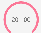
当前圈子:(图片1)

我需要的圆圈:
形状:
<?xml version="1.0" encoding="utf-8"?>
<layer-list xmlns:android="http://schemas.android.com/apk/res/android">
    <item>
        <shape android:shape="ring" android:innerRadiusRatio="2.5" android:useLevel="false"
            android:thicknessRatio="12">
            <solid android:color="#DDD"/>
     </shape>
    </item>
    <item>
        <shape android:shape="ring" android:innerRadiusRatio="2.5" android:useLevel="true"
            android:thicknessRatio="12">
            <solid android:color="@color/colorAccent"/>
        </shape>
    </item>
</layer-list>
布局:
<?xml version="1.0" encoding="utf-8"?>
<androidx.constraintlayout.widget.ConstraintLayout xmlns:android="http://schemas.android.com/apk/res/android"
    xmlns:app="http://schemas.android.com/apk/res-auto"
    xmlns:tools="http://schemas.android.com/tools"
    android:layout_width="match_parent"
    android:layout_height="match_parent">
    tools:context=".MainActivity">

    <ProgressBar
        android:id="@+id/timerProgressBar"
        android:layout_width="0dp"
        android:layout_height="0dp"
        app:layout_constraintDimensionRatio="1:1"
        android:indeterminateOnly="false"
        android:progressDrawable="@drawable/circle"
        android:rotation="-90"
        app:layout_constraintBottom_toTopOf="@+id/guidelineBottom"
        app:layout_constraintEnd_toEndOf="parent"
        app:layout_constraintStart_toStartOf="parent"
        app:layout_constraintTop_toTopOf="@+id/guidelinetop"
        android:progress="10"/>

    <androidx.constraintlayout.widget.Guideline
        android:id="@+id/guidelineBottom"
        android:layout_width="wrap_content"
        android:layout_height="wrap_content"
        android:orientation="horizontal"
        app:layout_constraintGuide_percent="0.5" />

    <androidx.constraintlayout.widget.Guideline
        android:id="@+id/guidelinetop"
        android:layout_width="wrap_content"
        android:layout_height="wrap_content"
        android:orientation="horizontal"
        app:layout_constraintGuide_percent="0.1" />


</androidx.constraintlayout.widget.ConstraintLayout>
解决方法
如果您不想自己绘制条形,可以使用https://github.com/futuredapp/donut。它是高度可定制的,因此您可以轻松实现所需的行为。

您可以使用材料组件库提供的CircularProgressIndicator。
类似的东西:
        <com.google.android.material.progressindicator.CircularProgressIndicator
            android:id="@+id/progress"
            app:growMode="bidirectional"
            app:trackThickness="8dp"
            app:indicatorColor="@color/green"
            app:trackColor="@color/grey"
            app:circularRadius="100dp"
            app:trackCornerRadius="8dp"
            android:progress="75"
            android:rotation="225"
            .../>
使用以下属性:
-
trackColor,您可以更改灰色/未覆盖部分的颜色。使用父级背景色将其隐藏。 -
trackCornerRadius更改指标的圆角。
您必须根据进度值应用旋转。
progress.rotation = 180+((1-value/100)/2*360)


注意:它至少需要版本 1.3.0-alpha04 。

您需要将#DDD颜色替换为透明颜色,并可以在其上方放置文本,这将为您提供所需的设计
<?xml version="1.0" encoding="utf-8"?>
<layer-list xmlns:android="http://schemas.android.com/apk/res/android">
    <item>
        <shape android:shape="ring" android:innerRadiusRatio="2.5" android:useLevel="false"
            android:thicknessRatio="12">
            <solid android:color="@android:color/transparent"/>
        </shape>
    </item>
    <item>
        <shape android:shape="ring" android:innerRadiusRatio="2.5" android:useLevel="true"
            android:thicknessRatio="12">
            <solid android:color="@color/colorAccent"/>
        </shape>
    </item>
</layer-list>
我认为您可以使用Lottie解决问题。有多个LottieFiles可用,或者您可以使用自己的SVG并在应用程序中使用Lottie加载它们。
例如。如果你用这个 https://assets9.lottiefiles.com/datafiles/cOSizCzzp3gv6Qv/data.json, 您可以将视图尺寸设置为显示圆的2/3,然后 可以设置动画的持续时间。您还可以设置开始帧 和动画的结束帧。
有多个可用的自定义选项。您可以在这里找到更多的彩票文件:https://lottiefiles.com/ 以及此处的实现:https://github.com/airbnb/lottie-android
希望这会有所帮助,祝你好运!