问题描述
需要帮助使表格具有响应性。
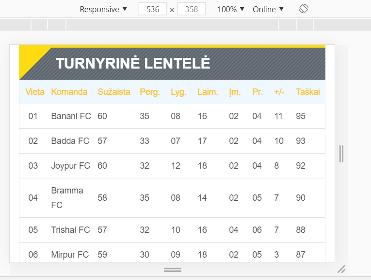
在这个尺寸上一切正常:
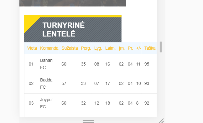
但是当屏幕尺寸减小时,我会变得像这样:
表格显示在 col-md-7 上:
<div class="row">
                    <div class="col-md-7">
                        <div class="ritekhela-fancy-title-two">
                            <h2>Turnyrinė lentelė</h2>
                        </div>

                        <div class="rs-point-table sec-spacer">
                            <div class="tab-content">
                                <table>
                                    <tr>
                                        <td>Vieta</td>
                                        <td class="team-name">Komanda</td>
                                        <td>Sužaista</td>
                                        <td>Perg.</td>
                                        <td>Lyg.</td>
                                        <td>Laim.</td>
                                        <td>Įm.</td>
                                        <td>Pr.</td>
                                        <td>+/-</td>
                                        <td>Taškai</td>
                                    </tr>
                                    <tr>
                                        <td>01</td>
                                        <td class="team-name">Banani FC</td>
                                        <td>60</td>
                                        <td>35</td>
                                        <td>08</td>
                                        <td>16</td>
                                        <td>02</td>
                                        <td>04</td>
                                        <td>11</td>
                                        <td>95</td>
                                    </tr>
                                   </table>
                            </div>
                        </div>
                    </div>
已编辑:
如果我尝试添加最大和最小宽度,标记的位置会减少太多:
解决方法
我看过你的第二个example。
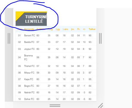
麻烦的部分显然是你的标题栏,它的元素在类 ritekhela-fancy-title-two
你有一个环绕这个类的 div,名为 row,这个 div 需要设置以适应嵌套内容的宽度。
由于 fit-content 是实验性的且 not available at all browsers,您需要将宽度设置为 auto 并使其表现为内联块
然后您必须将 ritekhela-fancy-title-two 类的宽度设置为 auto 并移除 float:left,或者将其设置为 float:none 并且它既不会在大屏幕上溢出也不会展开到小屏幕上表格的宽度。
就是这样,检查 fiddle 并实施上述更改
这些是更改/添加的两个 css 样式:
.row {
    width: fit-content; /*works with Chrome,but not with FF*/
    width: auto;
    display: inline-block;
}

.ritekhela-fancy-title-two {
    float: none;
    width: auto;
    padding: 12px 20px 12px 60px;
    border-top: 7px solid;
    background: url(/css/images/transparent-pattren.png);
    position: relative;
    margin-top: 30px;
    background-color: #6c757d;
}
编辑:如上更改也会影响下方的标题栏,这很容易纠正,为第二行增加一些高度:
.ec-nextmatch {
    border: 1px solid #f3f3f3;
    border-top: none;
    background-color: #fff;
    margin-bottom: 60px;
    float:none;
    height:90px;
    width:auto;
}
也从这个 css 中删除 .ec-nextmatch,所以现在看起来:
.ec-team-matches,.ec-match-countdown,.ec-match-countdown .countdown-row,.ec-ticket-button {
    float: left;
    width: 100%;
}
如果您想避免减小字体大小、表格单元格宽度等的麻烦。我建议使用 Bootstrap 响应式表格实用程序,基本上可以使表格水平滚动。可以这样实现...
...
<div class="tab-content table-responsive">
    <table class="table">
        ...
    </table>
</div>
...