问题描述
我想仅使用 CSS 和 HTML 获得简单的文本擦除效果的每个人,我有一个非常简单的代码。
我的目标是,当文本框缩小时文本不会调整大小,这就是我想要实现这种类型的文本擦除效果的方式。请注意,我需要一个完全透明的背景,因为我想将它用作抽搐的子警报。
有没有什么选项让文本保持在固定位置(右侧),当文本框从左到右擦拭时。
.containner{
width: 200px;
height: 150px;
background-color:green;

overflow: hidden;
position: relative;

}
.innercon{
    right: 0%;
width: 200px;
height: 50px;
background-color: pink;
animation: animaitonx;
animation-duration: 5s;
animation-iteration-count: infinite;
overflow: hidden;
position: absolute;
/*animation-delay: 10s;*/

}
@keyframes animaitonx{
    from{
        width: 200px;

    }
    to{
        width:0px;

    }
}
#copy{
    position: static;
}
.texttHolder{

    width:200px;
    text-align: right;

    color:red
}
<body onload="mainx()">
<div id="containner" class="containner">
<div class="innercon">
<div class="texttHolder" id="copy">
here is your text
</div>
<div id="paste">
</div>
</div>
</div>
</body>解决方法
一个简单的遮罩效果就可以做到:
h1 {
color: #fff;
display: table;
margin: 50px auto;
font-family: sans-serif;
font-size: 60px;
-webkit-mask-image: linear-gradient(to right,transparent 40%,#fff 60%);
-webkit-mask-position: right;
-webkit-mask-size: 250% 100%;
animation: hide 2s linear forwards;
}
h1.opposite {
-webkit-mask-image: linear-gradient(to left,#fff 60%);
animation-direction: reverse;
}
@keyframes hide {
to {
-webkit-mask-position: left;
}
}
body {
background: linear-gradient(to right,red,green);
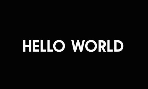
}<h1>A sample text</h1>
<h1 class="opposite">A sample text</h1>