问题描述
几个小时以来,我一直在研究与此相关的几件事。我终于让它工作了,但不知何故它又坏了。所以我来了。
对于我的用例,我想用 Packery 显示图像。图像必须自行排序,以便网格没有间隙。用户将能够选择网格内图像的大小,网格应相应排序。
对于我尝试过的每一种方法,它们都会显示在页面的其余部分,或者堆叠在一起。
我用 Masonry、Packery 和 Isotope 对此进行了测试。都给出相同的结果。 我下面的代码示例是 Packery 的尝试。
编辑: 经过更多测试,我发现只有在组合高度和宽度类时才会出现此问题。当仅存在其中之一时,不会发生重叠。不过我确实需要这个功能。
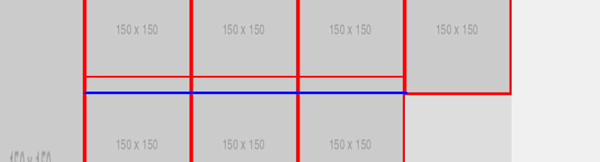
蓝线显示图像的结束位置。
$(document).ready(function() {
  let $grid = $('.grid').imagesLoaded(function() {
    // init Packery after all images have loaded
    $('.grid').packery({
      itemSelector: '.grid-item',percentPosition: true
    });
    $grid.packery('layout');
  });

  // I have also tried this approach
  let $grid = $('.grid').packery({
    itemSelector: '.grid-item',percentPosition: true
  });
  // layout Packery after each image loads
  $grid.imagesLoaded().progress(function() {
    $grid.packery();
  });
});
* {
box-sizing: border-box;
}
/* force scrollbar,prevents initial gap */
html {
overflow-y: scroll;
}
body {
font-family: sans-serif;
}
/* ---- grid ---- */
.grid {
background: #DDD;
}
/* clear fix */
.grid:after {
content: '';
display: block;
clear: both;
}
/* ---- .element-item ---- */
/* 5 columns,percentage width */
.grid-item {
float: left;
width: 16.667%;
height: 200px;
}
.grid-item img {
display: block;
width: 100%;
height: 100%;
}
.grid-item--small-width {
width: 16.667%;
}
/*Small*/
.grid-item--double-small-width {
width: 33.334%;
}
/*Double*/
.grid-item--half-width {
width: 50%;
}
/*Half*/
.grid-item--three-fourth-width {
width: 66.668%;
}
/*Bit More Than Half*/
.grid-item--big-width {
width: 83.335%;
}
/*Big*/
.grid-item--full-width {
width: 100%;
}
/*Full*/
.grid-item--small-height {
height: 16.667%;
}
/*Small*/
.grid-item--double-small-height {
height: 33.334%;
}
/*Double*/
.grid-item--half-height {
height: 50%;
}
/*Half*/
.grid-item--three-fourth-height {
height: 66.668%;
}
/*Bit More Than Half*/
.grid-item--big-height {
height: 83.335%;
}
/*Big*/
.grid-item--full-height {
height: 100%;
}
/*Full*/<link href="https://cdn.jsdelivr.net/npm/bootstrap@5.0.0-beta1/dist/css/bootstrap.min.css" rel="stylesheet">
<link rel="stylesheet" type="text/css" href="css/masonry.classes.css">
<section>
<div class="container-fluid text-center" style="background-color: white; color: black">
<div class="container" style="margin-bottom: 20px">
<div class="row">
<h1>Portfolio</h1>
<div class="col-md-12">
<div class="grid" style="height: 1200px;">
<div class="grid-sizer"></div>
<div class="grid-item grid-item--small-width grid-item--full-height"><img class="img-responsive" src="http://landstededev.test/storage/projects/projectImage_4.png"></div>
<div class="grid-item grid-item--small-width grid-item--half-height"><img class="img-responsive" src="http://landstededev.test/storage/projects/projectImage_4.png"></div>
<div class="grid-item grid-item--small-width grid-item--small-height"><img class="img-responsive" src="http://landstededev.test/storage/projects/projectImage_4.png"></div>
<div class="grid-item grid-item--small-width grid-item--small-height"><img class="img-responsive" src="http://landstededev.test/storage/project/projectImage_4.png"></div>
<div class="grid-item grid-item--full-width grid-item--small-height"><img class="img-responsive" src="http://landstededev.test/storage/projects/projectImage_4.png"></div>
<div class="grid-item grid-item--small-width grid-item--small-height"><img class="img-responsive" src="http://landstededev.test/storage/projects/projectImage_4.png"></div>
<div class="grid-item grid-item--small-width grid-item--small-height"><img class="img-responsive" src="http://landstededev.test/storage/projects/projectImage_4.png"></div>
<div class="grid-item grid-item--small-width grid-item--small-height"><img class="img-responsive" src="http://landstededev.test/storage/projects/projectImage_4.png"></div>
<div class="grid-item grid-item--small-width grid-item--small-height"><img class="img-responsive" src="http://landstededev.test/storage/projects/projectImage_4.png"></div>
<div class="grid-item grid-item--small-width grid-item--small-height"><img class="img-responsive" src="http://landstededev.test/storage/projects/projectImage_4.png"></div>
</div>
</div>
</div>
</div>
</div>
</section>
<section>
<div class="container-fluid" style="background-color: #f0f0f0; color: #121212">
<div class="container">
<div class="row align-items-center justify-content-center">
<div class="col-4 text-center">
<a href="https://twitter.com/" class="btn btn-primary" style="margin: 5px; width: 100%">Link To Twitter</a>
<br>
</div>
<div class="col-8" style="border-left: 2px solid #121212">
<h2 class="title">Title</h2>
<p>Some description will go here</p>
</div>
</div>
</div>
</div>
</section>
<script src="https://code.jquery.com/jquery-3.5.1.min.js"></script>
<script type="text/javascript" src="https://unpkg.com/packery@2.1.2/dist/packery.pkgd.min.js"></script>
<script src="https://unpkg.com/imagesloaded@4/imagesloaded.pkgd.min.js"></script>无论有没有 $grid.packery('layout'); 部分,javascript 都不起作用。我把它放在这里是因为它解决了我之前遇到的一个问题。
解决方法
经过几个小时的试验后,我发现不可能将同时使用百分比的宽度和高度类结合起来。 我现在只对宽度使用百分比。高度现在使用固定的像素值。
 设置时间 控制面板
 错误1:Request method ‘DELETE‘ not supported 错误还原:...