问题描述
这是我的 Sass 代码,
我测试了几次并确认媒体查询有效
但在 Chrome devtools 中,只出现一个(75em)媒体查询(关于最大宽度)..
//mixin for media queries
@mixin for-phone {
    @media (max-width: 37.5em) { @content }; // 600px
}
@mixin for-tab-port {
    @media (max-width: 56.25em) { @content }; // 900px
}
@mixin for-tab-land {
    @media (max-width: 75em) { @content }; // 1200px
  }
@mixin for-big-desktop {
    @media (min-width: 112.5em) { @content }; // above 1800px
}
// main.scss
html {
  font-size: 62.5%; // 1rem = 10px,10/16 = 62.5%

  @include for-tab-land {
    font-size: 56.25%; // 1rem = 9px,9/16 = 50%
  }

  @include for-tab-port {
    font-size: 50%; // 1rem = 9px,9/16 = 50%
  }

  @include for-phone {
    font-size: 30%; // 1rem = 9px,9/16 = 50%
  }

  @include for-big-desktop {
    font-size: 75%; // 1rem = 9px,9/16 = 50%
  }

}
我为此挣扎了三天多。还没有找到问题所在。
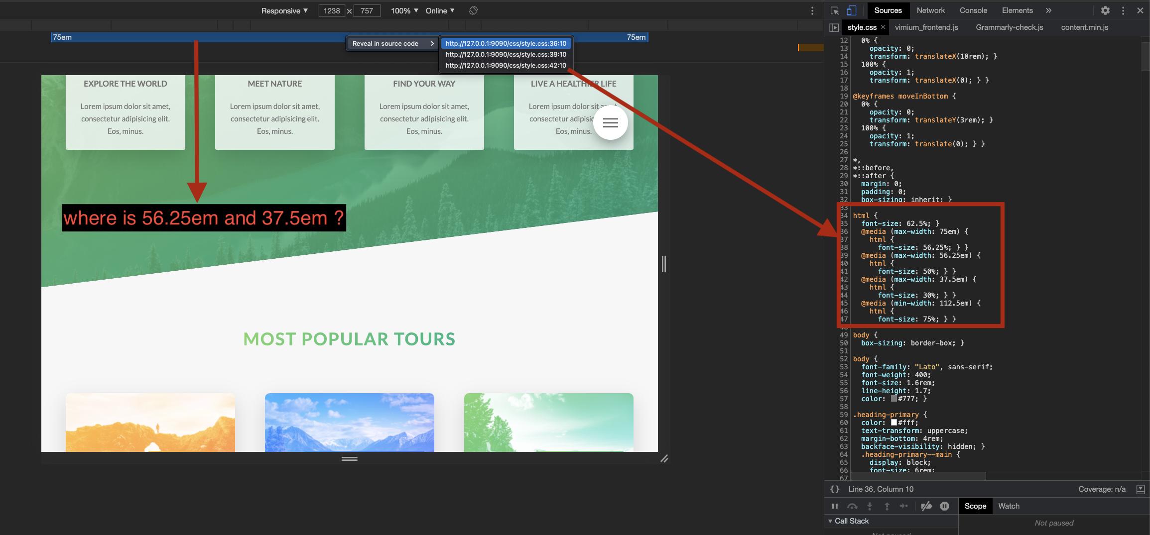
正如您在“源”面板中的屏幕截图中看到的,源代码中有 3 种媒体尺寸
但只显示了 75em。
请帮帮我....
解决方法
Chrome Dev 或 Chrome Canary 工作正常。 (都是Chrome的开发者版)
正如您在下面的屏幕截图中看到的,显示了多个最大宽度的媒体查询
