问题描述
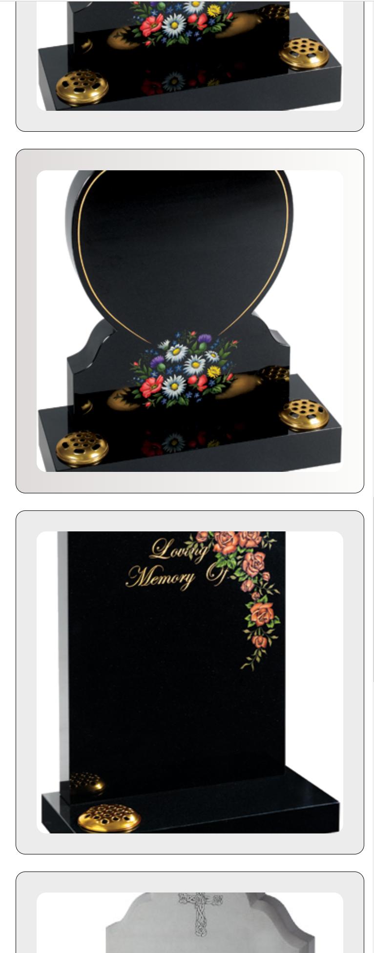
我希望我的图像行看起来像下图(边距仍在原位),但也希望图像显示 100% 的宽度。它似乎剪掉了一些图像。

我还希望它在移动视图中显示图像的整个高度和宽度。这是它在移动视图中的外观:
/* ---------------------------------------------------------------------------------------------------------------------------
START OF HEADSTONE-CATEGORY-SECTION CONTENT
---------------------------------------------------------------------------------------------------------------------------  */

.headstone-category-container {
  max-width: 100%;
  margin: 0 auto;
} /* Sets headstone category divs to take up 100% of the available width within its container */

.grid-row {
  display: flex;
  flex-flow: row wrap;
  justify-content: flex-start;
} /* Sets the way the headstone category divs are displayed (horizontally)
and allows for them to wrap round each other when screen adjusting */

.grid-item2 {
  height: 100%;
  flex-basis: 20%;
  -ms-flex: auto;
  width: 100%;
  position: relative;
  padding: 0.75%;
  Box-sizing: border-Box;
} /* Sets padding between headstone category divs,sets sizing and sets for row to be 5 divs */

.wrapping-link {
  position: absolute;
  top: 0;
  left: 0;
  bottom: 0;
  right: 0;
  z-index: 2;
  color: currentColor;
} /* Allows the user to be able to click anywhere within the headstone category div to access the href link */

.grid-item-wrapper {
  padding: 4px;
  -webkit-Box-sizing: initial;
  -moz-Box-sizing: initial;
  Box-sizing: initial;
  background: #ececec;
  margin: 0;
  height: 100%;
  width: 100%;
  overflow: hidden;
  -webkit-transition: padding 0.15s cubic-bezier(0.4,0.9,1),margin 0.15s cubic-bezier(0.4,Box-shadow 0.15s cubic-bezier(0.4,1);
  transition: padding 0.15s cubic-bezier(0.4,1);
  position: relative;border-radius: 12px;
  border: 1px solid black;
} /* Adds styling,sets sizing and sets transition speed of the headstone category div */

.grid-item-container2 {
  height: 100%;
  width: 100%;
  position: relative;
} /* Allows content to use full width and height of the headstone category div. Also styles the div. */

.grid-image-top2 {
  min-height: 375px;
  max-height: 575px;
  max-width: 100%;
  background-size: cover;
  position: relative;
  background-position: 50% 50%;
  border-radius: 12px;
  margin: 5%;
} /* Sets sizing and positioning of the images within the headstone category divs */

.grid-image-top2.lawn-memorials {
  background-image: url("https://www.kayparkmemorials.com/memorials/lawnmemorials/images/lawn43.jpg");
} /* Adds image to headstone category div for the lawn memorials */

.grid-image-top2.churchyard-memorials {
  background-image: url("https://www.kayparkmemorials.com/memorials/lawnmemorials/images/lawn13.jpg");
} /* Adds image to headstone category div for the churchyard memorials */

.grid-image-top2.children-memorials {
  background-image: url("https://www.kayparkmemorials.com/memorials/lawnmemorials/images/lawn27.jpg");
} /* Adds image to headstone category div for the children memorials */

.grid-image-top2.heart-memorials {
  background-image: url("https://www.kayparkmemorials.com/memorials/lawnmemorials/images/lawn42.jpg");
} /* Adds image to headstone category div for the heart memorials */

.grid-image-top2.books-memorials {
  background-image: url("https://www.kayparkmemorials.com/memorials/lawnmemorials/images/lawn13.jpg");
} /* Adds image to headstone category div for the books,scrolls and vases */

.grid-item-content {
  padding: 0 20px 20px 20px;
} /* Adds padding to the text within the headstone category divs */

.grid-item2:hover .grid-item-wrapper {
  padding: 1.5% 1.5%;
  margin: -1.5% -1.5%;
  background-image: linear-gradient(to right,rgb(223,219,219),rgb(252,252,250));
} /* Adds the padding for when users hover over the headstone category div. Also adds gradient to the small extra space added within the padding */

  /* 83em = 1327px*/
@media(max-width: 1327px) {
  .grid-item2 {
    flex-basis: 25%;
  } /* Sets the headstone category divs to display in a row of 4 */
}

@media(max-width: 1073px) {
   .grid-item2 {
    flex-basis: 33.33%;
  } /* Sets the headstone category divs to display in a row of 3 */
}

/* 48em = 768px*/
@media(max-width: 768px) {
  .grid-item2 {
    flex-basis: 50%;
  } /* Sets the headstone category divs to display in a row of 2 */
}

/* 36em = 577px*/
@media(max-width: 577px) {
  .grid-item2 {
    flex-basis: 100%;
    margin-bottom: 3.5%;
  } /* Adds bottom margin to the headstone category divs */
}

/* ---------------------------------------------------------------------------------------------------------------------------
END OF HEADSTONE-CATEGORY-SECTION CONTENT
---------------------------------------------------------------------------------------------------------------------------  */
<section id="headstone-category-section" class="headstone-category-section"> <!-- Start of section -->
<div class="headstone-category-container"> <!-- Start of div -->
<h1>Most Popular Headstones:</h1>
<div class="grid-row"> <!-- Start of div -->
<div class="grid-item2"> <!-- Start of div -->
<a class="wrapping-link" href="#"></a> <!-- Takes user to the designated link when user's click on the headstone category div -->
<div class="grid-item-wrapper"> <!-- Start of div -->
<div class="grid-item-container2"> <!-- Start of div -->
<div class="grid-image-top2 lawn-memorials"> <!-- Start of div -->
<span class="centered project-image-bg rex-ray-image"></span>
</div> <!-- End of div -->
</div> <!-- End of div -->
</div> <!-- End of div -->
</div> <!-- End of div -->
<div class="grid-item2"> <!-- Start of div -->
<a class="wrapping-link" href="#"></a> <!-- Takes user to the designated link when user's click on the headstone category div -->
<div class="grid-item-wrapper"> <!-- Start of div -->
<div class="grid-item-container2"> <!-- Start of div -->
<div class="grid-image-top2 churchyard-memorials"> <!-- Start of div -->
<span class="centered project-image-bg sputnik-image"></span>
</div> <!-- End of div -->
</div> <!-- End of div -->
</div> <!-- End of div -->
</div> <!-- End of div -->
<div class="grid-item2"> <!-- Start of div -->
<a class="wrapping-link" href="#"></a> <!-- Takes user to the designated link when user's click on the headstone category div -->
<div class="grid-item-wrapper"> <!-- Start of div -->
<div class="grid-item-container2"> <!-- Start of div -->
<div class="grid-image-top2 children-memorials"> <!-- Start of div -->
<span class="centered project-image-bg edgex-image"></span>
</div> <!-- End of div -->
</div> <!-- End of div -->
</div> <!-- End of div -->
</div> <!-- End of div -->
<div class="grid-item2"> <!-- Start of div -->
<a class="wrapping-link" href="#"></a> <!-- Takes user to the designated link when user's click on the headstone category div -->
<div class="grid-item-wrapper"> <!-- Start of div -->
<div class="grid-item-container2"> <!-- Start of div -->
<div class="grid-image-top2 heart-memorials"> <!-- Start of div -->
<span class="centered project-image-bg openswitch-image"></span>
</div> <!-- End of div -->
</div> <!-- End of div -->
</div> <!-- End of div -->
</div> <!-- End of div -->
<div class="grid-item2"> <!-- Start of div -->
<a class="wrapping-link" href="#"></a> <!-- Takes user to the designated link when user's click on the headstone category div -->
<div class="grid-item-wrapper"> <!-- Start of div -->
<div class="grid-item-container2"> <!-- Start of div -->
<div class="grid-image-top2 books-memorials"> <!-- Start of div -->
<span class="centered project-image-bg scaleio-image"></span>
</div> <!-- End of div -->
</div> <!-- End of div -->
</div> <!-- End of div -->
</div> <!-- End of div -->
</div> <!-- End of div -->
</div> <!-- End of div -->
</div> <!-- End of heastone-category-container div -->
</section> <!-- This section displays the headstone-category-section -->解决方法
主要问题是background-size: cover;。如果将其设置为 contain,则在调整浏览器大小时不应裁剪图像。请注意,我还添加了 background-repeat: no-repeat;。现在边框有点奇怪,但这是一个不同的问题,我建议您使用白色背景和灰色边框来实现您的原始实现。
/* ---------------------------------------------------------------------------------------------------------------------------
START OF HEADSTONE-CATEGORY-SECTION CONTENT
---------------------------------------------------------------------------------------------------------------------------  */

.headstone-category-container {
  max-width: 100%;
  margin: 0 auto;
} /* Sets headstone category divs to take up 100% of the available width within its container */

.grid-row {
  display: flex;
  flex-flow: row wrap;
  justify-content: flex-start;
} /* Sets the way the headstone category divs are displayed (horizontally)
and allows for them to wrap round each other when screen adjusting */

.grid-item2 {
  height: 100%;
  flex-basis: 20%;
  -ms-flex: auto;
  width: 100%;
  position: relative;
  padding: 0.75%;
  box-sizing: border-box;
} /* Sets padding between headstone category divs,sets sizing and sets for row to be 5 divs */

.wrapping-link {
  position: absolute;
  top: 0;
  left: 0;
  bottom: 0;
  right: 0;
  z-index: 2;
  color: currentColor;
} /* Allows the user to be able to click anywhere within the headstone category div to access the href link */

.grid-item-wrapper {
  padding: 4px;
  -webkit-box-sizing: initial;
  -moz-box-sizing: initial;
  box-sizing: initial;
  background: #ececec;
  margin: 0;
  height: 100%;
  width: 100%;
  overflow: hidden;
  -webkit-transition: padding 0.15s cubic-bezier(0.4,0.9,1),margin 0.15s cubic-bezier(0.4,box-shadow 0.15s cubic-bezier(0.4,1);
  transition: padding 0.15s cubic-bezier(0.4,1);
  position: relative;border-radius: 12px;
  border: 1px solid black;
} /* Adds styling,sets sizing and sets transition speed of the headstone category div */

.grid-item-container2 {
  height: 100%;
  width: 100%;
  position: relative;
} /* Allows content to use full width and height of the headstone category div. Also styles the div. */

.grid-image-top2 {
  min-height: 375px;
  max-height: 575px;
  max-width: 100%;
  background-size: contain;
  background-repeat: no-repeat;
  position: relative;
  background-position: 50% 50%;
  border-radius: 12px;
  margin: 5%;
} /* Sets sizing and positioning of the images within the headstone category divs */

.grid-image-top2.lawn-memorials {
  background-image: url("https://www.kayparkmemorials.com/memorials/lawnmemorials/images/lawn43.jpg");
} /* Adds image to headstone category div for the lawn memorials */

.grid-image-top2.churchyard-memorials {
  background-image: url("https://www.kayparkmemorials.com/memorials/lawnmemorials/images/lawn13.jpg");
} /* Adds image to headstone category div for the churchyard memorials */

.grid-image-top2.children-memorials {
  background-image: url("https://www.kayparkmemorials.com/memorials/lawnmemorials/images/lawn27.jpg");
} /* Adds image to headstone category div for the children memorials */

.grid-image-top2.heart-memorials {
  background-image: url("https://www.kayparkmemorials.com/memorials/lawnmemorials/images/lawn42.jpg");
} /* Adds image to headstone category div for the heart memorials */

.grid-image-top2.books-memorials {
  background-image: url("https://www.kayparkmemorials.com/memorials/lawnmemorials/images/lawn13.jpg");
} /* Adds image to headstone category div for the books,scrolls and vases */

.grid-item-content {
  padding: 0 20px 20px 20px;
} /* Adds padding to the text within the headstone category divs */

.grid-item2:hover .grid-item-wrapper {
  padding: 1.5% 1.5%;
  margin: -1.5% -1.5%;
  background-image: linear-gradient(to right,rgb(223,219,219),rgb(252,252,250));
} /* Adds the padding for when users hover over the headstone category div. Also adds gradient to the small extra space added within the padding */

  /* 83em = 1327px*/
@media(max-width: 1327px) {
  .grid-item2 {
    flex-basis: 25%;
  } /* Sets the headstone category divs to display in a row of 4 */
}

@media(max-width: 1073px) {
   .grid-item2 {
    flex-basis: 33.33%;
  } /* Sets the headstone category divs to display in a row of 3 */
}

/* 48em = 768px*/
@media(max-width: 768px) {
  .grid-item2 {
    flex-basis: 50%;
  } /* Sets the headstone category divs to display in a row of 2 */
}

/* 36em = 577px*/
@media(max-width: 577px) {
  .grid-item2 {
    flex-basis: 100%;
    margin-bottom: 3.5%;
  } /* Adds bottom margin to the headstone category divs */
}

/* ---------------------------------------------------------------------------------------------------------------------------
END OF HEADSTONE-CATEGORY-SECTION CONTENT
---------------------------------------------------------------------------------------------------------------------------  */
<section id="headstone-category-section" class="headstone-category-section"> <!-- Start of section -->
<div class="headstone-category-container"> <!-- Start of div -->
<h1>Most Popular Headstones:</h1>
<div class="grid-row"> <!-- Start of div -->
<div class="grid-item2"> <!-- Start of div -->
<a class="wrapping-link" href="#"></a> <!-- Takes user to the designated link when user's click on the headstone category div -->
<div class="grid-item-wrapper"> <!-- Start of div -->
<div class="grid-item-container2"> <!-- Start of div -->
<div class="grid-image-top2 lawn-memorials"> <!-- Start of div -->
<span class="centered project-image-bg rex-ray-image"></span>
</div> <!-- End of div -->
</div> <!-- End of div -->
</div> <!-- End of div -->
</div> <!-- End of div -->
<div class="grid-item2"> <!-- Start of div -->
<a class="wrapping-link" href="#"></a> <!-- Takes user to the designated link when user's click on the headstone category div -->
<div class="grid-item-wrapper"> <!-- Start of div -->
<div class="grid-item-container2"> <!-- Start of div -->
<div class="grid-image-top2 churchyard-memorials"> <!-- Start of div -->
<span class="centered project-image-bg sputnik-image"></span>
</div> <!-- End of div -->
</div> <!-- End of div -->
</div> <!-- End of div -->
</div> <!-- End of div -->
<div class="grid-item2"> <!-- Start of div -->
<a class="wrapping-link" href="#"></a> <!-- Takes user to the designated link when user's click on the headstone category div -->
<div class="grid-item-wrapper"> <!-- Start of div -->
<div class="grid-item-container2"> <!-- Start of div -->
<div class="grid-image-top2 children-memorials"> <!-- Start of div -->
<span class="centered project-image-bg edgex-image"></span>
</div> <!-- End of div -->
</div> <!-- End of div -->
</div> <!-- End of div -->
</div> <!-- End of div -->
<div class="grid-item2"> <!-- Start of div -->
<a class="wrapping-link" href="#"></a> <!-- Takes user to the designated link when user's click on the headstone category div -->
<div class="grid-item-wrapper"> <!-- Start of div -->
<div class="grid-item-container2"> <!-- Start of div -->
<div class="grid-image-top2 heart-memorials"> <!-- Start of div -->
<span class="centered project-image-bg openswitch-image"></span>
</div> <!-- End of div -->
</div> <!-- End of div -->
</div> <!-- End of div -->
</div> <!-- End of div -->
<div class="grid-item2"> <!-- Start of div -->
<a class="wrapping-link" href="#"></a> <!-- Takes user to the designated link when user's click on the headstone category div -->
<div class="grid-item-wrapper"> <!-- Start of div -->
<div class="grid-item-container2"> <!-- Start of div -->
<div class="grid-image-top2 books-memorials"> <!-- Start of div -->
<span class="centered project-image-bg scaleio-image"></span>
</div> <!-- End of div -->
</div> <!-- End of div -->
</div> <!-- End of div -->
</div> <!-- End of div -->
</div> <!-- End of div -->
</div> <!-- End of div -->
</div> <!-- End of heastone-category-container div -->
</section> <!-- This section displays the headstone-category-section -->