顶部黑条,中间部分和底部黑条都是弹性项目,它们是正文标签内部的包装div的子项,如下所示.
<!DOCTYPE html>
<html lang="en">
<head>
    <Meta charset="utf-8">
    <Meta http-equiv="X-UA-Compatible" content="IE=edge">
    <Meta name="viewport" content="width=device-width,initial-scale=1">
    <link href='https://fonts.googleapis.com/css?family=Open+Sans:400,300,300italic,400italic,600,600italic,700,700italic' rel='stylesheet' type='text/css'>
    <link href="~/Styles/bootstrap.min.css" rel="stylesheet" />
    <link href="~/Styles/font-awesome.min.css" rel="stylesheet" />
    <link href="~/Styles/ppt_site.css" rel="stylesheet" />
</head>
<body>
    <div class="wrapper">

        <div id="topRow">
        </div>

        <div id="centralRow">

            <div id="sidebarColumn">
            </div>

            <div id="contentColumn">
            </div>

        </div>

        <div id="bottomrow">
        </div>

    </div>

    @Section['customScripts']
    <script src="~/Scripts/siteGlobals.js"></script>

    <script src="~/requireconfig"></script>
    <script data-main="~/scripts/NewTemplatesAppLoader.js" src="~/requirejs"></script>

</body>
</html>
控制所有这些的样式表如下
.wrapper,html,body {
    height: 100%;
    margin: 0;
}

.wrapper {
    display: flex;
    -ms-flex-direction: column;
    -webkit-flex-direction: column;
    flex-direction: column;
}

#topRow {
    background-color: black;
    color: white;
}

#centralRow {
    -ms-flex: 1;
    -webkit-flex: 1;
    flex: 1;
    display: flex;
    -ms-flex-direction: row;
    -webkit-flex-direction: row;
    flex-direction: row;
}

#bottomrow {
    background-color: #333333;
    color: white;
}

#sidebarColumn {
    background-color: #B83B1D;
    color: white;
}

#contentColumn {
    -ms-flex: 1;
    -webkit-flex: 1;
    flex: 1;
    background-color: #F7F7F7;
    color: black;
    padding: 10px;
    overflow-y: auto;
}
至于主要布局,这一切都很完美,你会注意到,如果你看图像,红色侧栏作为顶部的区域,带有黄色边框.
该区域注定是一个div,它延伸了上面CSS中红色区域(Sidebar Column)的整个高度,但是尝试我可能无法让它做我需要的东西.
理想情况下,我希望它是一个div,这是一个flex容器,然后我可以放入4个flex项目,并且每个都占用每个可用空间的四分之一,但因为带有黄色边框的div似乎不能看到父容器的高度(红色侧边栏,这是一个弹性项目本身)然后它只占用它的内容周围的空间高度.
我已经尝试将它包装在更多的div中并定位这些div,我已经在更多的div中包装了更多的flex盒,我尝试了块,内联,表格单元以及我能想到的其他所有内容.
无论我尝试什么,我似乎无法让黄色镶边容器与其父亲的高度相同.
任何人的想法?
更新(第二天早上)
提出的2个解决方案确实可以自行完成,并且它们的工作方式也符合我的预期.
然而,在我的特定情况下,它们不起作用.
我正在使用NancyFX的超级简单视图引擎,而我正在使用KnockoutJS来构建“Web组件”,这样我就可以让我的作品重复使用了.
如果我编辑我的“主模板”,并将div直接插入标记中,嵌套在#sidebarColumn下面,我会得到所需大小相等的4个div.
但是,实际需要发生的是以下内容,我的模板如下所示:
<div class="wrapper">

    <div id="topRow">
        @Section['topbarContent']
    </div>

    <div id="centralRow">

        <div id="sidebarColumn">
            @Section['sidebarContent']
        </div>

        <div id="contentColumn">
            @Section['bodyContent']
        </div>

    </div>

    <div id="bottomrow">
        @Section['bottombarContent']
    </div>

</div>
如果我删除“@Section [‘sidebarContent’]”并将div直接放入其中.
如果我将div直接放在使用模板的“Page”中,如下所示:
@Master['shared/ppt_layout.html']
@Section['topbarContent']
<toptoolbar></toptoolbar>
@EndSection
@Section['sidebarContent']
<div>aaa</div>
<div>aaa</div>
<div>aaa</div>
<div>aaa</div>
@EndSection
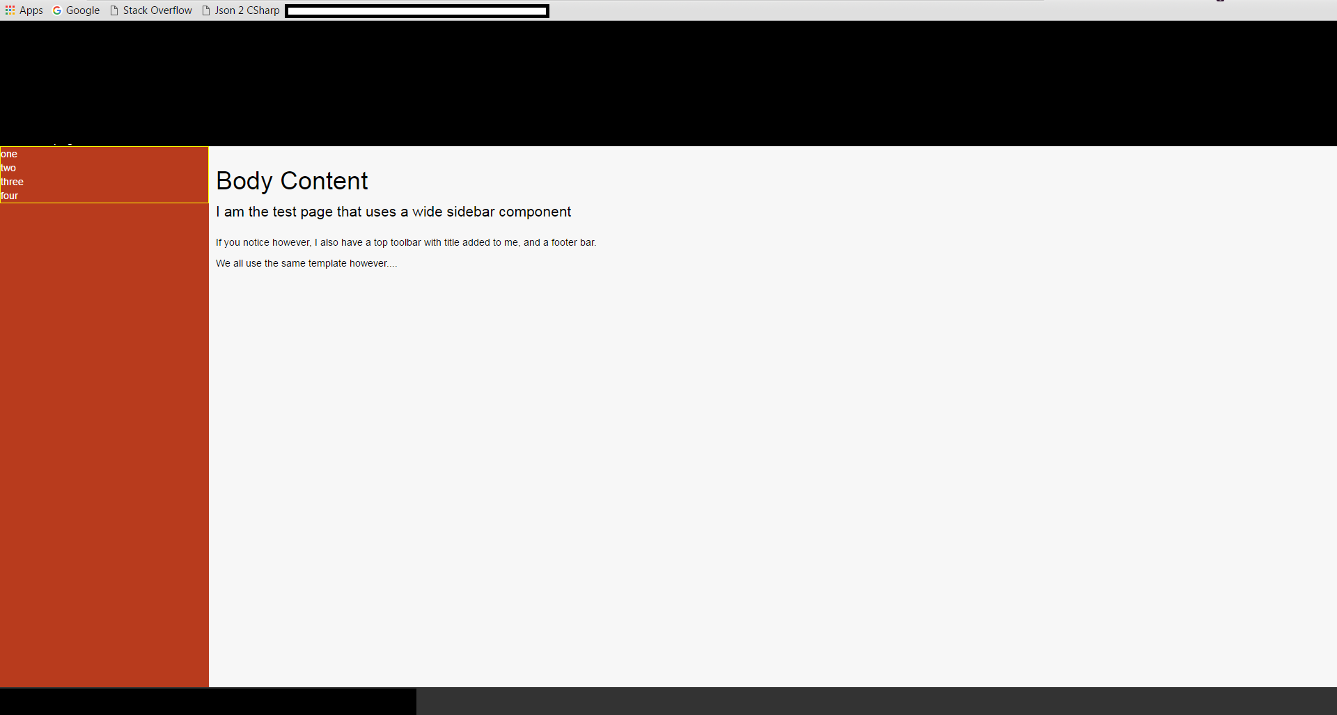
@Section['bodyContent']
<h1>Body Content</h1>
<p class="lead">I am the test page that uses a wide sidebar component</p>
<p>If you notice however,I also have a top toolbar with title added to me,and a footer bar.</p>
<p>We all use the same template however....</p>
@EndSection
@Section['bottombarContent']
<footerbar></footerbar>
@EndSection
@Section['customScripts']
@EndSection
这也有效,但是如果我将标记放在一个淘汰组件中,即使只是直接的div作为页面中的工作,那么我得到了我最初注意到的效果.
即使我尝试在组件内部构建一个新的flex布局,但垂直没有任何工作,水平但是一切都很完美.
例如,页脚栏分为左侧和右侧部分,没有任何问题,但垂直对齐只是被撤销.
解决方法
我在我的项目中使用knockout.js,特别是淘汰组件,这是造成问题的障碍.
对于那些之前没有使用过KO组件的人来说,这是一个非常简单的过程.您构建了一个JS视图模型,以及一小段HTML来提供组件显示表面.
然后你用:
ko.components.register("myComponent",{
    viewmodel: "Components/myComponent.js",template: "Components/myComponent.html"
});

ko.applyBindings();
注册您的组件.
一旦注册了组件,您就可以通过放置来简单地使用它
<myComponent></myComponent>
您希望在网页中添加它的位置.
现在这一切都很好,花花公子,但是……当KO实例化组件时,它会保留自定义标签.
所以如果你想象你的组件看起来像这样
<div>
    <div>Item...</div>
    <div>Item...</div>
    <div>Item...</div>
    <div>Item...</div>
</div>
而你的页面看起来像
<body>
    <div>
        <myComponent></myComponent>
    </div>
</body>
然后最终输出看起来像
<body>
    <div>
        <myComponent>
            <div>
                <div>Item...</div>
                <div>Item...</div>
                <div>Item...</div>
                <div>Item...</div>
            </div>
        </myComponent>
    </div>
</body>
鉴于上面的CSS中的规则,我的和两个响应者都是以包装div为目标,规则永远不会匹配目标div来启用它的flex.
密钥(正如我通过试验和错误发现的那样)是使用自定义标签名称EG:
#sidebarColumn > narrowsidebar {
     width: 70px;
     flex: 1;
     display: flex;
     flex-direction: column;
}
然后,从该父级继续进一步的flex操作.
但是,它仍然无法解释为什么当您在组件内部从头开始执行完整的flexBox布局时(即在主网页和/或模板中没有任何弹性操作),它仍然存在垂直对齐问题,如就我所知,KO对于导致这种行为的dom没有任何作用.
然而,对于我最初的问题,通过自定义标记进行定位让我得到了我需要的位置.
美女


