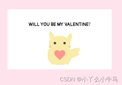
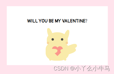
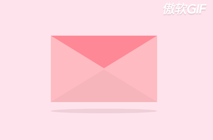
马上就要5月20号啦,准备好如何向心仪的她/他表白了嘛!特此出一篇告白小信件,效果图如下。纯html+css绘制,包含详细教程注释,干货满满哦。
链接置于文章结尾总结处。

一、叮咚!查收您的信件!
信件页面主要由信封,卡片,以及卡片上的皮卡丘组成。接下来也将分三部分进行讲解。
我们先创建envelope.html及envelope.css。
1.envelope
1.1 绘制信封主体
envelope.html
首先,绘制我们的信封,创建类名为container的<div>及类名为envelope的<div>。
我们将信封,卡片,以及卡片上的皮卡丘放在一个container中,方便我们调适三者统一的位置。
代码如下:
<!DOCTYPE html>
<html lang="en">
<head>
    <meta charset="UTF-8">
    <title>envelope</title>
    <link rel="stylesheet" href="envelope.css">
</head>
<body>
    <div class="container">
        <div class="envelope"></div>
    </div>
</body>
</html>
envelope.css
在最开始导入我们后面将会用到的字体样式。
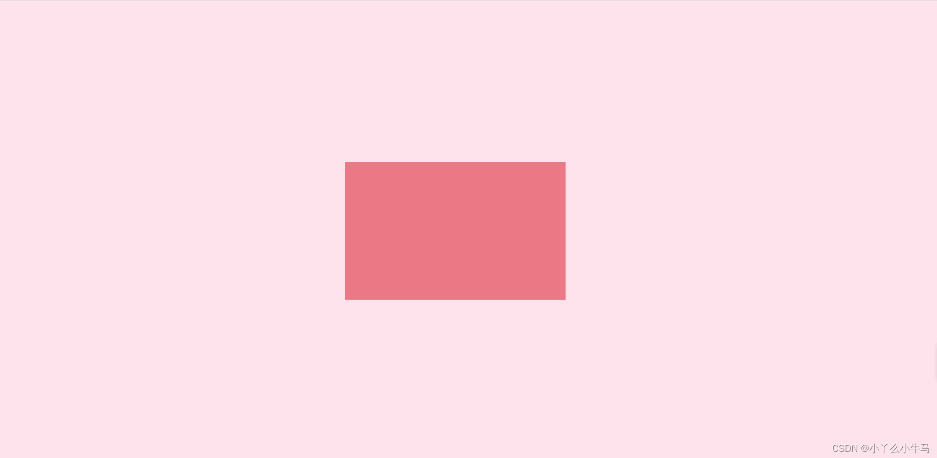
接着,重置浏览器样式,设置背景颜色,及信封颜色和大小。
其中,container和envelope均设置为相对定位。
绝对定位和相对定位,总结一下就是不希望影响到其他元素的就设置为绝对定位,反之,需要在页面中占有位置的就设置为相对定位。具体实例见此文对Absolute(绝对定位)与Relative(相对定位)的解析。
- vw:视窗宽度的百分比(1vw 代表视窗的宽度为 1%)
- vh:视窗高度的百分比
- vmin:当前 vw 和 vh 中较小的一个值
- vmax:当前 vw 和 vh 中较大的一个值
代码如下:
@import url('https://fonts.googleapis.com/css2?family=Pangolin&display=swap');
/*重置浏览器样式*/
* {
    margin: 0;
    padding: 0;
}
/*
    使主体居中
    vw:视窗宽度的百分比(1vw 代表视窗的宽度为 1%)
    vh:视窗高度的百分比
*/
body {
    height: 100vh;
    width: 100vw;
    background: #FFE3EC;
    font-family: 'Pangolin',cursive;
    font-size: 1vmin;
    /*弹性布局*/
    display: flex;
    /*设置flex子项在每个flex行的交叉轴上的中心对齐,交叉轴方向为column,即垂直方向**/
    align-items: center;
    /*设置flex子项在主轴上的中心对齐*/
    justify-content: center;
}
/*
使用相对定位(什么时候用相对定位或绝对定位?在文档流中相对定位的元素占有位置,而且会影响后面的元素(块元素、行内块元素),比如两个div并排,另外一个会换行。而绝对定位就是把该元素从文档流中踢出,不会占用文档流的位置,也不会影响后面的元素。)
vmin:当前 vw 和 vh 中较小的一个值
vmax:当前 vw 和 vh 中较大的一个值
*/
.container {
    position: relative;
    top: 0vmin;
}
/*相对定位,并设置背景色和大小*/
.envelope {
    position: relative;
    background: #eb7885;
    height: 30vmin;
    width: 48vmin;
}
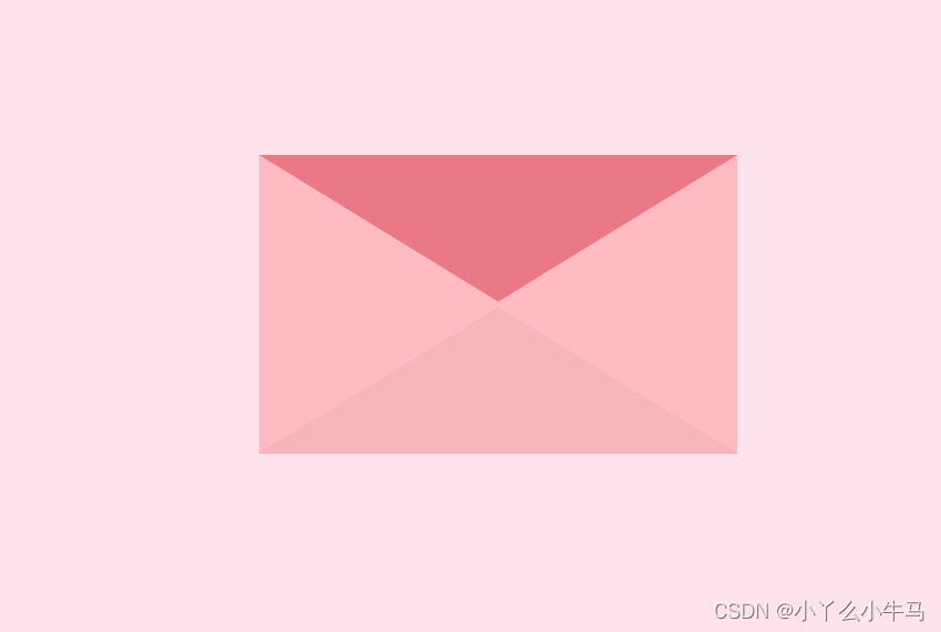
运行效果:
1.2 绘制信封细节
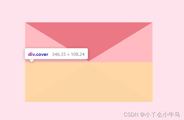
信封主要由上下左右四个颜色不同的三角形组成。
我们加入一个新的<div>命名为cover,在原先的信封上覆盖上该元素。
<div class="cover"></div>
并通过设置该元素前后伪元素的样式形成四个三角。
加入该<div>后的html代码如下:
envelop.html
<!DOCTYPE html>
<html lang="en">
<head>
    <meta charset="UTF-8">
    <title>envelope</title>
    <link rel="stylesheet" href="envelope.css">
</head>
<body>
    <div class="container">
        <div class="envelope"></div>
        <div class="cover"></div>
    </div>
</body>
</html>
envelop.css
可以看到,信封有四个三角形组成。
1.2.1 CSS绘制三角形—border法
那么如何绘制出三角形呢?
(会的看官可以直接往下)
这里我们使用 CSS 盒模型中的 border(边框) 即可实现。
原理:
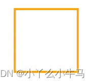
首先来看在为元素添加 border 时,border 的样子。假设有如下代码(与本文所写项目无关):
		<div></div>

		div {
		    width: 50px;
		    height: 50px;
		    border: 2px solid orange;
		}
效果图:
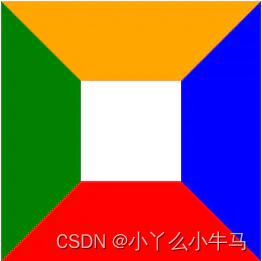
这是我们平常使用 border 最普遍的情况——往往只给 border 一个较小的宽度(通常为 1 ~ 2px);然而这样的日常用法就会容易让大家对 border 的形成方式产生误解,即认为元素的 border 是由四个矩形边框拼接而成。
然而事实并不是这样。实际上,元素的 border 是由三角形组合而成,为了说明这个问题,我们可以增大 border 的宽度,并为各 border 边设置不同的颜色:
		div {
		    width: 50px;
		    height: 50px;
		    border: 40px solid;
		    border-color: orange blue red green;
		}
效果图
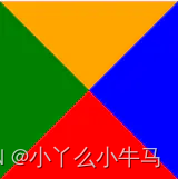
既然如此,那么更进一步,把元素的内容尺寸设置为 0 会发生什么情况呢?
		div {
		    width: 0;
		    height: 0;
		    border: 40px solid;
		    border-color: orange blue red green;
		}
效果图
我们将发现,此时元素由上下左右 4 个三角形“拼接”而成;那么,为了实现最终的效果,即保留最下方的三角形,还应该怎么做?很简单,我们只需要把其它
border 边的颜色设置为白色或透明色:
		div {
		    width: 0;
		    height: 0;
		    border: 40px solid;
		    // 分别代表:上 左右 下
		    border-color: transparent transparent red;
		}
效果图
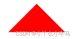
不过,被“隐藏”的上
border 仍然占据着空间,要想使得绘制出的三角形尺寸最小化,还需要将上border的宽度设置为0(其它情况同理)。
1.2.2 绘制信封
绘制我们的信件
相信看了上面的讲解,大家一定了解了如何绘制三角形了。接下来我们将cover即其前后伪元素绘制成如下三个三角形。完成我们信封的制作。
(不了解伪元素的可以看下这篇::before选择器和::after选择器)
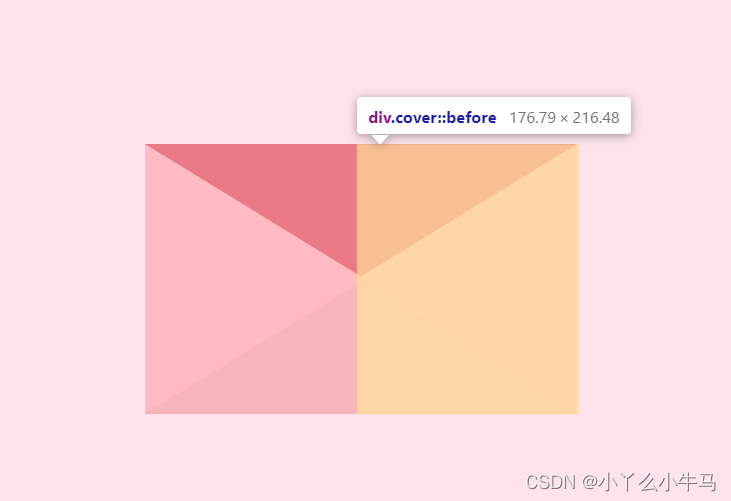
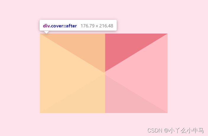
由于
cover元素不应该影响envelope元素在页面中的位置,所以设置为绝对定位。但我们又需要该元素显示在envelope之上,我们通过修改元素的堆叠顺序,来实现该效果,即设置 z-index: 3;代码如下:envelope.css
.cover {
    position: absolute;
    height: 0;
    width: 0;

    border-bottom: 15vmin solid #f5b5bb;
    border-left: 24vmin solid transparent;
    border-right: 24vmin solid transparent;
    top: 15vmin;
    z-index: 3;
}

.cover::after { /*left triangle*/
    position: absolute;
    content: '';
    border-left: 24.5vmin solid #ffbbc1;
    border-bottom: 15vmin solid transparent;
    border-top: 15vmin solid transparent;
    top: -15vmin;
    left: -24vmin;
}

.cover::before {
    position: absolute;
    content: '';
    border-right: 24.5vmin solid #ffbbc1;
    border-bottom: 15vmin solid transparent;
    border-top: 15vmin solid transparent;
    top: -15vmin;
    left: -0.5vmin;
}
最终效果如下:
1.3 信封开合动画
接着绘制信封开合的动画。信封的开合同样是一个三角形,绕信封顶部边缘旋转180°实现的。
我们先加入该三角形的<div>命名为lib加入到envelope.html中。
<div class="lid"></div>
envelope.html
<!DOCTYPE html>
<html lang="en">
<head>
    <meta charset="UTF-8">
    <title>envelope</title>
    <link rel="stylesheet" href="envelope.css">
</head>
<body>
    <div class="container">
        <div class="envelope"></div>
        <div class="cover"></div>
        <div class="lid"></div>
    </div>
</body>
</html>
接着创建信件开合的动画,分别为open和open-rev。
我们使用transform属性,该属性允许我们对元素进行旋转、缩放、移动或倾斜。
设置参数rotate(angle) 定义 2D 旋转,在参数中规定角度。在这里我们将angle分别设置为180deg和-180deg,从而实现三角形的旋转,呈现效果为信封的开合。
动画定义代码如下:
envelope.css
@keyframes open {
    100% {
        transform: rotatex(180deg);
    }
}
/*信件合上的动画*/
@keyframes open-rev {
    from {
        transform: rotatex(-180deg);
    }
}
接着,我们将该元素绘制为三角形,并通过transform-origin属性,设置旋转元素的基点位置。
通过animation属性为该元素设置定义好的动画,及动画执行时间。当鼠标hover于信封时,信封打开,反之信封合上。
代码如下:
envelope.css
.lid {
    position: absolute;
    height: 0;
    width: 0;

    border-top: 15vmin solid #ff8896;
    border-left: 24vmin solid transparent;
    border-right: 24vmin solid transparent;

    top: 0;
    /*设置旋转元素的基点位置,为盒子的顶部边缘*/
    transform-origin: top;
    animation: open-rev 2s;
}

.container:hover .lid {
    animation: open 0.5s;
    animation-fill-mode: forwards;
}
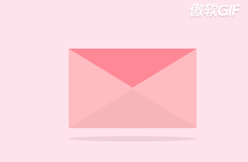
至此,我们的信封就大功告成啦!
运行效果:

1.4 加入阴影
这一步较为,简单,也可以省略该元素,加入显得稍有立体感。
首先,在envelope.html中加入类名为shadow的元素。
envelope.html
<!DOCTYPE html>
<html lang="en">
<head>
    <meta charset="UTF-8">
    <title>envelope</title>
    <link rel="stylesheet" href="envelope.css">
</head>
<body>
    <div class="container">
        <div class="envelope"></div>
        <div class="cover"></div>
        <div class="lid"></div>
        <div class="shadow"></div>
    </div>
</body>
</html>
随后设置该元素的样式,为一个较窄的横向的椭圆。
envelope.css
.shadow {
    position: relative;
    top: 3vmin;
    border-radius: 50%;
    opacity: 0.7;
    height: 2vmin;
    width: 48vmin;
    background: #e8c5d0;
}
我们envelop部分至此就完成了!
运行效果如下:
1.5 envelope全部代码
envelope.html
<!DOCTYPE html>
<html lang="en">
<head>
    <meta charset="UTF-8">
    <title>envelope</title>
    <link rel="stylesheet" href="envelope.css">
</head>
<body>
    <div class="container">
        <div class="envelope"></div>
        <div class="cover"></div>
        <div class="lid"></div>
        <div class="shadow"></div>
    </div>
</body>
</html>
envelope.css
@import url('https://fonts.googleapis.com/css2?family=Pangolin&display=swap');
/*重置浏览器样式*/
* {
    margin: 0;
    padding: 0;
}
/*
    使主体居中
    vw:视窗宽度的百分比(1vw 代表视窗的宽度为 1%)
    vh:视窗高度的百分比
*/
body {
    height: 100vh;
    width: 100vw;
    background: #FFE3EC;
    font-family: 'Pangolin',cursive;
    font-size: 1vmin;
    /*弹性布局*/
    display: flex;
    /*设置flex子项在每个flex行的交叉轴上的中心对齐,交叉轴方向为column,即垂直方向**/
    align-items: center;
    /*设置flex子项在主轴上的中心对齐*/
    justify-content: center;
}
/*
使用相对定位(什么时候用相对定位或绝对定位?在文档流中相对定位的元素占有位置,而且会影响后面的元素(块元素、行内块元素),比如两个div并排,另外一个会换行。而绝对定位就是把该元素从文档流中踢出,不会占用文档流的位置,也不会影响后面的元素。)
vmin:当前 vw 和 vh 中较小的一个值
vmax:当前 vw 和 vh 中较大的一个值
*/
.container {
    position: relative;
    top: 0vmin;
}
/*相对定位,并设置背景色和大小*/
.envelope {
    position: relative;
    background: #eb7885;
    height: 30vmin;
    width: 48vmin;
}

.cover {
    position: absolute;
    height: 0;
    width: 0;

    border-bottom: 15vmin solid #f5b5bb;
    border-left: 24vmin solid transparent;
    border-right: 24vmin solid transparent;
    top: 15vmin;
    z-index: 3;
}

.cover::after { /*left triangle*/
    position: absolute;
    content: '';
    border-left: 24.5vmin solid #ffbbc1;
    border-bottom: 15vmin solid transparent;
    border-top: 15vmin solid transparent;
    top: -15vmin;
    left: -24vmin;
}

.cover::before {
    position: absolute;
    content: '';
    border-right: 24.5vmin solid #ffbbc1;
    border-bottom: 15vmin solid transparent;
    border-top: 15vmin solid transparent;
    top: -15vmin;
    left: -0.5vmin;
}

/*创建信件打开的动画,使用rotateX(),围绕其在给定的度数在x轴旋转*/
@keyframes open {
    100% {
        transform: rotatex(180deg);
    }
}
/*信件合上的动画*/
@keyframes open-rev {
    from {
        transform: rotatex(-180deg);
    }
}

.lid {
    position: absolute;
    height: 0;
    width: 0;

    border-top: 15vmin solid #ff8896;
    border-left: 24vmin solid transparent;
    border-right: 24vmin solid transparent;

    top: 0;
    /*设置旋转元素的基点位置,为盒子的顶部边缘*/
    transform-origin: top;
    animation: open-rev 2s;
}

.container:hover .lid {
    animation: open 0.5s;
    animation-fill-mode: forwards;
}

.shadow {
    position: relative;
    top: 3vmin;
    border-radius: 50%;
    opacity: 0.7;
    height: 2vmin;
    width: 48vmin;
    background: #e8c5d0;
}
2. card
2.1 加入卡片元素并设置其样式
接着,就是绘制卡片部分了,也较为简单,是一个长方形的白色卡片,设置其样式,并为其添加滑动的动画。
首先,我们在container内添加元素<div>,并命名为card。为方便我们观察,先将关于信封的元素注释掉。
代码如下:
envelope.html
<!DOCTYPE html>
<html lang="en">
<head>
    <meta charset="UTF-8">
    <title>envelope</title>
    <link rel="stylesheet" href="envelope.css">
</head>
<body>
    <div class="container">
<!--        <div class="envelope"></div>-->
        <div class="card" id="test">

        </div>
<!--        <div class="cover"></div>-->
<!--        <div class="lid"></div>-->
<!--        <div class="shadow"></div>-->
    </div>
</body>
</html>
接着,设置样式为白色背景的长方形。
envelope.css
.card {
position: absolute;
/*白色的卡片*/
background: white;
height: 25vmin;
width: 43vmin;
display: flex;
/*设置div水平显示*/
flex-direction: column;
/*设置flex子项在每个flex行的交叉轴上的中心对齐,交叉轴方向为column,即垂直方向**/
align-items: center;
/*设置flex子项在主轴上的中心对齐*/
justify-content: center;
left: 2.5vmin;
top: 0vmin;
/*卡片落回动画*/
animation: slide-rev 0.2s ease-out;
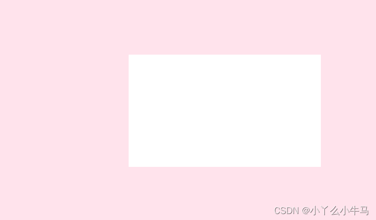
}
运行效果:
2.2 加入卡片划出的动画
首先,编写划出和落回信封的滑动动画。命名为slide和slide-rev。
我们通过transform属性来实现,设置translatey参数,使卡片纵向移动。
同时,由于卡片设置为绝对定位,为了不被信封遮挡住,我们需要在卡片划出时,提高元素的堆叠顺序,通过更改z-index属性实现。
滑动动画代码如下:
envelope.css
/*卡片划出信封*/
@keyframes slide {
    100% {
        transform: translatey(-15vmin);
        z-index: 2;
    }
}
/*卡片落回信封*/
@keyframes slide-rev {
    from {
        transform: translatey(-15vmin);
    }
}
接着,我们加入鼠标hover于信封时,卡片执行划出动画。
.container:hover .card {
    /*卡片划出动画*/
    animation: slide 0.2s;
    animation-delay: 0.5s;
    /*把卡面动画地从一个地方移动到另一个地方,并让它停留在那里。*/
    animation-fill-mode: forwards;
}
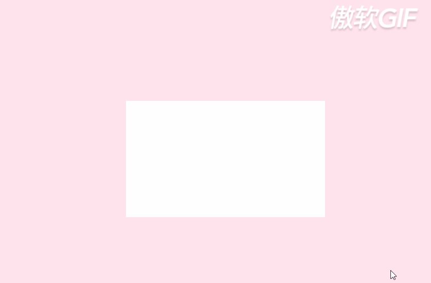
至此,我们的卡片就完成了。
运行效果:
2.3 加入卡片后的全部代码
envelope.html
<!DOCTYPE html>
<html lang="en">
<head>
    <meta charset="UTF-8">
    <title>envelope</title>
    <link rel="stylesheet" href="envelope.css">
</head>
<body>
    <div class="container">
<!--        <div class="envelope"></div>-->
        <div class="card" id="test"> </div>
<!--        <div class="cover"></div>-->
<!--        <div class="lid"></div>-->
<!--        <div class="shadow"></div>-->
    </div>
</body>
</html>
envelope.css
@import url('https://fonts.googleapis.com/css2?family=Pangolin&display=swap');
/*重置浏览器样式*/
* {
    margin: 0;
    padding: 0;
}
/*
    使主体居中
    vw:视窗宽度的百分比(1vw 代表视窗的宽度为 1%)
    vh:视窗高度的百分比
*/
body {
    height: 100vh;
    width: 100vw;
    background: #FFE3EC;
    font-family: 'Pangolin',cursive;
    font-size: 1vmin;
    /*弹性布局*/
    display: flex;
    /*设置flex子项在每个flex行的交叉轴上的中心对齐,交叉轴方向为column,即垂直方向**/
    align-items: center;
    /*设置flex子项在主轴上的中心对齐*/
    justify-content: center;
}
/*
使用相对定位(什么时候用相对定位或绝对定位?在文档流中相对定位的元素占有位置,而且会影响后面的元素(块元素、行内块元素),比如两个div并排,另外一个会换行。而绝对定位就是把该元素从文档流中踢出,不会占用文档流的位置,也不会影响后面的元素。)
vmin:当前 vw 和 vh 中较小的一个值
vmax:当前 vw 和 vh 中较大的一个值
*/
.container {
    position: relative;
    top: 0vmin;
}
/*相对定位,并设置背景色和大小*/
.envelope {
    position: relative;
    background: #eb7885;
    height: 30vmin;
    width: 48vmin;
}

.cover {
    position: absolute;
    height: 0;
    width: 0;

    border-bottom: 15vmin solid #f5b5bb;
    border-left: 24vmin solid transparent;
    border-right: 24vmin solid transparent;
    top: 15vmin;
    z-index: 3;
}

.cover::after { /*left triangle*/
    position: absolute;
    content: '';
    border-left: 24.5vmin solid #ffbbc1;
    border-bottom: 15vmin solid transparent;
    border-top: 15vmin solid transparent;
    top: -15vmin;
    left: -24vmin;
}

.cover::before {
    position: absolute;
    content: '';
    border-right: 24.5vmin solid #ffbbc1;
    border-bottom: 15vmin solid transparent;
    border-top: 15vmin solid transparent;
    top: -15vmin;
    left: -0.5vmin;
}

/*创建信件打开的动画,使用rotateX(),围绕其在给定的度数在x轴旋转*/
@keyframes open {
    100% {
        transform: rotatex(180deg);
    }
}
/*信件合上的动画*/
@keyframes open-rev {
    from {
        transform: rotatex(-180deg);
    }
}

.lid {
    position: absolute;
    height: 0;
    width: 0;

    border-top: 15vmin solid #ff8896;
    border-left: 24vmin solid transparent;
    border-right: 24vmin solid transparent;

    top: 0;
    /*设置旋转元素的基点位置,为盒子的顶部边缘*/
    transform-origin: top;
    animation: open-rev 2s;
}

.container:hover .lid {
    animation: open 0.5s;
    animation-fill-mode: forwards;
}

.shadow {
    position: relative;
    top: 3vmin;
    border-radius: 50%;
    opacity: 0.7;
    height: 2vmin;
    width: 48vmin;
    background: #e8c5d0;
}

.card {
    position: absolute;
    /*白色的卡片*/
    background: white;
    height: 25vmin;
    width: 43vmin;
    display: flex;
    /*设置div水平显示*/
    flex-direction: column;
    /*设置flex子项在每个flex行的交叉轴上的中心对齐,交叉轴方向为column,即垂直方向**/
    align-items: center;
    /*设置flex子项在主轴上的中心对齐*/
    justify-content: center;
    left: 2.5vmin;
    top: 0vmin;
    animation: slide-rev 0.2s ease-out;
}

.container:hover .card {
    /*卡片划出动画*/
    animation: slide 0.2s;
    animation-delay: 0.5s;
    /*把卡面动画地从一个地方移动到另一个地方,并让它停留在那里。*/
    animation-fill-mode: forwards;
}
/*卡片划出信封*/
@keyframes slide {
    100% {
        transform: translatey(-15vmin);
        z-index: 2;
    }
}
/*卡片落回信封*/
@keyframes slide-rev {
    from {
        transform: translatey(-15vmin);
    }
}
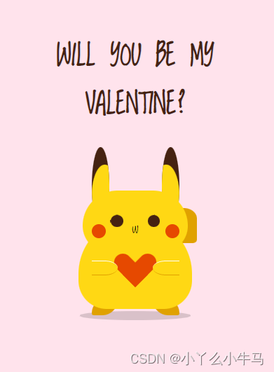
3. pikachu
现在,要开始绘制卡片上的内容啦!由文本及可爱的皮卡丘组成。为了方便观察,我们还是注释掉信封元素。
3.1加入文本
首先,我们从简单的开始,在card元素间,加入我们的文本元素,命名为message,大家可以写自己想说的话。
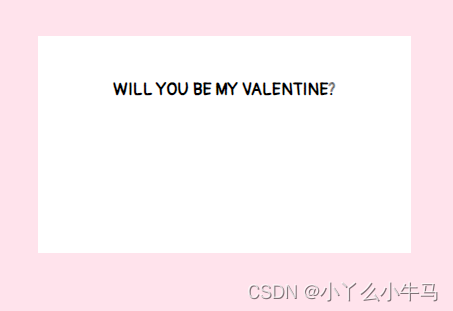
<h1 class="message" >WILL YOU BE MY VALENTINE?</h1>
加入文本后的代码:
envelope.html
<!DOCTYPE html>
<html lang="en">
<head>
    <meta charset="UTF-8">
    <title>envelope</title>
    <link rel="stylesheet" href="envelope.css">
</head>
<body>
    <div class="container">
<!--        <div class="envelope"></div>-->
        <div class="card" id="test">
            <h1 class="message" >WILL YOU BE MY VALENTINE?</h1>
        </div>
<!--        <div class="cover"></div>-->
<!--        <div class="lid"></div>-->
<!--        <div class="shadow"></div>-->
    </div>
</body>
</html>
然后,设置文本向上移。
envelope.css
运行效果:

3.2 绘制皮卡丘
皮卡丘由躯干,耳朵,尾巴,手臂,嘴巴,以及捧着的小心心组成。我们将一一绘制。
3.2.1 绘制躯干
首先,在card元素内,加入命名为pikachu的div元素。
envelope.html
<!DOCTYPE html>
<html lang="en">
<head>
    <meta charset="UTF-8">
    <title>envelope</title>
    <link rel="stylesheet" href="envelope.css">
</head>
<body>
    <div class="container">
<!--        <div class="envelope"></div>-->
        <div class="card" id="test">
            <h1 class="message" >WILL YOU BE MY VALENTINE?</h1>
            <div class="pikachu">
            </div>
        </div>
<!--        <div class="cover"></div>-->
<!--        <div class="lid"></div>-->
<!--        <div class="shadow"></div>-->
    </div>
</body>
</html>
接着,我们通过设置该元素(pikachu)及其前后伪元素的样式,来绘制躯干,眼睛,脸颊以及小脚丫。
3.2.1.1 身体
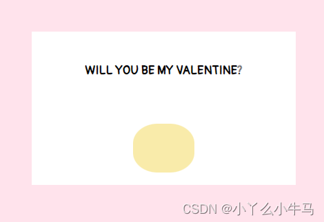
身体部分,是一个黄色的椭圆形。我们通过设置pikachu元素的样式来实现。
envelope.css
.pikachu {
    position: absolute;
    background: #f9ebaa;
    height: 8vmin;
    width: 10vmin;
    border-radius: 40%;
    top: 15vmin;
    display: flex;
}
运行效果:
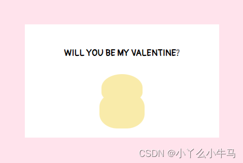
3.2.1.2 绘制头部
头部,是一个较小的黄色椭圆形。我们通过设置pikachu::before选择的伪元素的样式来实现。
envelope.css
.pikachu::before {
    content: '';
    position: absolute;
    background: #f9ebaa;
    height: 6vmin;
    width: 9vmin;
    border-radius: 90% 90% 60% 60%;
    top: -4vmin;
    left: 0.5vmin;
}
运行效果:
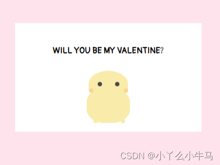
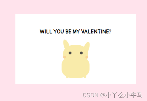
3.2.1.3 绘制眼睛,脸颊以及脚
眼睛,脸颊以及脚,通过设置pikachu::after选择的伪元素中的阴影(box-shadow)实现。
envelope.css
.pikachu::after {
    content: '';
    position: absolute;
    background: transparent;
    height: 1vmin;
    width: 1vmin;
    top: 2vmin;
    left: -1.5vmin;
    color: #4a4947;
    border-radius: 50%;
    box-shadow:
            4vmin -3.5vmin,8vmin -3.5vmin,2vmin -2vmin #fad598,10vmin -2vmin #fad598,3vmin 5vmin #f9ebaa,9.3vmin 5vmin #f9ebaa;
}
运行效果:
3.2.2 绘制耳朵及尾巴
首先,在pikachu元素内,加入命名为limbs的div元素。
envelope.html
<!DOCTYPE html>
<html lang="en">
<head>
    <meta charset="UTF-8">
    <title>envelope</title>
    <link rel="stylesheet" href="envelope.css">
</head>
<body>
    <div class="container">
<!--        <div class="envelope"></div>-->
        <div class="card" id="test">
            <h1 class="message" >WILL YOU BE MY VALENTINE?</h1>
            <div class="pikachu">
                <div class="limbs"></div>
            </div>
        </div>
<!--        <div class="cover"></div>-->
<!--        <div class="lid"></div>-->
<!--        <div class="shadow"></div>-->
    </div>
</body>
</html>
接着,我们通过设置该元素(limbs)及其前后伪元素的样式,来绘制左耳右耳及尾巴。
3.2.2.1 绘制耳朵
两只耳朵分别为两个椭圆形。形状相同,但位置及偏移角度不同。我们通过设置limbs元素及.limbs::after选择的伪元素的样式分别实现左耳和右耳。
envelope.css
.limbs {
    position: relative;
    width: 0;
    height: 0;
    border-left: 1vmin solid transparent;
    border-right: 1vmin solid transparent;
    border-bottom: 6vmin solid #f9ebaa;
    border-radius: 80%;
    top: -6vmin;
    left: 1vmin;
    transform: rotate(-20deg);
}

.limbs::after {
    content: '';
    position: absolute;
    width: 0;
    height: 0;
    border-left: 1vmin solid transparent;
    border-right: 1vmin solid transparent;
    border-bottom: 6vmin solid #f9ebaa;
    border-radius: 80%;
    top: 3vmin;
    left: 5vmin;
    transform: rotate(40deg);
}
运行效果:
3.2.2.2 绘制尾巴
尾巴也由两个椭圆形组成。我们通过设置.limbs::before选择的伪元素的样式,设置元素为椭圆形,再设置该元素的阴影(box-shadow)为相同颜色的椭圆形,绘制出尾巴。
envelope.css
.limbs::before {
    content: '';
    position: absolute;
    background: #f9ebaa;
    width: 5vmin;
    height: 2vmin;
    border-radius: 40%;
    top: 10vmin;
    left: 4vmin;
    box-shadow:
            -1vmin 1.5vmin #f9ebaa;
}
运行效果:
至此,皮卡丘的绘制就完成一大半啦!
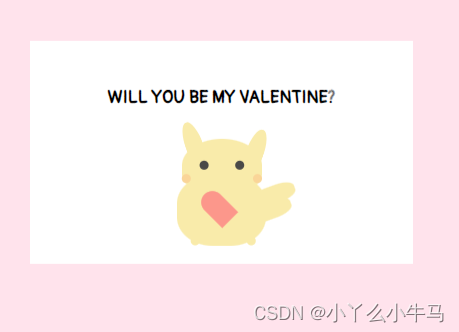
3.2.3 绘制爱心
首先,在pikachu元素内,加入命名为heart的div元素。
envelope.html
<!DOCTYPE html>
<html lang="en">
<head>
    <meta charset="UTF-8">
    <title>envelope</title>
    <link rel="stylesheet" href="envelope.css">
</head>
<body>
    <div class="container">
<!--        <div class="envelope"></div>-->
        <div class="card" id="test">
            <h1 class="message" >WILL YOU BE MY VALENTINE?</h1>
            <div class="pikachu">
                <div class="limbs"></div>
                <div class="heart"></div>
            </div>
        </div>
<!--        <div class="cover"></div>-->
<!--        <div class="lid"></div>-->
<!--        <div class="shadow"></div>-->
    </div>
</body>
</html>
爱心由两个相同的不知道怎么说的形状组成(见图),我们通过设置heart元素样式,来固定爱心的位置,设置其前后伪元素相同的样式,并将其中一个伪元素旋转一定的角度,绘制出爱心。
首先,固定位置,并绘制出两个半个的爱心。
envelope.css
.heart {
    position: relative;
    width: 5vmin;
    height: 4vmin;
    top: 2vmin;
    left: 0.6vmin;
}
.heart:before,.heart:after {
    position: absolute;
    content: "";
    left: 2.5vmin;
    top: 0;
    width: 2.5vmin;
    height: 4vmin;
    background: #fc978b;
    border-radius: 2.5vmin 2.5vmin 0 0;
    transform: rotate(-45deg);
    transform-origin: 0 100%;
}
运行效果:
由下图,可以看到,由于设置为绝对定位,两个相同的半个爱心,是重叠在一起的。
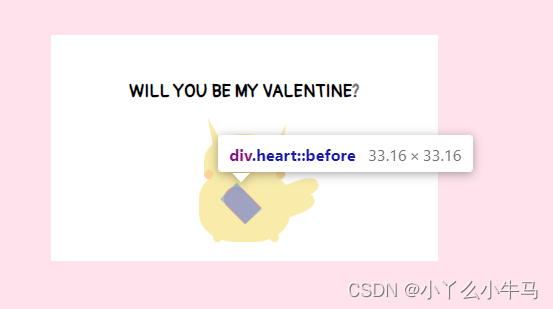
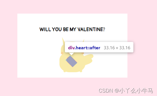
因此,我们只需要将其中一个,旋转一定的角度,使两个元素对称即可。
envelope.css
.heart:after {
    left: 0;
    transform: rotate(45deg);
    transform-origin: 100% 100%;
}
至此,我们的小爱心,也绘制完成了。
3.2.4 绘制手臂
首先,在pikachu元素内,加入命名为arms的div元素。
envelope.html
<!DOCTYPE html>
<html lang="en">
<head>
    <meta charset="UTF-8">
    <title>envelope</title>
    <link rel="stylesheet" href="envelope.css">
</head>
<body>
    <div class="container">
<!--        <div class="envelope"></div>-->
        <div class="card" id="test">
            <h1 class="message" >WILL YOU BE MY VALENTINE?</h1>
            <div class="pikachu">
                <div class="limbs"></div>
                <div class="heart"></div>
                <div class="arms"></div>
            </div>
        </div>
<!--        <div class="cover"></div>-->
<!--        <div class="lid"></div>-->
<!--        <div class="shadow"></div>-->
    </div>
</body>
</html>
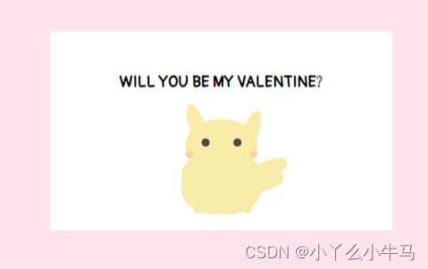
手臂也是由两个与身体颜色相同的椭圆形组成的,我们通过设置arms元素及其后伪元素的样式,绘制出两只手臂。
envelope.css
.arms {
    position: relative;
    background: #f9ebaa;
    width: 4.2vmin;
    height: 2vmin;
    border-radius: 60% 60% 90% 60% / 50% 50% 90% 90%;
    top: 3vmin;
    left: -5vmin;
}
.arms::after {
    content: '';
    position: absolute;
    background: #f9ebaa;
    width: 4vmin;
    height: 2vmin;
    border-radius: 60% 60% 90% 60% / 50% 50% 90% 90%;
    left: 5vmin;
    top: 0vmin;
}
运行效果:
3.2.5 绘制嘴巴
首先,在pikachu元素内,加入命名为smile的div元素。
envelope.html
<!DOCTYPE html>
<html lang="en">
<head>
    <meta charset="UTF-8">
    <title>envelope</title>
    <link rel="stylesheet" href="envelope.css">
</head>
<body>
    <div class="container">
<!--        <div class="envelope"></div>-->
        <div class="card" id="test">
            <h1 class="message" >WILL YOU BE MY VALENTINE?</h1>
            <div class="pikachu">
                <div class="limbs"></div>
                <div class="heart"></div>
                <div class="arms"></div>
                <div class="smile"></div>
            </div>
        </div>
<!--        <div class="cover"></div>-->
<!--        <div class="lid"></div>-->
<!--        <div class="shadow"></div>-->
    </div>
</body>
</html>
嘴巴也是由两条弧线组成的,我们通过设置smile元素及其伪元素的样式,绘制出两条弧线,组成嘴巴。
envelope.css
.smile {
    position: relative;
    background: transparent;
    height: 1vmin;
    width: 1vmin;
    border-radius: 50%;
    border-bottom: 0.3vmin solid #4a4947;
    left: -5vmin;
    top: -1.3vmin;
}

.smile::before {
    position: absolute;
    content: '';
    background: transparent;
    height: 1vmin;
    width: 1vmin;
    border-radius: 50%;
    border-bottom: 0.3vmin solid #4a4947;
    left: 0.7vmin;
}
运行效果:
4. 信件全部代码
我们的信件部分到此就完成了,解开注释看看具体效果吧。
全部代码如下:
envelope.html
<!DOCTYPE html>
<html lang="en">
<head>
    <meta charset="UTF-8">
    <title>envelope</title>
    <link rel="stylesheet" href="envelope.css">
</head>
<body>
    <div class="container">
        <div class="envelope"></div>
        <div class="card" id="test">
            <h1 class="message" >WILL YOU BE MY VALENTINE?</h1>
            <div class="pikachu">
                <div class="limbs"></div>
                <div class="heart"></div>
                <div class="arms"></div>
                <div class="smile"></div>
            </div>
        </div>
        <div class="cover"></div>
        <div class="lid"></div>
        <div class="shadow"></div>
    </div>
</body>
</html>
envelope.css
@import url('https://fonts.googleapis.com/css2?family=Pangolin&display=swap');
/*重置浏览器样式*/
* {
    margin: 0;
    padding: 0;
}
/*
    使主体居中
    vw:视窗宽度的百分比(1vw 代表视窗的宽度为 1%)
    vh:视窗高度的百分比
*/
body {
    height: 100vh;
    width: 100vw;
    background: #FFE3EC;
    font-family: 'Pangolin',cursive;
    font-size: 1vmin;
    /*弹性布局*/
    display: flex;
    /*设置flex子项在每个flex行的交叉轴上的中心对齐,交叉轴方向为column,即垂直方向**/
    align-items: center;
    /*设置flex子项在主轴上的中心对齐*/
    justify-content: center;
}
/*
使用相对定位(什么时候用相对定位或绝对定位?在文档流中相对定位的元素占有位置,而且会影响后面的元素(块元素、行内块元素),比如两个div并排,另外一个会换行。而绝对定位就是把该元素从文档流中踢出,不会占用文档流的位置,也不会影响后面的元素。)
vmin:当前 vw 和 vh 中较小的一个值
vmax:当前 vw 和 vh 中较大的一个值
*/
.container {
    position: relative;
    top: 0vmin;
}
/*相对定位,并设置背景色和大小*/
.envelope {
    position: relative;
    background: #eb7885;
    height: 30vmin;
    width: 48vmin;
}

.cover {
    position: absolute;
    height: 0;
    width: 0;

    border-bottom: 15vmin solid #f5b5bb;
    border-left: 24vmin solid transparent;
    border-right: 24vmin solid transparent;
    top: 15vmin;
    z-index: 3;
}

.cover::after { /*left triangle*/
    position: absolute;
    content: '';
    border-left: 24.5vmin solid #ffbbc1;
    border-bottom: 15vmin solid transparent;
    border-top: 15vmin solid transparent;
    top: -15vmin;
    left: -24vmin;
}

.cover::before {
    position: absolute;
    content: '';
    border-right: 24.5vmin solid #ffbbc1;
    border-bottom: 15vmin solid transparent;
    border-top: 15vmin solid transparent;
    top: -15vmin;
    left: -0.5vmin;
}

/*创建信件打开的动画,使用rotateX(),围绕其在给定的度数在x轴旋转*/
@keyframes open {
    100% {
        transform: rotatex(180deg);
    }
}
/*信件合上的动画*/
@keyframes open-rev {
    from {
        transform: rotatex(-180deg);
    }
}

.lid {
    position: absolute;
    height: 0;
    width: 0;

    border-top: 15vmin solid #ff8896;
    border-left: 24vmin solid transparent;
    border-right: 24vmin solid transparent;

    top: 0;
    /*设置旋转元素的基点位置,为盒子的顶部边缘*/
    transform-origin: top;
    animation: open-rev 2s;
}

.container:hover .lid {
    animation: open 0.5s;
    animation-fill-mode: forwards;
}

.shadow {
    position: relative;
    top: 3vmin;
    border-radius: 50%;
    opacity: 0.7;
    height: 2vmin;
    width: 48vmin;
    background: #e8c5d0;
}

.card {
    position: absolute;
    /*白色的卡片*/
    background: white;
    height: 25vmin;
    width: 43vmin;
    display: flex;
    /*设置div水平显示*/
    flex-direction: column;
    /*设置flex子项在每个flex行的交叉轴上的中心对齐,交叉轴方向为column,即垂直方向**/
    align-items: center;
    /*设置flex子项在主轴上的中心对齐*/
    justify-content: center;
    left: 2.5vmin;
    top: 0vmin;
    animation: slide-rev 0.2s ease-out;
}

.container:hover .card {
    /*卡片划出动画*/
    animation: slide 0.2s;
    animation-delay: 0.5s;
    /*把卡面动画地从一个地方移动到另一个地方,并让它停留在那里。*/
    animation-fill-mode: forwards;
}
/*卡片划出信封*/
@keyframes slide {
    100% {
        transform: translatey(-15vmin);
        z-index: 2;
    }
}
/*卡片落回信封*/
@keyframes slide-rev {
    from {
        transform: translatey(-15vmin);
    }
}

.message {
    position: absolute;
    top: 5vmin;
}

.pikachu {
    position: absolute;
    background: #f9ebaa;
    height: 8vmin;
    width: 10vmin;
    border-radius: 40%;
    top: 15vmin;
    display: flex;
}
.pikachu::before {
    content: '';
    position: absolute;
    background: #f9ebaa;
    height: 6vmin;
    width: 9vmin;
    border-radius: 90% 90% 60% 60%;
    top: -4vmin;
    left: 0.5vmin;
}
.pikachu::after {
    content: '';
    position: absolute;
    background: transparent;
    height: 1vmin;
    width: 1vmin;
    top: 2vmin;
    left: -1.5vmin;
    color: #4a4947;
    border-radius: 50%;
    box-shadow:
            4vmin -3.5vmin,9.3vmin 5vmin #f9ebaa;
}

.limbs {
    position: relative;
    width: 0;
    height: 0;
    border-left: 1vmin solid transparent;
    border-right: 1vmin solid transparent;
    border-bottom: 6vmin solid #f9ebaa;
    border-radius: 80%;
    top: -6vmin;
    left: 1vmin;
    transform: rotate(-20deg);
}

.limbs::after {
    content: '';
    position: absolute;
    width: 0;
    height: 0;
    border-left: 1vmin solid transparent;
    border-right: 1vmin solid transparent;
    border-bottom: 6vmin solid #f9ebaa;
    border-radius: 80%;
    top: 3vmin;
    left: 5vmin;
    transform: rotate(40deg);
}

.limbs::before {
    content: '';
    position: absolute;
    background: #f9ebaa;
    width: 5vmin;
    height: 2vmin;
    border-radius: 40%;
    top: 10vmin;
    left: 4vmin;
    box-shadow:
            -1vmin 1.5vmin #f9ebaa;
}

.heart {
    position: relative;
    width: 5vmin;
    height: 4vmin;
    top: 2vmin;
    left: 0.6vmin;
}
.heart:before,.heart:after {
    position: absolute;
    content: "";
    left: 2.5vmin;
    top: 0;
    width: 2.5vmin;
    height: 4vmin;
    background: #fc978b;
    border-radius: 2.5vmin 2.5vmin 0 0;
    transform: rotate(-45deg);
    transform-origin: 0 100%;
}
.heart:after {
    left: 0;
    transform: rotate(45deg);
    transform-origin: 100% 100%;
}

.arms {
    position: relative;
    background: #f9ebaa;
    width: 4.2vmin;
    height: 2vmin;
    border-radius: 60% 60% 90% 60% / 50% 50% 90% 90%;
    top: 3vmin;
    left: -5vmin;
}
.arms::after {
    content: '';
    position: absolute;
    background: #f9ebaa;
    width: 4vmin;
    height: 2vmin;
    border-radius: 60% 60% 90% 60% / 50% 50% 90% 90%;
    left: 5vmin;
    top: 0vmin;
}

.smile {
    position: relative;
    background: transparent;
    height: 1vmin;
    width: 1vmin;
    border-radius: 50%;
    border-bottom: 0.3vmin solid #4a4947;
    left: -5vmin;
    top: -1.3vmin;
}

.smile::before {
    position: absolute;
    content: '';
    background: transparent;
    height: 1vmin;
    width: 1vmin;
    border-radius: 50%;
    border-bottom: 0.3vmin solid #4a4947;
    left: 0.7vmin;
}
二、打开您的信件
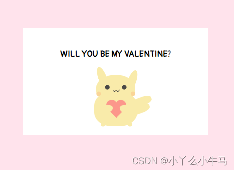
第二个页面,就是信件内容啦。其中元素与card上的元素基本相同。
博主在这个页面重新绘制了一只皮卡丘,增加了些光影的细节及动画。
当然,用之前那只也是可以的。
新的这只长酱紫:
emmmm,现在是凌晨3点了,孩子想睡觉了,就先贴个代码吧!大家需要,可以留言或私信我,我会补上教程。相信聪明的大佬们自己也是能看懂的。
pikachu.html
<!DOCTYPE html>
<html lang="en">
<head>
    <meta charset="UTF-8">
    <title>pikachu</title>
    <link rel="stylesheet" href="pikachu.css">
</head>
<body>
<div class="wrapper">
    <h2>Will you be my valentine?</h2>
    <div class="pikachu">
        <div class="head">
            <div class="ears left brown"><div class="ears-inside yellow"></div></div>
            <div class="ears right brown"><div class="ears-inside yellow"></div></div>
            <div class="face yellow">
                <span class="eye left brown"></span>
                <span class="eye right brown"></span>
                <span class="mouth">w</span>
                <span class="cachete left"></span>
                <span class="cachete right"></span>
            </div>
        </div>
        <div class="body yellow">
            <div class="heart"></div>
            <div class="paw left yellow"></div>
            <div class="paw right yellow"></div>
        </div>
        <div class="leg left yellow-dark"></div>
        <div class="leg right yellow-dark"></div>
        <div class="tail yellow-dark"></div>
    </div>

</div>

</body>
</html>
pikachu.css
@import url(https://fonts.googleapis.com/css?family=Loved+by+the+King);

body,html {
    background: #FFE3EC;
    height:100%;
    font-family: 'Loved by the King',cursive;
}

div,ul,span{
    display: block; position: absolute;
    margin: auto; padding: 0;
    top: 0; bottom: 0; right: 0; left: 0;
}

.brown { background-color: #452211;}
.yellow { background-color: #ffd814}
.yellow-dark { background-color: #e0a100}

.wrapper {
    height: 450px;
    width: 300px;
}

h2 {
    text-transform: uppercase;
    text-align: center;
    font-size: 2em;
    color: #452211;
}

.pikachu{
    top: auto;
    height: 65%;
    width: 140px;
}

.pikachu::before {
    position: absolute;
    content: '';
    background: rgba(0,0.15);
    height: 10px;
    width: 90%;
    margin: auto;
    left: 0;
    right: 0;
    bottom: 95px;
    border-radius: 50%;
}

.pikachu .head {
    bottom: auto;
    height: 120px;
    width: 120px;
    z-index: 3;
}

.pikachu .head .face{
    width: 120px;
    height: 70px;
    top: auto;
    border-radius:  40px 40px 30px 30px;
    z-index: 2;
}

.face .eye {
    width: 14px;
    height: 14px;
    border-radius: 50%;
    bottom: auto;
    top: 28px;
    -webkit-animation: blink 4s infinite;
}


.eye.left {
    right: auto;
    left: 32px;
}

.eye.right {
    left: auto;
    right: 32px;
}

.face .mouth {
    text-align: center;
    height: 10px;
}

.face .cachete {
    width: 16px;
    height: 16px;
    border-radius: 50%;
    bottom: auto;
    top: 38px;
    background-color: #e64900;
    z-index: 9;
}

.cachete.left {
    right: auto;
    left: 10px;
}

.cachete.right {
    left: auto;
    right: 10px;
}


.pikachu .head .ears{
    width: 20px;
    height: 90px;
    bottom: auto;
    border-radius: 50%;
    overflow: hidden;
    z-index: 1;
}

.ears.left{
    right: auto;
    left: 10px;
}

.ears.right{
    left: auto;
    right: 10px;
}

.ears .ears-inside{
    top: auto;
    height: 70px;
    width: 30px;
    border-radius: 50%;
}

.ears.right .ears-inside{
    position: absolute;
    left: -50%;
}

.pikachu .body {
    bottom: auto;
    top: 80px;
    height: 105px;
    width: 130px;
    border-radius: 80px 80px 40px 40px;
    overflow: hidden;
    z-index: 2;
}

.pikachu .body .paw{
    bottom: auto;
    top: 50px;
    height: 15px;
    width: 30px;
    z-index: 9;
    border-bottom: 1px solid #e0a100;
    border-top: 1px solid #FFFFFF;
}

.pikachu .body .paw.left{
    right: auto;
    left: 15px;
    border-radius: 0 50% 50% 0;
}

.pikachu .body .paw.right{
    left: auto;
    right: 15px;
    border-radius: 50% 0 0 50%;
}

.pikachu .body .heart {
    width: 40px;
    height: 40px;
    bottom: auto;
    top: 10px;
    z-index: 8;
    animation:beat 0.45s infinite;
    -webkit-animation:beat 0.45s infinite;
}

.pikachu .body .heart:before,.pikachu .body .heart:after {
    position: absolute;
    content: "";
    left: 20px;
    top: 30px;
    width: 50%;
    height: 100%;
    background: #e64900;
    -moz-border-radius: 20px 20px 0 0;
    border-radius: 10px 10px 0 0;
    -webkit-transform: rotate(-45deg);
    -moz-transform: rotate(-45deg);
    -ms-transform: rotate(-45deg);
    -o-transform: rotate(-45deg);
    transform: rotate(-45deg);
    -webkit-transform-origin: 0 100%;
    -moz-transform-origin: 0 100%;
    -ms-transform-origin: 0 100%;
    -o-transform-origin: 0 100%;
    transform-origin: 0 100%;
}
.pikachu .body .heart:after {
    left: 0px;
    -webkit-transform: rotate(45deg);
    -moz-transform: rotate(45deg);
    -ms-transform: rotate(45deg);
    -o-transform: rotate(45deg);
    transform: rotate(45deg);
    -webkit-transform-origin: 100% 100%;
    -moz-transform-origin: 100% 100%;
    -ms-transform-origin: 100% 100%;
    -o-transform-origin: 100% 100%;
    transform-origin :100% 100%;
}

.pikachu .leg {
    z-index: 1;
    bottom: auto;
    top: 172px;
    height: 20px;
    width: 30px;
}

.pikachu .leg.left {
    right: auto;
    left: 20px;
    border-radius: 80px 10px 80px 10px;
}

.pikachu .leg.right {
    left: auto;
    right: 20px;
    border-radius: 10px 80px 10px 80px;
}

.pikachu .tail {
    z-index: 1;
    height: 40px;
    width: 50px;
    left:auto;
    bottom: auto;
    top: 70px;
    border-radius: 10% 30%;
}

.signature {
    position: absolute;
    margin: auto;
    bottom: 0;
    top: auto;
}

.signature p{
    text-align: center;
    font-family: Helvetica,Arial,Sans-Serif;
    font-size: 0.85em;
}

.signature .much-heart{
    display: inline-block;
    position: relative;
    margin: 0 4px;
    height: 10px;
    width: 10px;
    background: #AC1D3F;
    border-radius: 4px;
    -ms-transform: rotate(45deg);
    -webkit-transform: rotate(45deg);
    transform: rotate(45deg);
}

.signature .much-heart::before,.signature .much-heart::after {
    display: block;
    content: '';
    position: absolute;
    margin: auto;
    height: 10px;
    width: 10px;
    border-radius: 5px;
    background: #AC1D3F;
    top: -4px;
}

.signature .much-heart::after {
    bottom: 0;
    top: auto;
    left: -4px;
}

.signature a {
    color: #333;
    text-decoration: none;
    font-weight: bold;
}

@keyframes blink{
0% {  height: 14px; top: 28px;}
5% {  height: 2px; top: 34px;}
10% {  height: 14px; top: 28px;}
40% {  height: 14px; top: 28px;}
50% {  height: 2px; top: 34px;}
55% {  height: 14px; top: 28px;}
100% {  height: 14px; top: 28px;}
}
三、联结两个页面
我们在信件页面,使用JS添加点击事件即可实现。
<!DOCTYPE html>
<html lang="en">
<head>
    <meta charset="UTF-8">
    <title>envelope</title>
    <link rel="stylesheet" href="envelope.css">
</head>
<body>
<div class="container" >
  <div class="envelope" ></div>
  <div class="card" id="test">
<!--      添加文案-->
    <h1 class="message" >WILL YOU BE MY VALENTINE?</h1>
    <div class="pikachu">
      <div class="limbs"></div>
      <div class="heart"></div>
      <div class="arms"></div>
      <div class="smile"></div>
    </div>
  </div>
  <div class="cover"></div>
  <div class="lid"></div>
  <div class="shadow"></div>
</div>
<script>
  window.onload = function (){
    var go = document.getElementById("test");
    go.onclick = function (){
      location.href = "./pikachu.html"
    }
  }
</script>
</body>
</html>
总结
预祝大家520快乐,愿你们今后每一个平凡的小普通,都是小牛马求而不得的心动QAQ。
链接:https://pan.baidu.com/s/1VOcJvm5555FVpdMA76XTJQ
提取码:LDL6
 原文:https://www.cnblogs.com/wenruo/p/9732704.html 先上...