常见定位方案
在讲 BFC 之前,我们先来了解一下常见的定位方案,定位方案是控制元素的布局,有三种常见方案:
- 普通流 (normal flow)
在普通流中,元素按照其在 HTML 中的先后位置至上而下布局,在这个过程中,行内元素水平排列,直到当行被占满然后换行,块级元素则会被渲染为完整的一个新行,除非另外指定,否则所有元素默认都是普通流定位,也可以说,普通流中元素的位置由该元素在 HTML 文档中的位置决定。
- 浮动 (float)
在浮动布局中,元素首先按照普通流的位置出现,然后根据浮动的方向尽可能的向左边或右边偏移,其效果与印刷排版中的文本环绕相似。
- 绝对定位 (absolute positioning)
在绝对定位布局中,元素会整体脱离普通流,因此绝对定位元素不会对其兄弟元素造成影响,而元素具体的位置由绝对定位的坐标决定。
BFC 概念
Formatting context(格式化上下文) 是 W3C CSS2.1 规范中的一个概念。它是页面中的一块渲染区域,并且有一套渲染规则,它决定了其子元素将如何定位,以及和其他元素的关系和相互作用。
那么 BFC 是什么呢?
BFC 即 Block Formatting Contexts (块级格式化上下文),它属于上述定位方案的普通流。
具有 BFC 特性的元素可以看作是隔离了的独立容器,容器里面的元素不会在布局上影响到外面的元素,并且 BFC 具有普通容器所没有的一些特性。
通俗一点来讲,可以把 BFC 理解为一个封闭的大箱子,箱子内部的元素无论如何翻江倒海,都不会影响到外部。
BFC 触发条件
只要元素满足下面任一条件即可触发 BFC 特性:
- HTML 根元素
- 浮动元素:float 除 none 以外的值
- 绝对定位元素:position (absolute、fixed)
- display 为 inline-block、table-cells、flex
- overflow 除了 visible 以外的值 (hidden、auto、scroll)
- 网格布局元素
- 元素属性 colum-span 设置为 all
使用 overflow 触发 BFC(清除浮动)
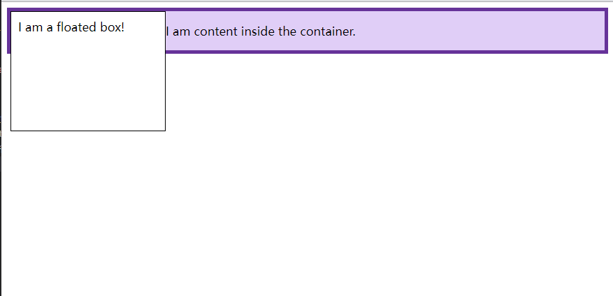
在下面的示例中,我们在应用了边框的 <div> 中有一个浮动元素。该 div 的内容与浮动元素一起浮动。由于 float 的内容比它旁边的内容高,所以现在 DIV 的边框贯穿了 float。浮动已脱离文档流,因此 DIV 的背景和边框仅包含内容,而不包含浮动。
<!--
 * @Date: 2021-11-22 14:03:18
 * @information: BFC
-->
<!DOCTYPE html>
<html>
  <head>
    <meta charset="UTF-8" />
    <meta http-equiv="X-UA-Compatible" content="IE=edge" />
    <meta name="viewport" content="width=device-width,initial-scale=1.0" />
    <title>Document</title>
    <style>
      .box {
        background-color: rgb(224,206,247);
        border: 5px solid rebeccapurple;
      }

      .float {
        float: left;
        width: 200px;
        height: 150px;
        background-color: white;
        border: 1px solid black;
        padding: 10px;
      }
    </style>
  </head>
  <body>
    <div class="box">
      <div class="float">I am a floated box!</div>
      <p>I am content inside the container.</p>
    </div>
  </body>
</html>
创建一个新的 BFC 将包含该浮动。在过去,一种典型的方法是设置 overflow: auto 或设置其他不是 overflow: visible 的值。
<!DOCTYPE html>
<html>
  <head>
    <meta charset="UTF-8" />
    <meta http-equiv="X-UA-Compatible" content="IE=edge" />
    <meta name="viewport" content="width=device-width,247);
        border: 5px solid rebeccapurple;
+       overflow: auto;
      }

      .float {
        float: left;
        width: 200px;
        height: 150px;
        background-color: white;
        border: 1px solid black;
        padding: 10px;
      }
    </style>
  </head>
  <body>
    <div class="box">
      <div class="float">I am a floated box!</div>
      <p>I am content inside the container.</p>
    </div>
  </body>
</html>
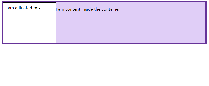
设置 overflow: auto 会自动创建包含浮动的新 BFC。现在,我们的 DIV 在布局中变成了一个迷你布局。任何子元素都将包含在其中。
使用 display: flow-root 显示创建 BFC
使用 display: flow-root(或 display: flow-root list-item)将创建一个新的 BFC,而不会产生任何其他潜在的问题副作用。
<!DOCTYPE html>
<html>
  <head>
    <meta charset="UTF-8" />
    <meta http-equiv="X-UA-Compatible" content="IE=edge" />
    <meta name="viewport" content="width=device-width,247);
        border: 5px solid rebeccapurple;
+       display: flow-root;
      }

      .float {
        float: left;
        width: 200px;
        height: 150px;
        background-color: white;
        border: 1px solid black;
        padding: 10px;
      }
    </style>
  </head>
  <body>
    <div class="box">
      <div class="float">I am a floated box!</div>
      <p>I am content inside the container.</p>
    </div>
  </body>
</html>
使用<div>上的 display: flow-root ,该容器内的所有内容都参与该容器的块格式上下文,并且浮动不会从元素底部弹出。
flow-root 关键字的意义是,创建的内容本质上类似于一个新的根元素(如 <html> ),并确定这个新的上下文如何创建及其流布局如何实现。
BFC 特性及应用
同一个 BFC 下外边距会发生折叠
<!DOCTYPE html>
<html>
  <head>
    <meta charset="UTF-8" />
    <meta http-equiv="X-UA-Compatible" content="IE=edge" />
    <meta name="viewport" content="width=device-width,initial-scale=1.0" />
    <title>Document</title>
    <style>
      div {
        width: 100px;
        height: 100px;
        background: lightblue;
        margin: 100px;
      }
    </style>
  </head>
  <body>
    <div></div>
    <div></div>
  </body>
</html>

从效果上看,因为两个 div 元素都处于同一个 BFC 容器下 (这里指 body 元素) 所以第一个 div 的下边距和第二个 div 的上边距发生了重叠,所以两个盒子之间距离只有 100px,而不是 200px。
首先这不是 CSS 的 bug,我们可以理解为一种规范,如果想要避免外边距的重叠,可以将其放在不同的 BFC 容器中。
<!DOCTYPE html>
<html>
  <head>
    <meta charset="UTF-8" />
    <meta http-equiv="X-UA-Compatible" content="IE=edge" />
    <meta name="viewport" content="width=device-width,initial-scale=1.0" />
    <title>Document</title>
    <style>
      .container {
        overflow: hidden;
      }
      p {
        width: 100px;
        height: 100px;
        background: lightblue;
        margin: 100px;
      }
    </style>
  </head>
  <body>
    <div class="container">
      <p></p>
    </div>
    <div class="container">
      <p></p>
    </div>
  </body>
</html>

这时候,两个盒子边距就变成了 200px
BFC 可以包含浮动的元素(清除浮动)
我们都知道,浮动的元素会脱离普通文档流,来看下下面一个例子
<div style="border: 1px solid #000;">
  <div style="width: 100px;height: 100px;background: #eee;float: left;"></div>
</div>

由于容器内元素浮动,脱离了文档流,所以容器只剩下 2px 的边距高度。如果使触发容器的 BFC,那么容器将会包裹着浮动元素。
<div style="border: 1px solid #000;overflow: hidden">
  <div style="width: 100px;height: 100px;background: #eee;float: left;"></div>
</div>

BFC 可以阻止元素被浮动元素覆盖
先来看一个文字环绕效果:
<div style="height: 100px;width: 100px;float: left;background: lightblue">
  我是一个左浮动的元素
</div>
<div style="width: 200px; height: 200px;background: #eee">
  我是一个没有设置浮动,也没有触发 BFC 元素,width: 200px; height:200px;
  background: #eee;
</div>

这时候其实第二个元素有部分被浮动元素所覆盖,(但是文本信息不会被浮动元素所覆盖) 如果想避免元素被覆盖,可触第二个元素的 BFC 特性,在第二个元素中加入 overflow: hidden,就会变成:
<div style="height: 100px;width: 100px;float: left;background: lightblue">
  我是一个左浮动的元素
</div>
<div style="width: 200px; height: 200px;background: #eee; overflow: hidden">
  我是一个没有设置浮动,width: 200px; height:200px;
  background: #eee;
</div>

这个方法可以用来实现两列自适应布局,效果不错,这时候左边的宽度固定,右边的内容自适应宽度(去掉上面右边内容的宽度)。
参考:10 分钟理解 BFC 原理、Introduction to formatting contexts 格式化上下文简介
 原文:https://www.cnblogs.com/wenruo/p/9732704.html 先上...