在写移动端页面的布局的时候是按照iphone6的尺寸写的,在iphone5中因为宽度的问题导致样式错乱。
如下所示是ratings.vue中的<template>内容
<template>
  <!--评价页的高度可能会超过页面,所以需要bette-scroll-->
  <!--在内容真正开始的地方,其外部会有一个div包裹-->
  <div class="ratings"> <!--父元素的高度要固定高度-->
    <div class="ratings-content"> <!--子元素这里是better-scroll实例化的对象-->
      <div class="overview">
        <div class="overview-left">
          <h1 class="score">{{seller.score}}</h1>
          <div class="title">综合评分</div>
          <div class="rank">高于周边商家{{seller.rankRate}}%</div>
        </div>
        <div class="overview-right">
          <div class="score-wrapper">
            <span class="title">服务态度</span>
            <star :size="36" :score="seller.serviceScore"></star>
            <span class="score">{{seller.serviceScore}}</span>
          </div>
          <div class="score-wrapper">
            <span class="title">商品评分</span>
            <star :size="36" :score="seller.foodScore"></star>
            <span class="score">{{seller.foodScore}}</span>
          </div>
          <div class="delivery-wrapper">
            <span class="title">送达时间</span>
            <span class="delivery">{{seller.deliveryTime}}分钟</span>
          </div>
        </div>
      </div>
    </div>
  </div>
</template>
<style lang="stylus">
  .ratings
    position:absolute
    top:174px       /*这是.header + .tab的高度*/
    bottom:0        /*设成绝对定位,设置top和bottom的值,就相当于设定固定的height*/
    left:0
    width: 100%
    overflow:hidden
    .overview
      display: flex
      padding:18px 0
      .overview-left
        flex:0 0 137px
        padding:6px 0
        width:137px   /*设置兼容性*/
        border-right:1px solid rgba(7,17,27,0.1)
        text-align :center
        .score
          margin-bottom:6px
          line-height:28px
          font-size:24px
          color:rgb(255,153,0)
        .title
          margin-bottom:8px
          line-height:12px
          font-size:12px
          color:rgb(7,27)
        .rank
          line-height:10px
          font-size:10px
          color:rgb(147,159)
      .overview-right
        flex:1
        padding:6px 0 6px 24px
        .score-wrapper
          margin-bottom:8px
          font-size:0
          .title,.star,.score
            display:inline-block  /*设置这两个是因为有些是文字,有些是图片*/
            vertical-align: top   /*这样就能对齐*/
            line-height:18px
          .title
            font-size:12px
            color:rgb(7,27)
          .star
            margin:0 12px
          .score
            font-size:12px
            color:rgb(255,0)
        .delivery-wrapper
          font-size:0
          .title            /*.title,.delivery没有设置display:inline-block,*/
            line-height:18px   /*vertical-align: top,是因为他们都是文字,会自动对齐*/
            font-size:12px
            color:rgb(7,27)
          .delivery
            margin-left:12px
            font-size:12px
            color:rgb(147,159)
</style>
在浏览器上选择iphone6的显示效果如下
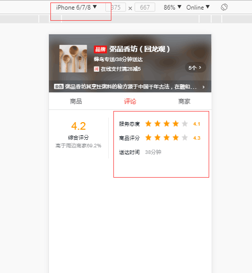
从上面可以看出布局一切正常。下图是iphone5中显示的样式:
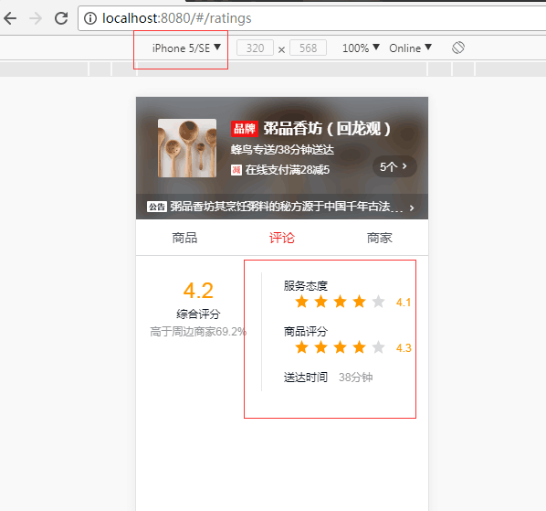
从上图可以看出右边的红色圈中的布局已经错乱了,那是因为样式尺寸是按照Iphone6的宽度设置的,而iphone5的宽度较小,所以导致页面宽度不够,布局显示错乱的现象。
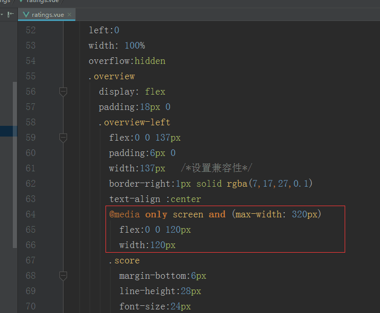
解决的方法:使用@media查询,缩小左边的div的宽度以及右边div的padding-left的值,如下图所示

在iphone5下的显示效果
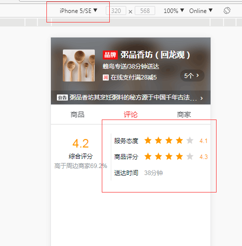
这样就ok了,在其他模式下显示和没有加@media查询之前一样
 原文:https://www.cnblogs.com/wenruo/p/9732704.html 先上...